


Hey there, it’s Jacob at Retention.Blog 👋
I got tired of reading high-level strategy articles, so I started writing actionable advice I would want to read.
Nearly every week I share practical learnings you can apply to your business.
Retention.Blog is sponsored by Botsi
Your A/B test is lying to you.
Move from A/B to AI with personalized offers for each user to increase LTV by 30-50%. Learn more →
I’ve been thinking about paywall optimization tactics and at the heart of them are two things:
Increasing awareness of the free trial
Getting more people on annual plans
I’m not saying there aren’t any other underlying goals for paywall optimization, but so many come back to these simple objectives.
We want to learn from competitors, not blindly copy, so understanding the “why” behind a tactic is important to be able to innovate on a tactic to make it your own.
Trials
If you ever watched your wife click on an ad for an app, go download the app, go through the onboarding flow, reach the paywall, and exclaim, “Ugh, I don’t want to pay for that.”
And then you ask her, “Did you see the trial? If you’re interested in it, you could try it for free and see if you like it?”
And she says, “No, but I don’t want it.”
You may start to realize that people don’t read, they tap through things quickly, and even if you have a trial on the paywall, people react strongly to being asked for money and will emotionally respond without ever comprehending your trial.
Let’s take a look:
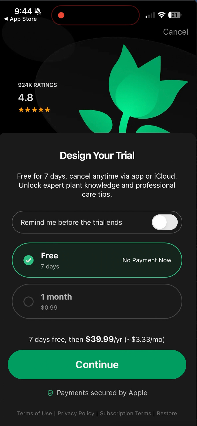
What’s the purpose of Design your trial?
It’s not actually to have people design their trial, it give the perception of choice and lets people be consciously aware of the trial.
When you force someone to interact with the trial choice, this means they can’t ignore there is a free trial.
Let’s look at multi-page paywall from Duolingo:
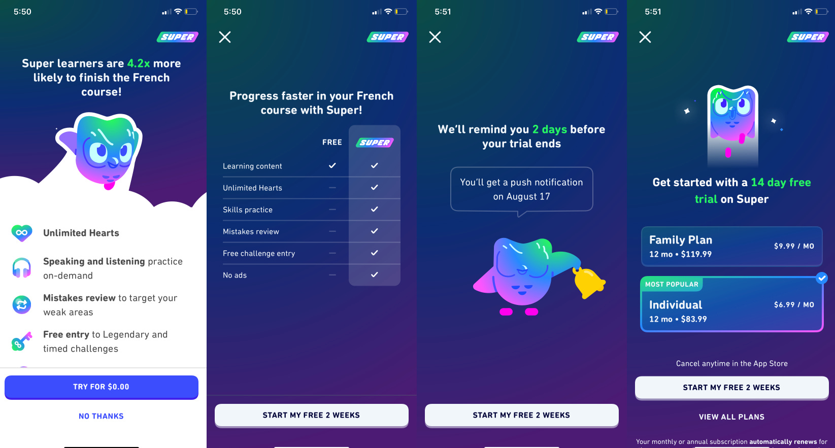
A big innovation was the page dedicated to the trial reminder.
The trial reminder forces awareness that there is a trial and you don’t have to pay immediately.
An evolution of this trial reminder screen:
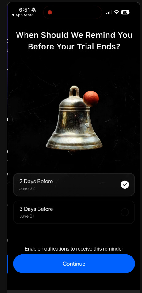
Now we’re introducing and forcing even more awareness through action.
There are options for when you want your trial reminder, so this forces more cognitive action and awareness of the trial.
And of course, the goal is also to have fewer people cancel the trial immediately, but simply being aware they don’t have to pay is the first step.
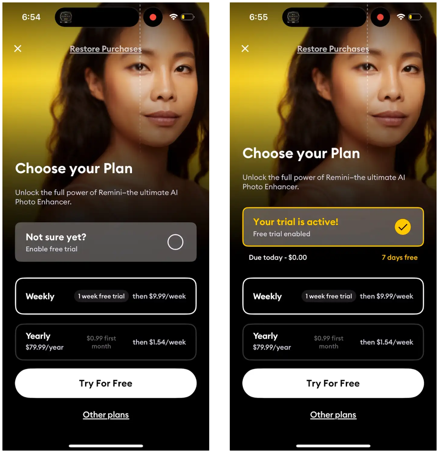
Free Trial Selector/Indicator
Apple has started to ban the trial toggle, but possibly this option is still allowed?
Look how they’re adding more awareness
A lot these ideas started with the Blinkest trial timeline:
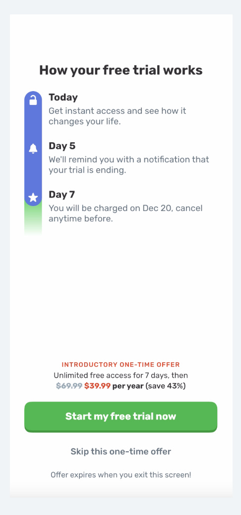
Use “Try for $0.00” in the CTA buttons
“Start me free trial” in the header in big bold text
Trial timelines
Design your trial
Trial reminder toggles
👀 New Price Power Podcast:
Failed Payments Are Free Money w/ Philip Pages
Philip is the CEO of Redux Payments and has looked inside hundreds of payment accounts. Most of them are leaving real money on the table. He walks through the difference between a customer who wants to churn and a card that simply had no funds that morning; why recovered subscribers stick around for another three to six billing cycles; and how not to blow up your Stripe account.

Listen or watch on Youtube, Spotify, and Apple Podcasts:
Annual Plans
The other huge lever is getting more annual subscriptions.
Monthly subscriptions have super high churn, and if you can get someone on an annual subscription that is half the price of the monthly, this will still equate to 2x higher LTV for that user.
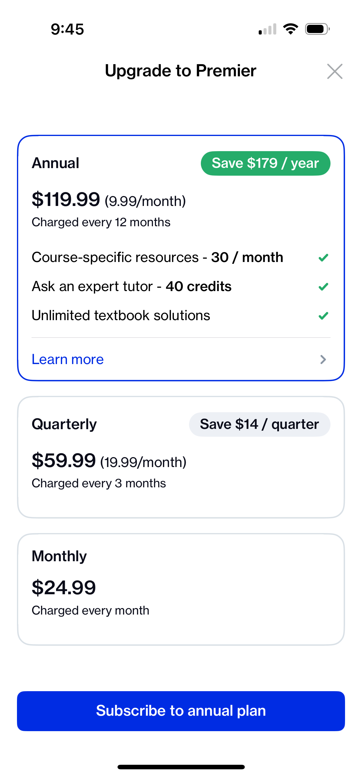
Generally, you want to use Monthly and other plans as a price anchor to show that the annual plan is a much better deal.
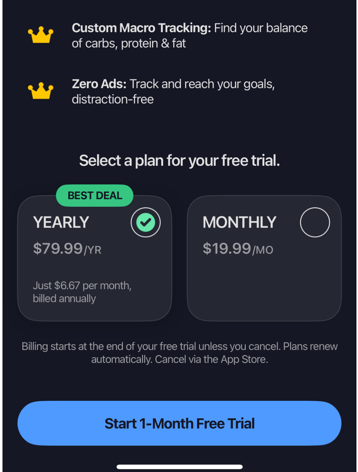
You emphasize the percentage savings, break down the annual price to monthly, add badges on the paywall, and overall, guide your users to that longer plan.
Some apps that have enough brand cache or a strong enough conversion funnel, only offer annual plans:
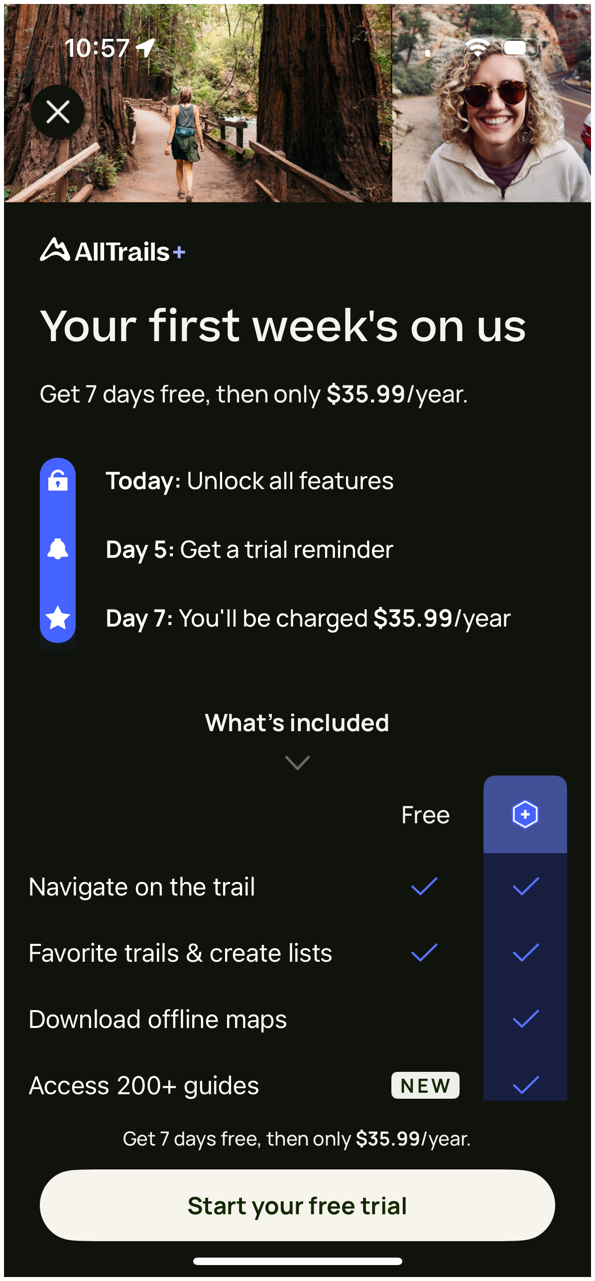
More likely to be effective, is to only show the Annual plan at first, but also make the “Monthly Plan” available:
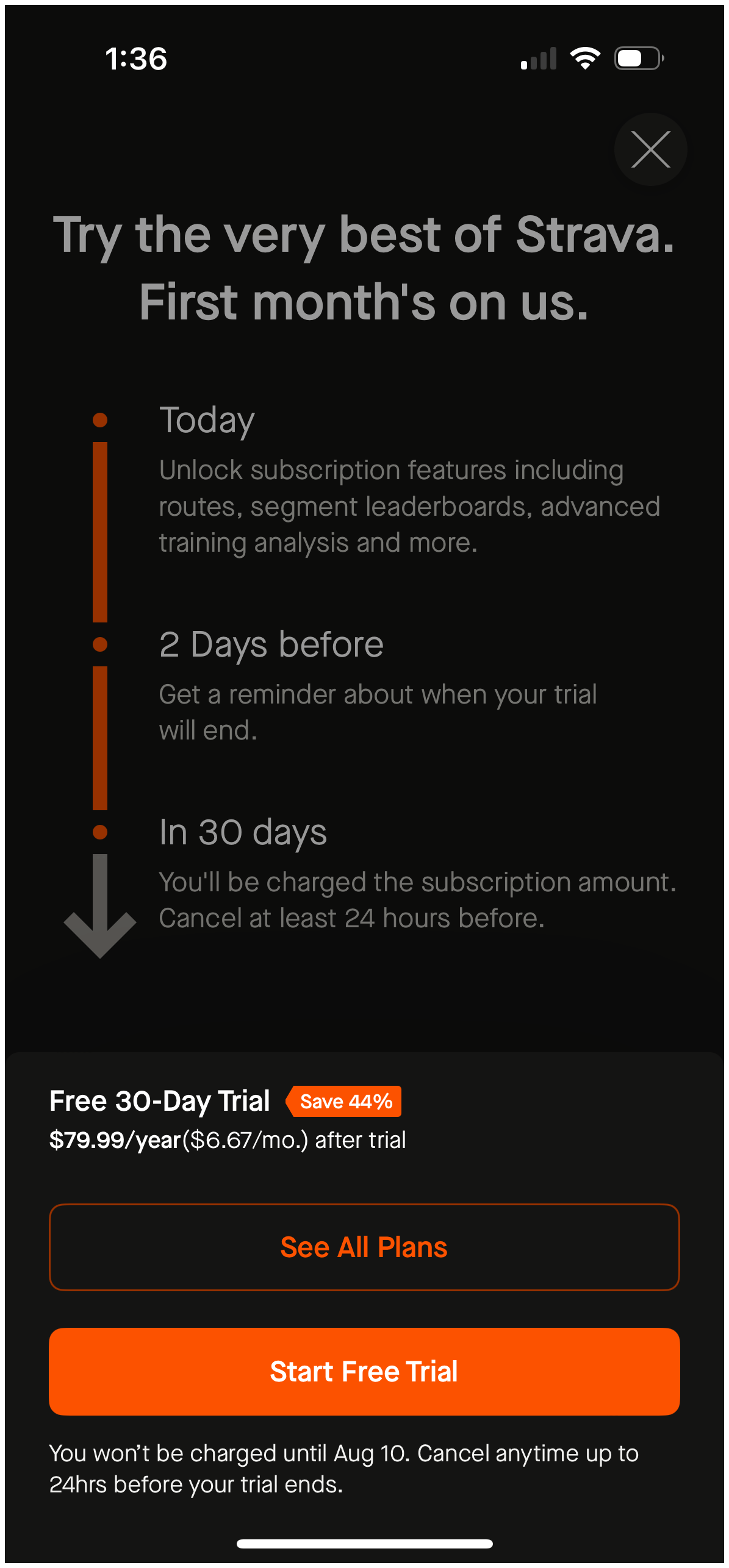
This works well because you get everyone that has high intent to buy annual plans, but if someone is more price sensitive they’ll check out the other options.
Going back to this Design your trial tactic - why does it work?
As I mentioned above, part of it is simply making you more aware of the free trial.
But the 2nd part is that you’re able to drive all users to annual plans.
A lot of apps before this paywall had either Annual and Monthly plans, or only one annual plan on their paywall.
For apps that had the standard monthly and annual, this allowed them to remove the monthly plan, but still give users a choice of what plan, and 1 month for $0.99 is a great option for price sensitive people.
What I’ve seen and heard is that actually very few users purchase the design your trial.
For apps that moved from annual only to this paywall, it gave another annual plan option for price sensitive users.
Wrapping Up
Whenever we can, we want to try to figure out the “Why” behind a tactic.
Why is it working for one app and not another?
Why is this something I should try?
Why does this work at all?
This allows us not copy blindly, but to imitate and innovate (kind of catchy, huh?).
Interested in how to imitate creatively? Check out this past post:

📣 Want to help support and spread the word?
Go to my LinkedIn here and like, comment, or share my posts.
OR

Great inspiration, as always dear Jacob! :-)