

Imitate creatively
Level up your EQ with Ahead

Hey there, it’s Jacob at Retention.Blog 👋
I got tired of reading high-level strategy articles, so I started writing actionable advice I would want to read.
Every week I share practical learnings you can apply to your business.
Get ahead by checking out Ahead

There is nothing really stopping apps from imitating the conversion tactics of others.
The end users will usually never notice.
Revenue and download data is easily accessible, so it’s very easy to know who is succeeding and growing.
They say imitation is the greatest form of flattery.
Successful tactics proliferate so quickly in the mobile app world. It’s hard to know who even did them first.
But if you’re copying your competitors or other apps directly, you’re likely not going to see the best results.
Before blindly copying, you should try to understand and distill down the essence of the idea.
Ask yourself:
Why is this working?
How do users think about this interaction?
What type of psychology does this tap into?
Does it make sense for my category of product?
Does it make sense for my user base?
It’s easy to copy. It’s hard to understand and then modify and manipulate to make it make sense for your product.
From what I see, Ahead uses many proven tactics, but adapts them to fit their product and brand.
They go beyond the basics to create a very compelling experience.
Let’s check out Ahead’s new user experience
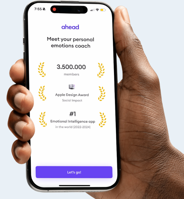
Personal coach imbues a higher value
Uses social proof and awards
And this last one is interesting - “#1 emotional intelligence app” Do you know of a lot of other emotional intelligence apps? I don’t. Create a new category of product and you will be the best!
Also, why does Ahead put those laurels around each item?
Because that’s what Apple uses for their awards in the app store! I look at this as a form of “borrowed credibility.”
Ahead forces account creation before the rest of the onboarding.
But they replicated a tactic commonly used before a paywall before the account creation!

This is the commitment pact approach, but tweaked a bit.
A lot of other apps use the “Hold to commit”, but ahead modified this to ask you to draw a quick checkmark.
This simple interaction forces you to engage and not blindly tap through the screens. It also creates extra investment to build more momentum before the account creation page.

And of course, they use best practices of SSO options with Google and Apple.
After account creation, they do something else cool.

They mention their free trial up front!
They’re priming you for what’s to come.
They let you know you can try it for free, but there are also built-in costs from the mental health experts.
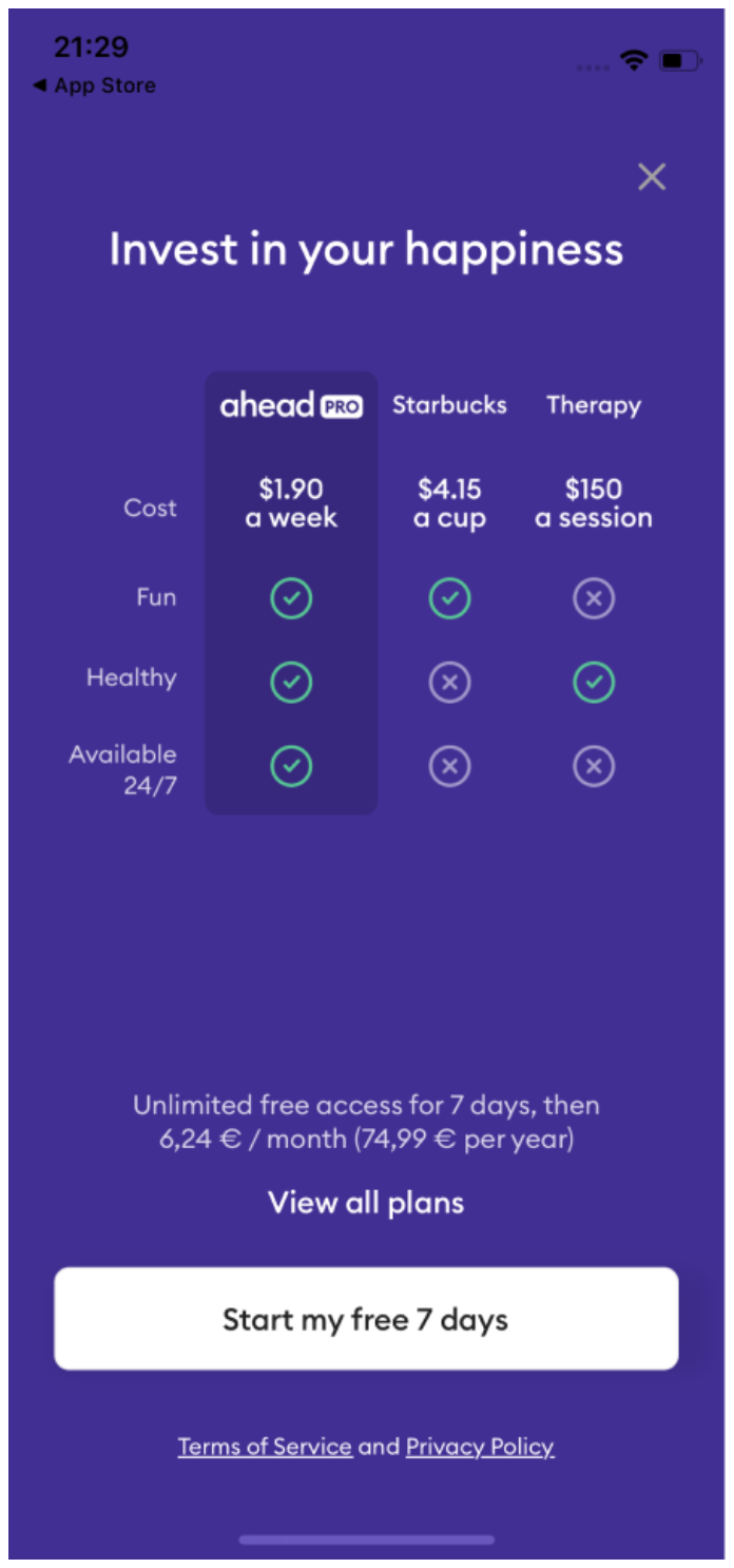
People think of digital products as free too often, so they’re breaking out of this by connecting it to real-world costs
I also like the comparison to the price of a movie ticket. I’ve seen other apps comparing to the price of a cup of coffee (I’ll come back to this concept when I get to the paywall).

Before they dive into questions, they let you know they’re personalizing the product for you AND your data won’t be shared.
Get ahead of common concerns.
We start with a common, “What are your goals question”
This goal question should let them personalize recommendations later on.
But then they move into a 10-question flow that asks creative questions to create more recommendations for you.

Great copy makes such a difference in the perception of a product.
The copy for every single question and on the graph is awesome.
And it’s especially important for an app that’s dealing with emotions and anger.
If you can put a smile on someone’s face with your copy, you’ve won.
I also like the creativity of how they designed these scales.

They could have done a classic slider, but this is much more visually interesting
But they’re asking 10 questions, and that’s a lot, so we need a mid-way break.

Goal gradient: The closer you are to completing a goal, the more likely you are to finish. Reminding people they’re half way through will boost completion.

Loading screens show the work the app is doing for you and reinforces the personalization value
I also really like this emotional profile.
Too many apps create all these questions and then don’t have anything to show for it.
And the Superpower and Growth area is well done. This is instant value and helps me understand myself better. And ideally, I resonate with what they share.
Next, they recommend journeys:

Once I pick my journeys, I appreciate the % match rate with the quiz.
This combined with the emotional profile lets me know all those questions weren’t for nothing and increases my perceived value of the product.
I kind of wish I knew more about what these journeys entail. Or what a journey is?
If I tap on the journey I learn a bit more, but not more details about what’s to follow in the app.
Possibly this is thoughtful and intentional. Overloading users with too much information or details can cause them to think too much and decide it’s not what they’re looking for.

Do you notice how they turn to a dark color scheme? I wonder if the preceding quiz flow was added later and these dark purple screens are part of an earlier onboarding flow version.
Putting famous universities and institutions is always helpful.
But you realize when you read the text, they don’t actually claim any affiliation. “..based on decades of research”
“Borrowed credibility”

What health and fitness app is complete without a graph showing your progress??
And let’s sprinkle in some social proof via testimonial

This is a great pre-paywall commitment.
It’s similar to the commitment tactic used before the account creation.
The title copy of the screen also instills that you’ll make progress easily and quickly. We all have the question, “How long will it take me to see results?”, in the back of our mind when trying something new.
Now the paywall!

Their title copy changes based on your original goal!
I’m a huge fan of simple copy personalization.
Simple dynamic copy based on a user’s goal is a great tactic. I’ve seen it work multiple times in different ways (in-app, email copy, etc.).
After they tap on the “Continue” button they have a hard paywall. You can’t use the app without starting a trial. They use the trial timeline view.
Interestingly, it looks like they previously used a cost comparison graphic. Here is an older version of the paywall:
Once you get into the app, true to their marketing message (Duolingo of emotional something or other), they have a Duolingo-style progression of lessons and similar UI.
Think back to my original message of imitate, but make it your own.
You have to complete 3 to move on to the next “level” or set of lessons.
A couple more cool tactics post-onboarding:

I canceled my trial and when I open the app, they have a banner that reminds me! I think this will show once a day because it counts down.
I had an annual plan with a trial, but since they know people might not be ready to commit to a full year for a variety of reasons, they offer a lower payment of $9.99 per month.
It’s not a discount, it’s just trying to get you to switch to a different plan if the annual commitment is too much.
And one I’ve never seen before:

When I went to close the app by swiping up, it stopped me! This screen popped up instead.
I don’t really know how it works, but I swiped up on the bottom of my phone, and they showed this screen. One more small little interaction to make a conscious commitment to come back to the app.
It was a little surprising, but how could I be mad at that friendly little purple blob? If they had asked me to buy something, it would have felt annoying, but this was such a small ask of just tapping, that I didn’t mind at all.
Ahead has done a phenomenal job of innovating and creating a valuable product, but also using proven concepts to drive new user conversion.
There are many different tactics I’m eager to try in my own work with different apps!
Check out the Whimsical board here to see the full onboarding flow.

📣 Want to help support and spread the word?
Go to my LinkedIn here and like, comment, or share my posts.
OR
Share this newsletter by clicking here.

They definitely use some really nice tactics. They paywall looks a bit cheezy with the pricing and I think it's not immediately clear what the price is because they have a weekly, monthly, and annual price all on one page. But the rest is pretty clever.