


Hey there, it’s Jacob at Retention.Blog 👋
I got tired of reading high-level strategy articles, so I started writing actionable advice I would want to read.
Nearly every week I share practical learnings you can apply to your business.
Retention.Blog is sponsored by Botsi
Don’t make your first screen boring
I see a missed opportunity among many apps.
When you look at your onboarding sequence, you typically have a few points with large drop off:
Your sign up or account creation
Notification or permission opt-in
Paywalls
But everyone forgets about the very first screen!
You can have 10-30% of new users never make it past the first loading screen.
A lot of people think, “There’s nothing I can do about that, these users never wanted to use my app”
Maybe that’s true. Maybe it’s not.
Sure, some of these users will never progress for whatever reason, and so your goal shouldn’t be 0% drop off on the first screen.
But I bet you can improve it!
One of the easiest ways, I believe, is to do more than the bare minimum.
What’s the bare minimum?
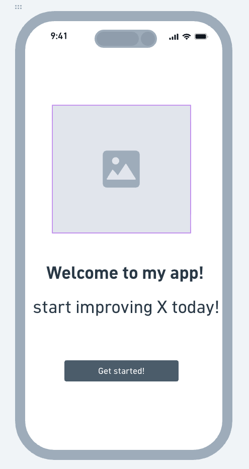
How many of your apps have a first screen that is some derivation of this?
Yeah, probably 95% of apps look like this.
Why?
Because people aren’t creative and play it safe.
When a new app founder or designer is trying to figure out how to design their welcome screen, what do they do?
They go look at big apps, and say, “Oh, I guess this is how it’s done”
BORING!
And not only boring, but unoptimized.
Let’s take a look at 5 different first screens of apps
Opal
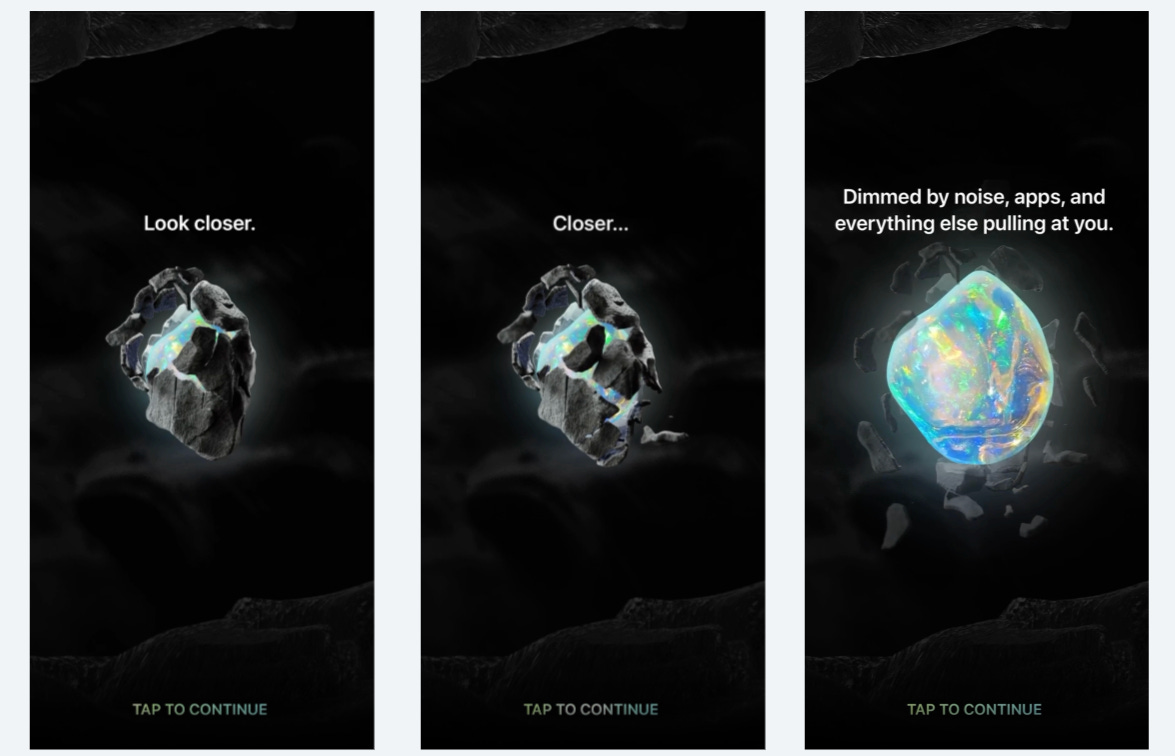
Opal is a screen time app.
You earn rocks opals as you keep to your screen time goal longer.
They recently redid their onboarding experience, and now when you start the app for the first time, they show you this cryptic glowing rock thing.
You tap it, bop it, twist it…sorry, I got a flash back to child hood
You tap the rock a few times and it breaks apart to reveal a glowing opal.
This is so much more engaging!!
It’s a happy combination between interesting and easy.
You want to capture someone’s attention, but not make them to do much work to progress.
Past breakdown of Opal’s full new onboarding flow:

Rise
RISE Sleep Science app has a pretty solid hook too.
It’s not only visually interesting, but it’s phenomenal writing and copy.
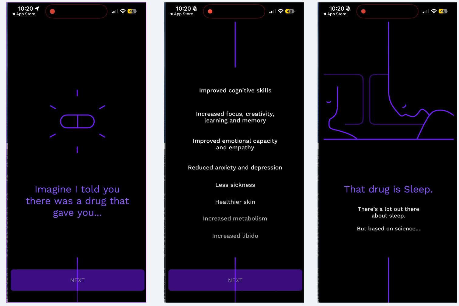
“Imagine I told you there was a drug that gave you…”
Woah! What’s the drug?!
Oh, it’s just sleep.
This is the first screen that loads as a new user opening the app.
There is 0% chance you’re not tapping “NEXT” through these first screens.
Again, so much more intriguing than a boring “Get started” button
👀 New Price Power Podcast:
Jonathan has designed close to 4,700 paywalls.
Jonathan Parra, founder of Tapas Growth, explains why app category predicts test results better than the app itself, how to sequence design, packaging, and price tests, and why the ugly paywall keeps winning.

Listen or watch on Youtube, Spotify, and Apple Podcasts:
Headway
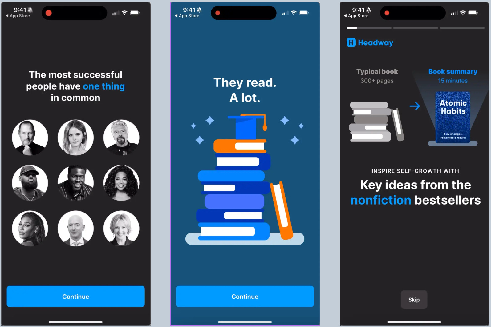
Headway has a bit of a different idea.
This is the first screen of the app after the splash screen is done loading.
Instead of some visual animation or engaging interaction, they have a curiosity hook.
To be fair, this is tangential to RISE’s strategy.
If I’m downloading Headway I likely want to improve myself or learn something, and so I’m going to be curious about what successful people do.
And of course, they connect it back to reading, their core value prop.
Caveat, I haven’t checked headway recently, this may have changed. See a progression of their flow here:

Flo
Flo is constantly testing and optimizing.
I wasn’t actually sure if Flo had a dynamic screen for new users, but I bet they weren’t ones to leave this screen unoptimized.
With millions of new users, this would a huge waste for them.
I have a video for you!
Flo has a short little video/animation experience for new users.
For them, this is even more important because they have three serious data sharing opt-ins since they’re asking you for health information.
Those opt-ins would be scary if they were the first thing that loaded for new users.
And check out what’s after this animation - a question asking your name. Still no generic welcome/sign up/login screen.
I’m so excited to be back at Business of Apps NYC!
I'll be speaking at Business of Apps in NYC on September 17, talking about 'Unlocking Retention Through the Only Proven Method: Activation'.
This is one of my favorite conferences of the year, and I’ve been the past few years.
If you’re in the area, come to the conference, and send me a message so I can say hi.
Finch
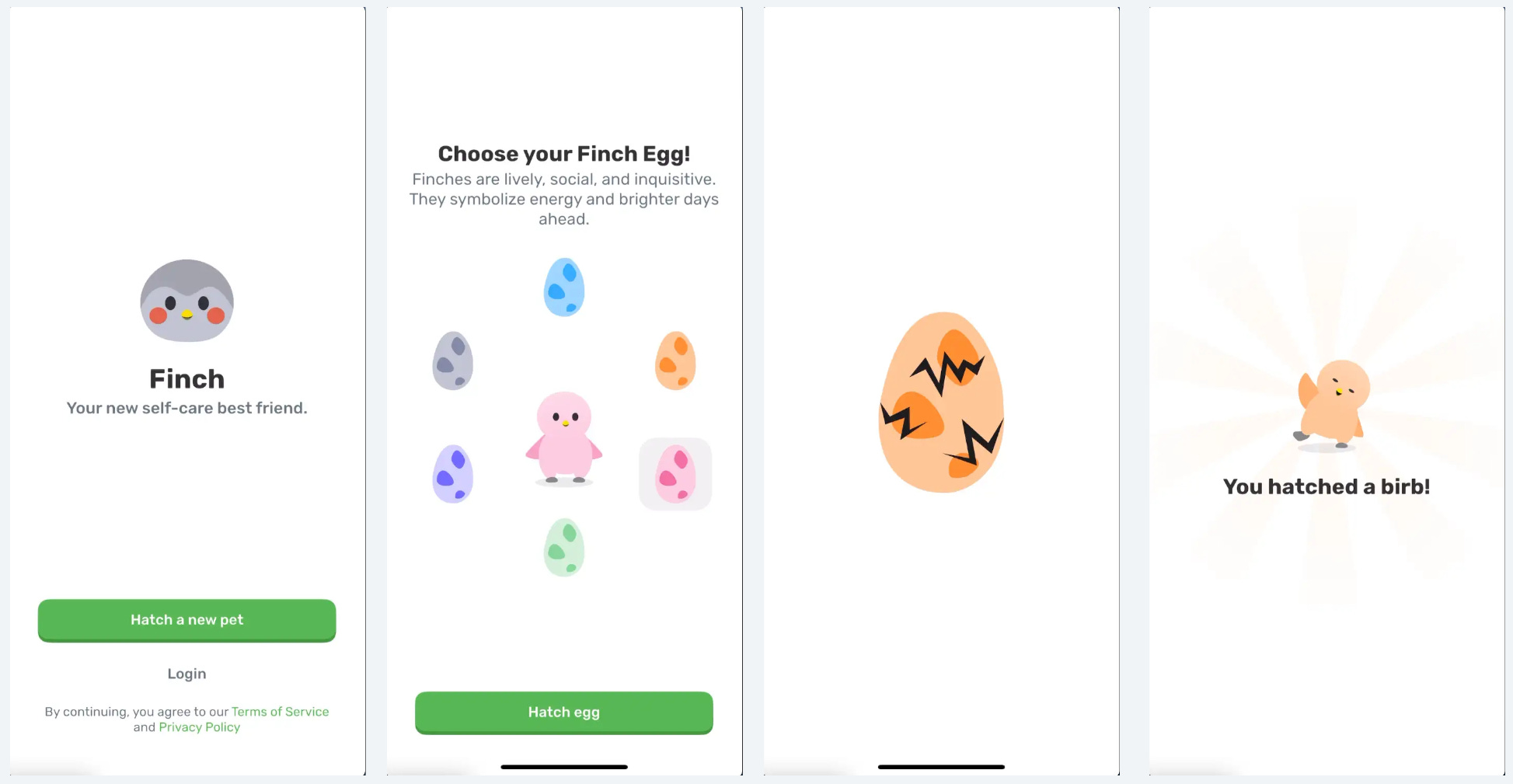
If for some reason you feel you need a login option, take a look at Finch.
Maybe you have lots of re-engagements, or returning users, and it will create a poor experience because they lose their saved progress if they can’t login.
Finch has a more traditional login option, but also a fun contextual CTA button to get started: “Hatch a new pet”
Then, the very next screen is a strong hook.
You select what color bird egg you want, and then instantly the bird hatches and you meet your “birb”
If you need a login screen, still make the very next screen a strong attention grabber.
📣 Want to help support and spread the word?
Go to my LinkedIn here and like, comment, or share my posts.
OR
Share this newsletter by clicking here.
