

Headway Evolution 2024->2025
See how Headway's onboarding evolved

Hey there, it’s Jacob at Retention.Blog 👋
I got tired of reading high-level strategy articles, so I started writing actionable advice I would want to read.
Every week I share practical learnings you can apply to your business.
Let’s travel through time
When we look at competitor products to get inspiration, we have to acknowledge it’s only a point in time.
We don’t know what’s currently being tested, or what was tested and didn’t work.
What if we could go back in time and see how a product has evolved?
Luckily for you, I have a time machine.
Let’s go to January 2024 and see what Headway’s onboarding looked like then.
Next, we’ll make a stop in June 2024.
Lastly, we’ll go back to last week (Jan 2025).
1 sec, the time machine takes a few to warm up.
*rumbling noises…*
We’re ready! On to January 2024!
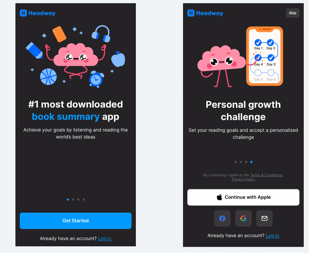
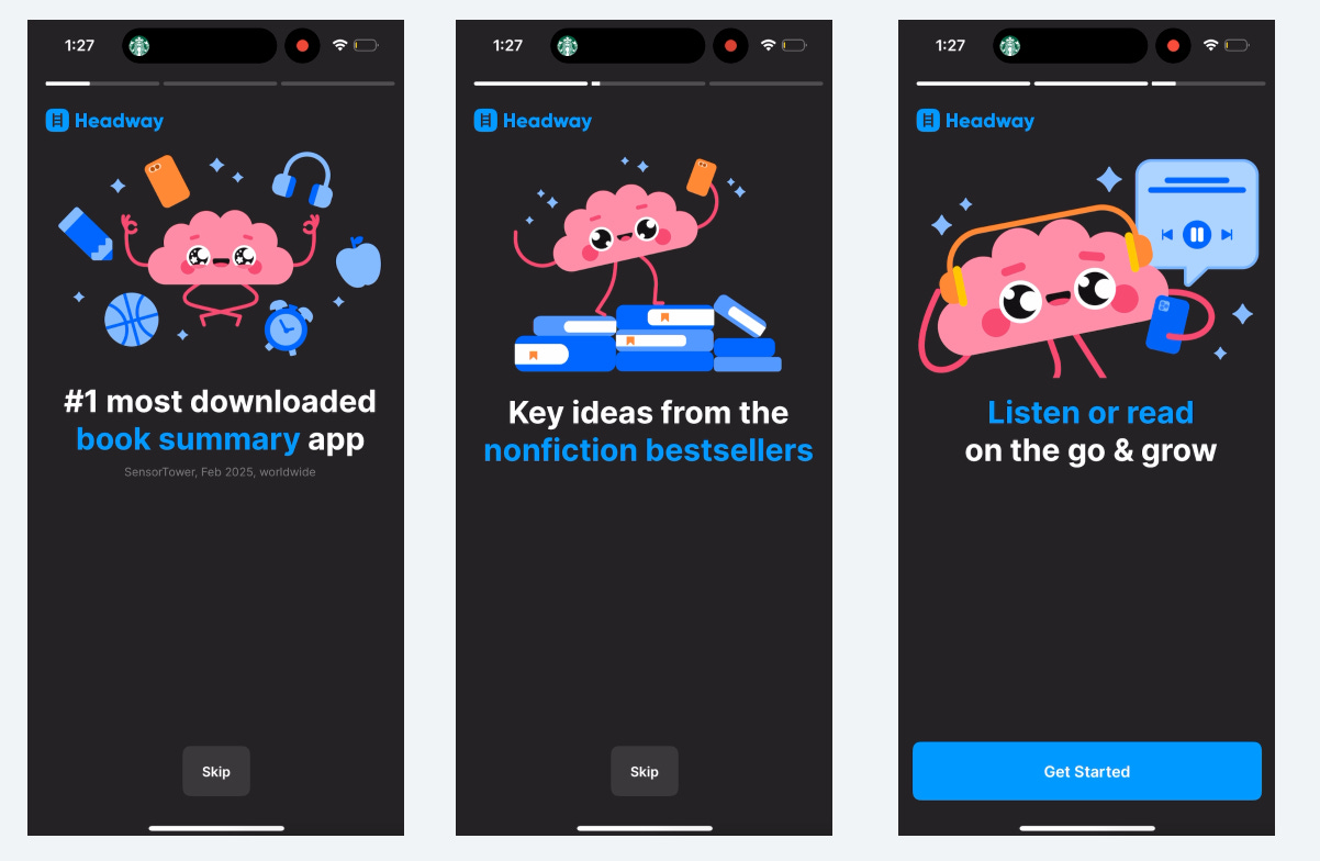
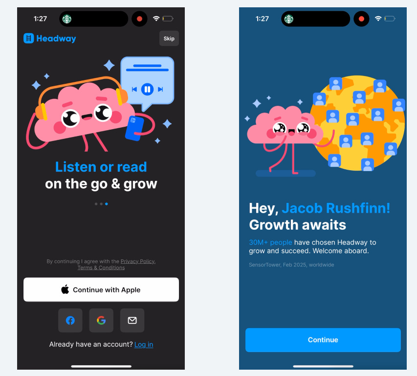
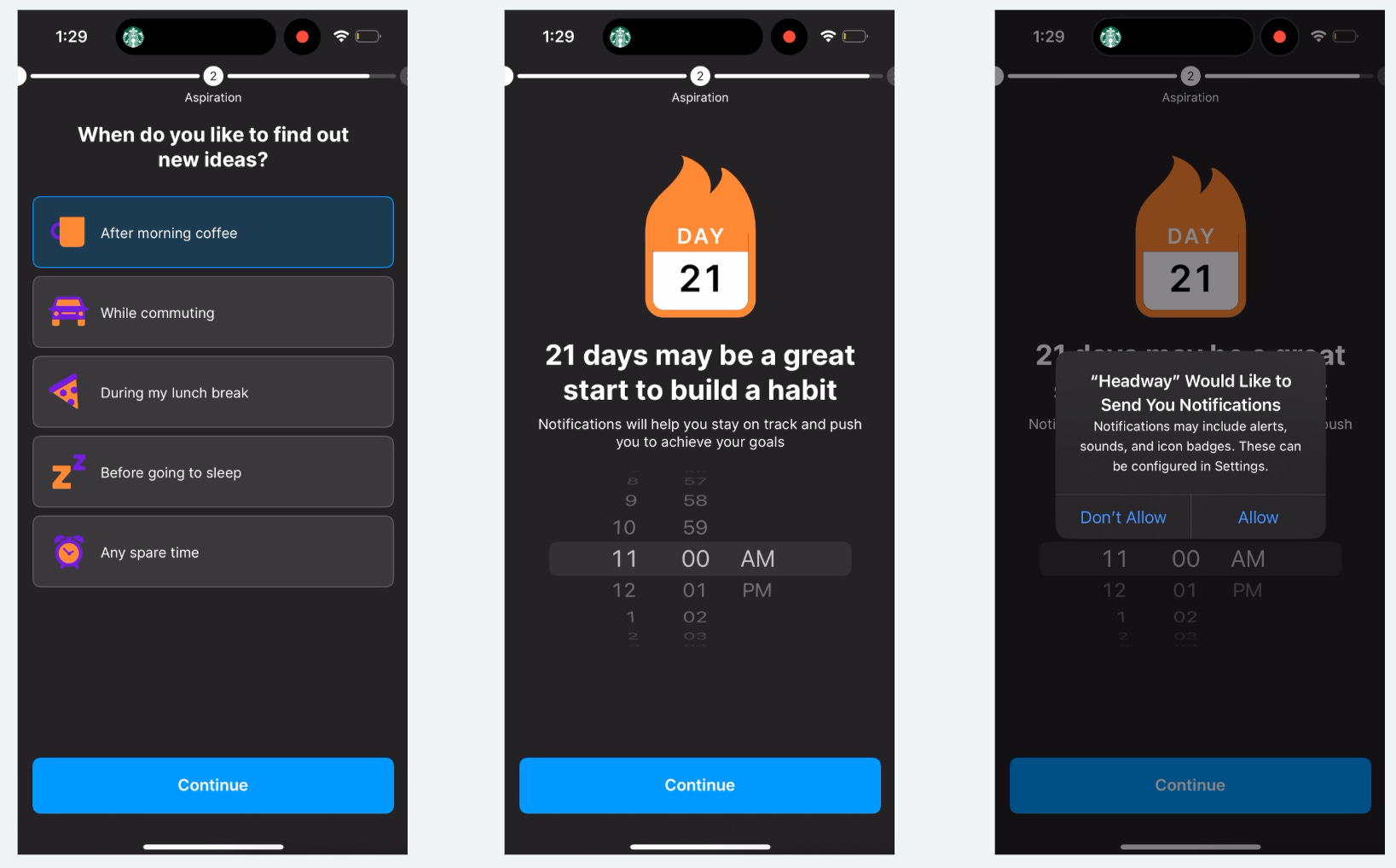
Here’s the beginning of Headway’s onboarding flow in Jan 2024
Clear and concise description
Uses social proof to motivate (“#1 most downloaded…”
Scrolling carousel with additional benefits
Account creation immediately
Users may have more motivation and excitement early in the flow, so if you’re going to force account creation doing it first could decrease their drop off
Capturing an email early allows for re-engagement if they drop off
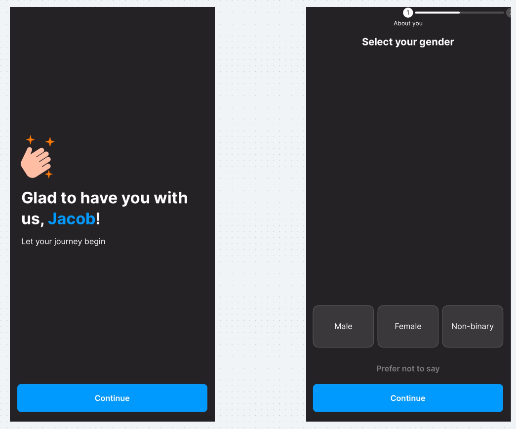
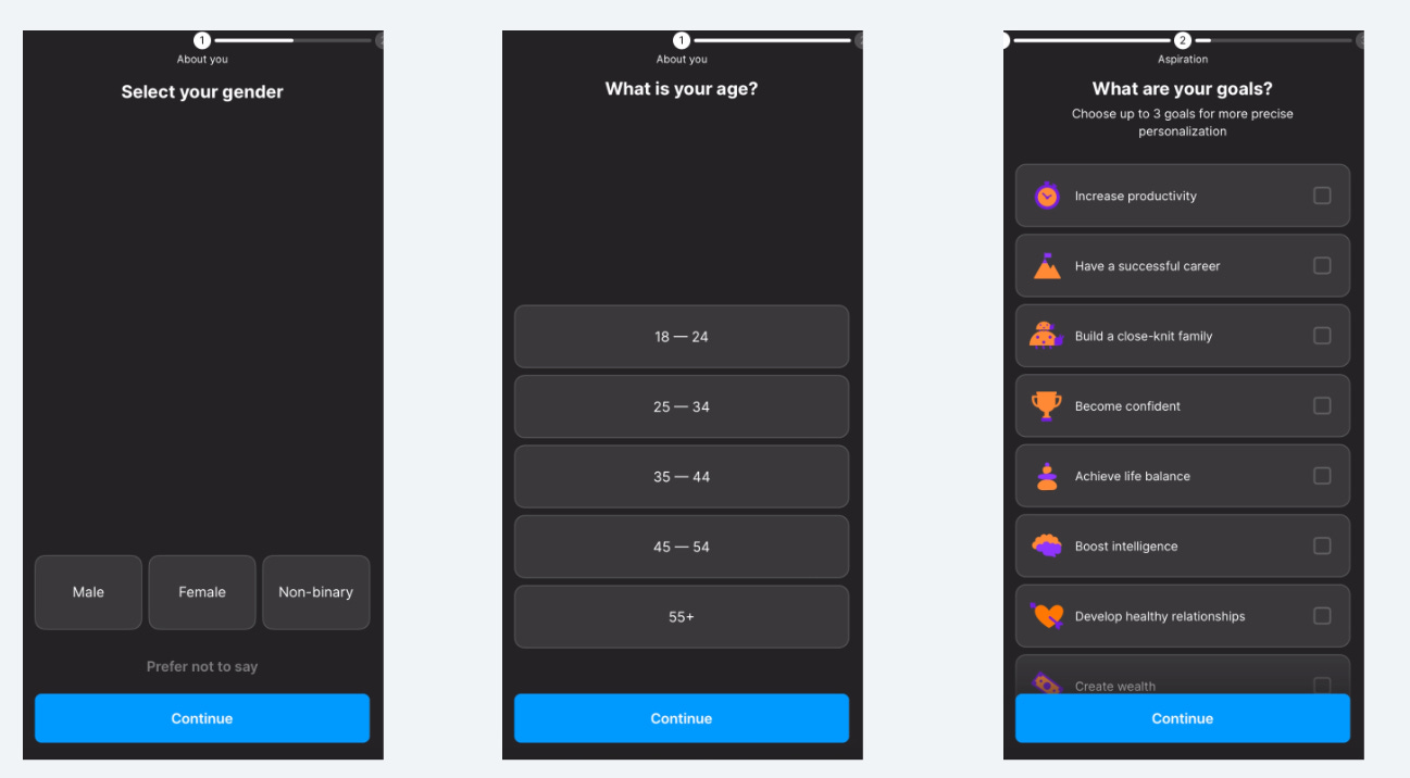
Progress bar clues users in that there will be more questions.
Make sure users know what to expect and aren’t surprised.
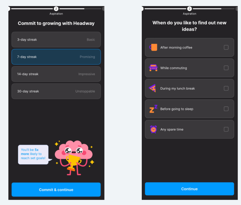
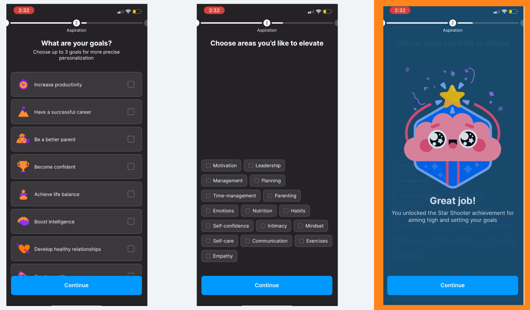
“Choose up to 3 goals for more precise personalization”
I’m happy to give this info because I want my experience to be more personalized.
Headway reiterates and reinforces their value throughout the onboarding experience.
It’s a nice balance of asking questions and adding motivation for users.
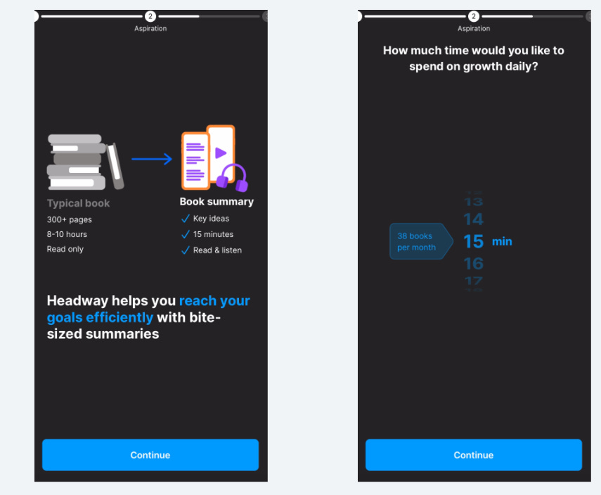
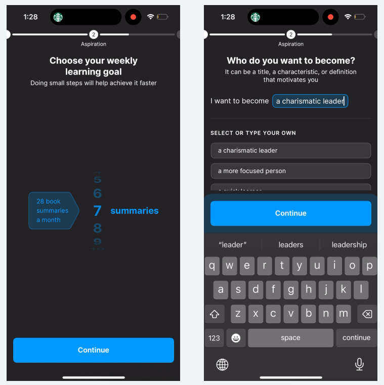
(^ Not shown: “Do you know what a book summary is?” screen before these two. They do eventually remove this.)
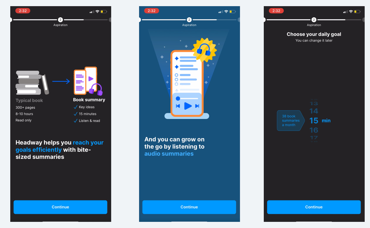
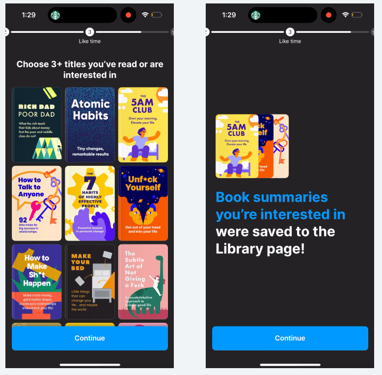
Not only does Headway get me to commit to using the app for a certain amount of time, they also show how much value I’ll be getting with just 15 minutes!
38 books is a lot!
Even more commitment!
They make me feel good about this commitment because I know I’ll be reaching my goals faster.
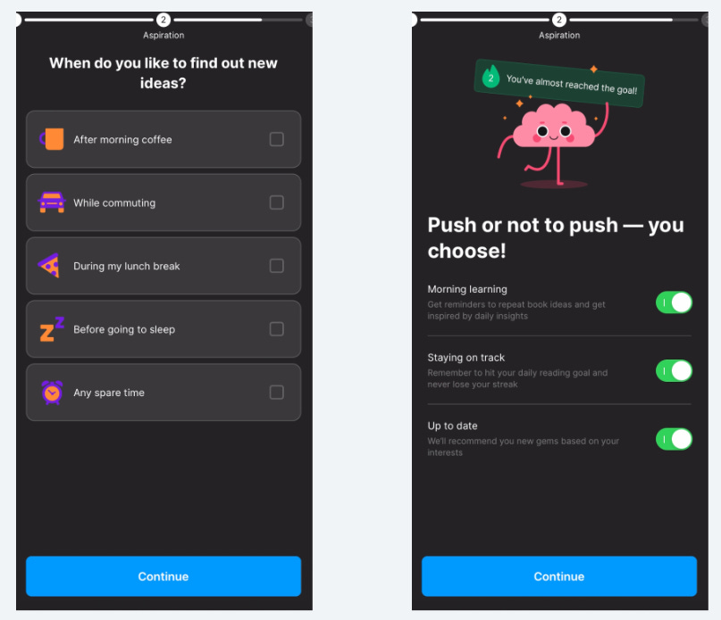
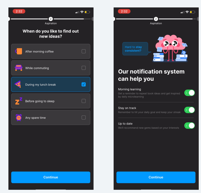
I’m hoping they use this to customize when they send my notifications or messages.
I’m not only opting into push notifications, I get to pick which ones I want!
These clearly explain the value I’m getting from each notification type.
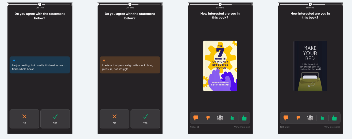
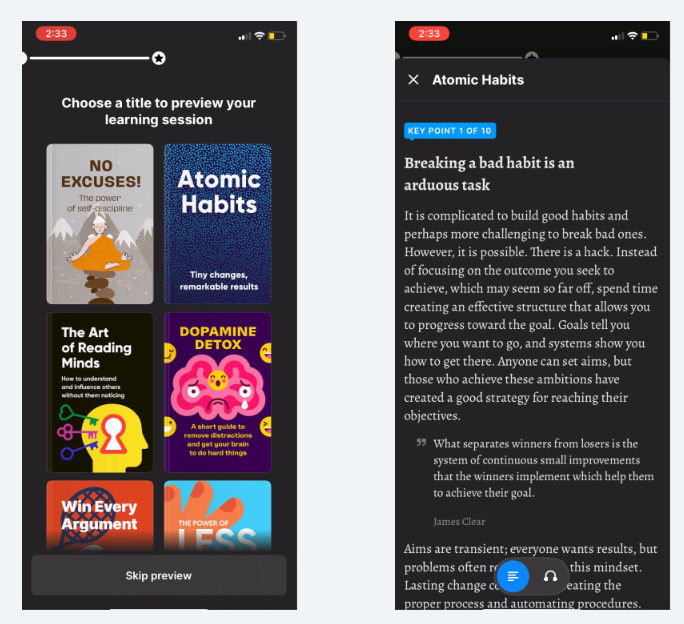
I love them seeding the app experience with some books to start with.
I would have liked an option to say I’ve already read this book.
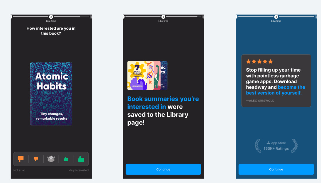
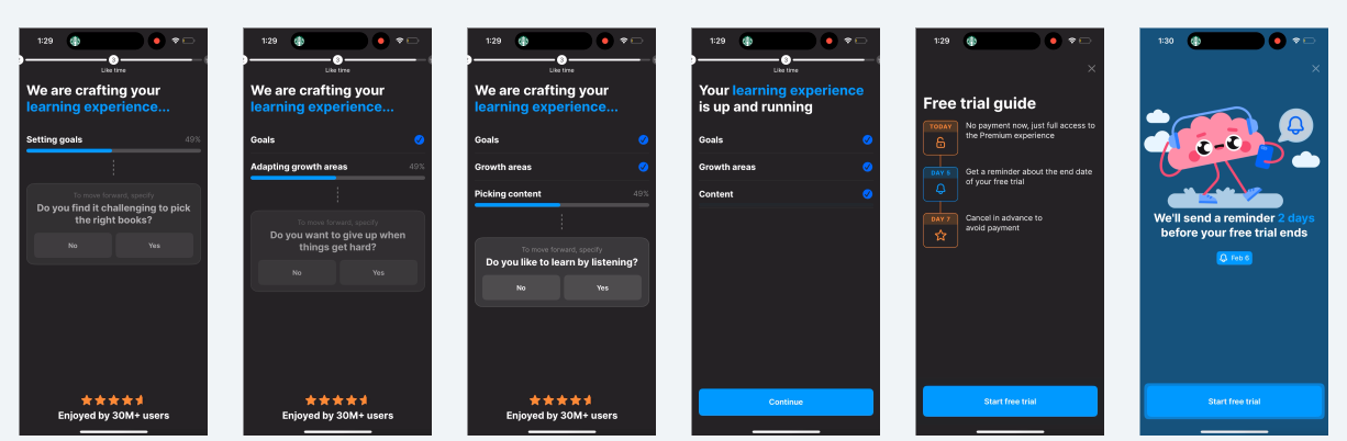
Testimonials and social proof on one screen!
A wonderful job of balancing their “asks” with positive reinforcement and motivation.
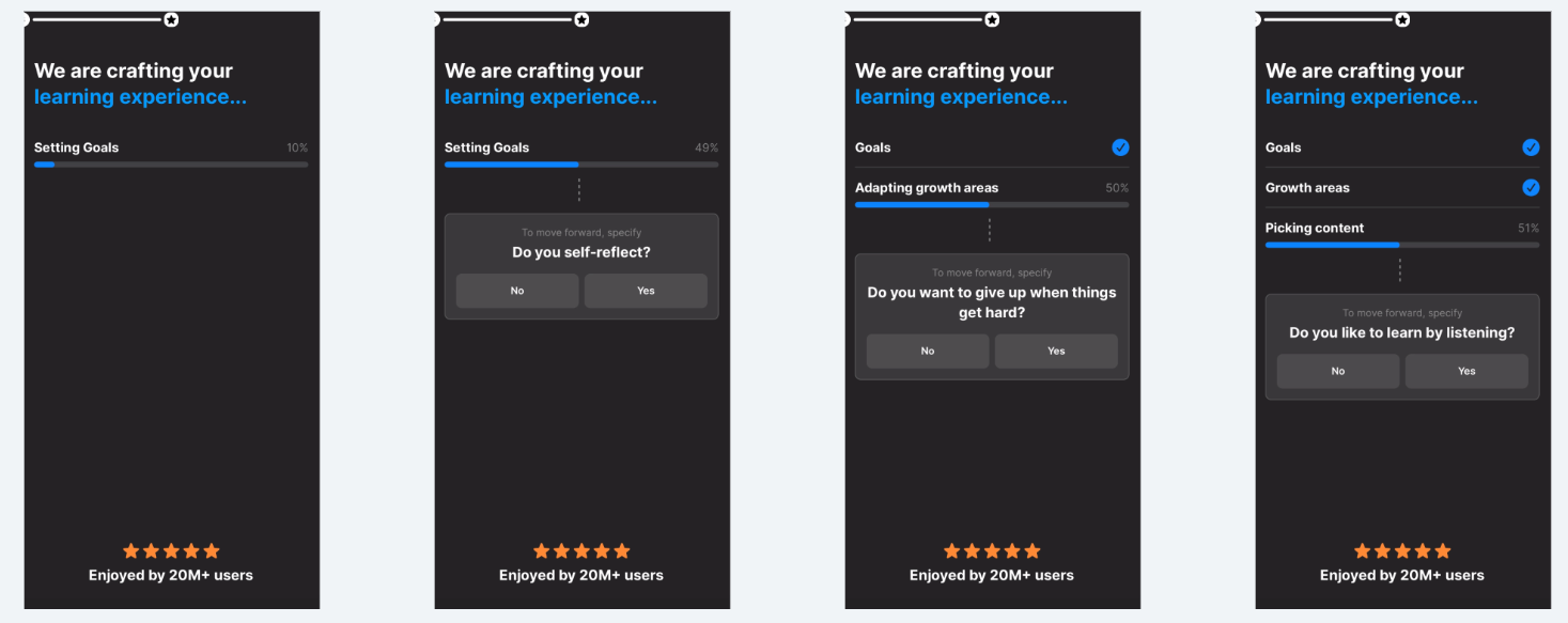
I believe these loading bars don’t actually show “processing”, but give the illusion that all of your inputs are creating a super personalized app experience.
Past post on effectively using loading screens:

Many questions that build upon each other to make it seem like the whole app is crafted for you.
If it ain’t broke, don’t fix it - Headway uses a similar testimonial screen in multiple places to keep you going through onboarding.
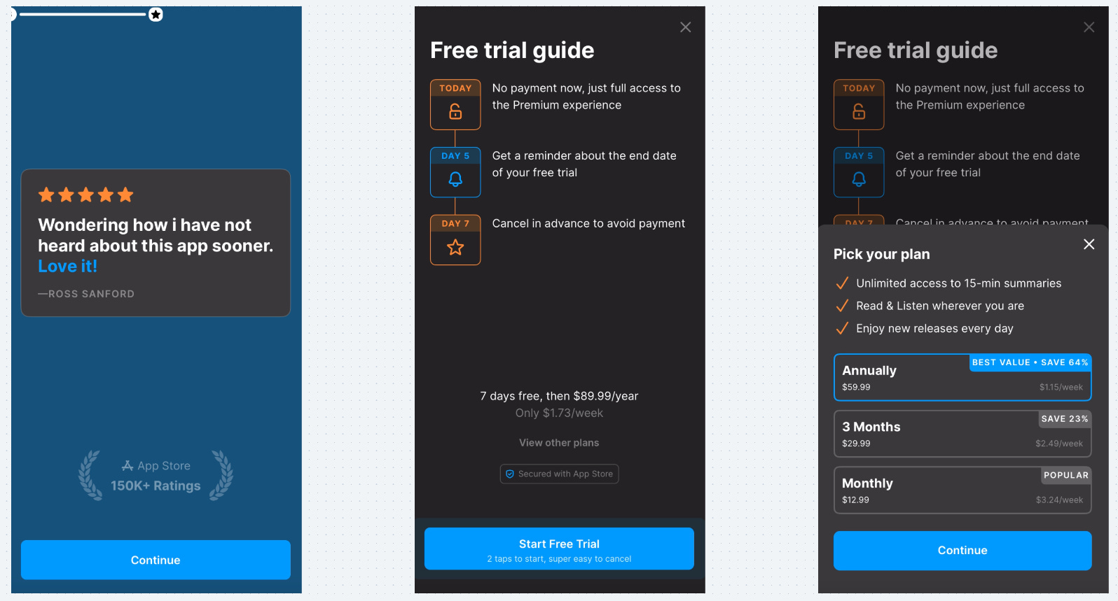
And then we move into the paywall - they use the Blinkest trial timeline view
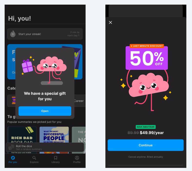
I didn’t start a trial, and right after this free gift popped up.
This in-app message also appeared every time I opened the app after.
If someone doesn’t start your trial, don’t give up!
A 50% discount! Wow!
If you don’t start a trial you have lower intent, so this last ditch effort makes sense.
This also isn’t a trial, so starting an annually plan immediately is worth it for them even at a discount.
I know I didn’t go into everything is
Let’s hop back in the time machine and go to June 2024.
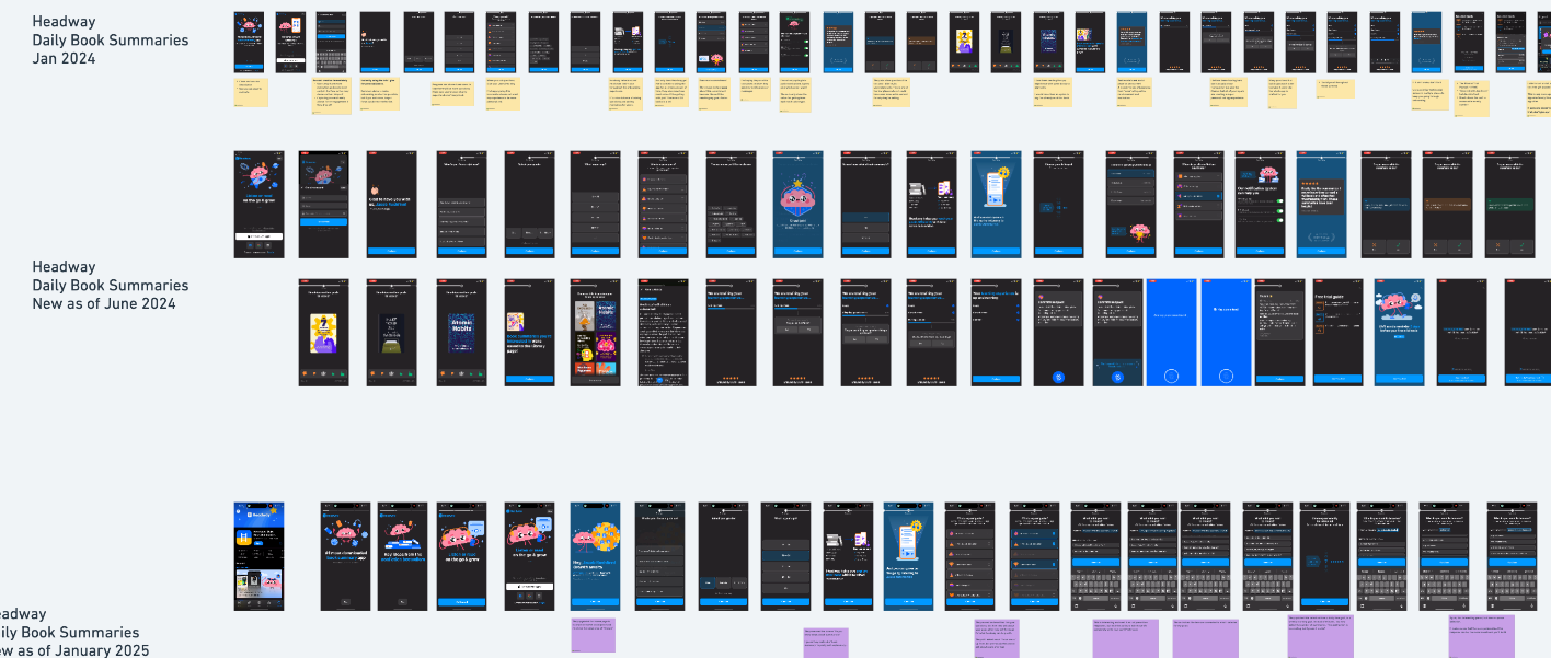
Want to review everything yourself? See all three iterations of Headway’s onboarding here.
For the next iteration, I’m not going to show the entire flow, I’m only going to show what has changed.
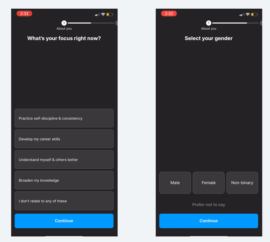
Instead, of starting with Gender, they ask about “your focus right now” - does this allow them to change the “What are your goals?” question later on?
They’ve added some “achievement” screens early on to keep you excited and motivated.
”Audio summaries” is new - this make sense because it’s a new feature they launched I believe. If you want to drive adoption of a new feature, the first step is to make sure people know about it!
And another small change:
Instead of “38 books a month”
They say, “38 book summaries a month”
This is a small touch, but is less confusing and more clear about the value.
I wonder if people were confused about getting summaries not books?
The title on the push prompt screen changed from: “Push or not to push - you choose!”
Sometimes we try to be too clever. More people think of “push” as “notifications” - don’t forget the user’s perspective.
They started to test out a section where it was an interactive preview of a learning session. This was pretty cool, but as you’ll see, it didn’t stick.
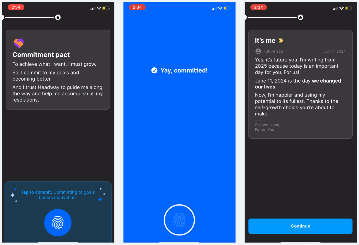
One of the biggest changes is this version is the commitment prompt!
This is right before the paywall to build extra investment before asking someone to start a trial.
And we have a completely new paywall flow…
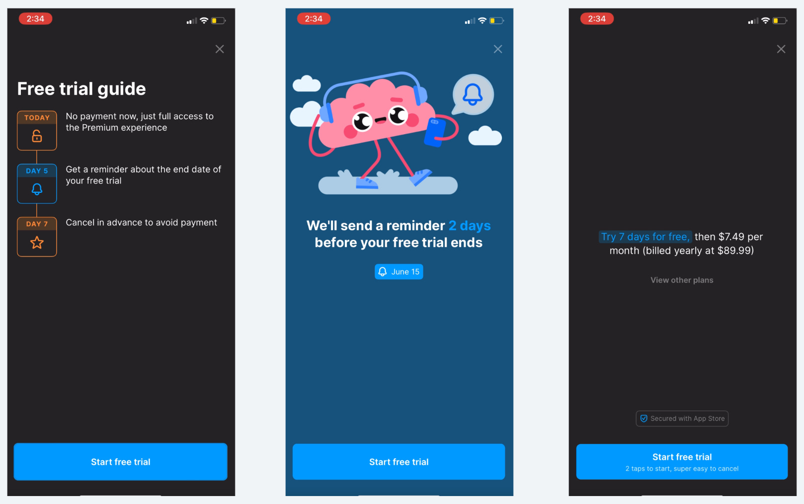
This was inspired by the approach Duolingo started using with a multi-page paywall. (see that here). It’s not 100% the same, but has a similar style.
We’re seeing this multi-page paywall become pretty popular and successful among other apps (need a new paywall test? try this out).
How do you predict the future of apps? Look at what Duolingo did 6 months ago.
What are the major changes from January 2024 to June 2024?
Small tweaks to add an achievement screen
Launch of audio summaries
Testing an interactive learning preview
Larger changes:
Commitment prompt
Multi-page paywall
Back to the time machine!
*twists dial to 1 week ago*
Headway has progressively built a longer onboarding.
A lot of people ask me, “Should I start small with my onboarding flow and test into things, or do I try to build everything from the start?”
Start small, and test into a longer flow. This is a good study of how Headway didn’t start with everything you see today.
Okay, let’s check out January 2025:
Again, I’m only going to show you what changed.
Headway modified their first screen to use a “Stories” format that automatically scrolls with a delay or with tap.
Don’t reinvent UI patterns that are common in other consumer apps. Everyone knows this “Stories” UI, so you don’t have to teach them how to use your app.
After account creation, they modified what’s next. This design was actually from a screen they used previously, but they repurposed it so they could bring social proof earlier in the process and combined with the name personalization.
Lesson: Built trust early. (social proof rarely hurts)
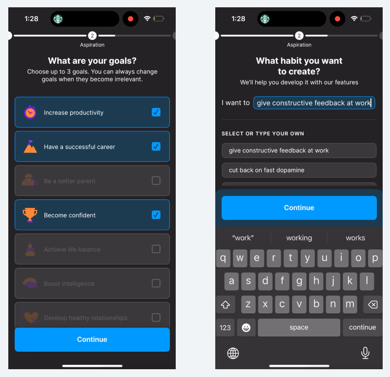
After you select your goals, they added this custom Habit selection UI.
It’s pretty damn cool.
They populate a pre-written response, give you other options for pre-written habits, but also allow you to type whatever you want!
You can edit the pre-written response to tweak the wording, or write something completely new. And it’s obvious you can write something because of the cursor at the end of the selection.
One note - the sub-title, “We’ll help you develop it with our features” is kind of lazy writing. “…with our features” - what features? Whenever you can, get specific.
This is the very next screen - they’ve modified how they ask you to choose a time goal.
Previously:
“Choose your daily goal”
And you selected the number of minutes
It’s now a “weekly learning goal”…interesting.
Instead of minutes, you now select the number of summaries. I’m surprised this abstraction away from time works, but I guess it more accurately conveys the value you’re getting.
And it moves away from using the app every day, which may be hard to sustain.
Then Headway has another one of these cool pre-written/custom response questions for “Who do you want to become?”
It makes sense that the more personalized this response can be, the more investment you’ll build.
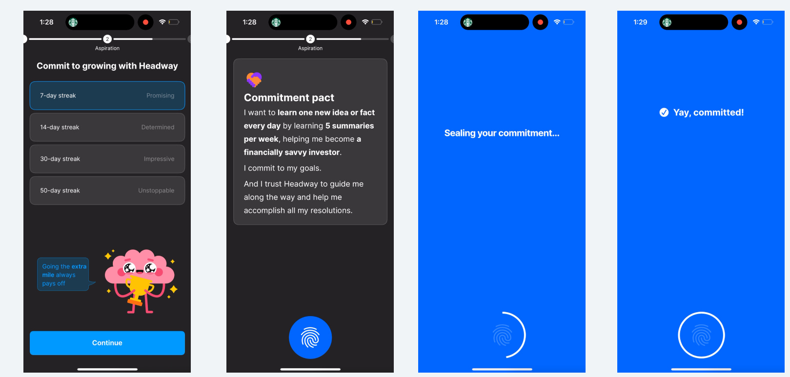
Woah! The commitment prompt location has completely changed!
It’s no longer right before the paywall. Instead, it’s used to help improve the push opt-in
As you can see, they also reworked the push prompt flow
The “preference center” approach has been removed and replaced with this time of day selection. It also more directly ties notifications to building a habit.
They completely re-did this book selection process. Previously, they would show a single book and you would rate it. You selected 3 books.
Now you scroll through a bunch of books and pick the ones you like. This makes sense because Headway shows more value through the many books, and doesn’t limit your selection to 3 books.
Everything is the same in the loading screen flow and the paywall.
Wait! The post-paywall flow has changed.
If I decline the first paywall, they show a survey view:
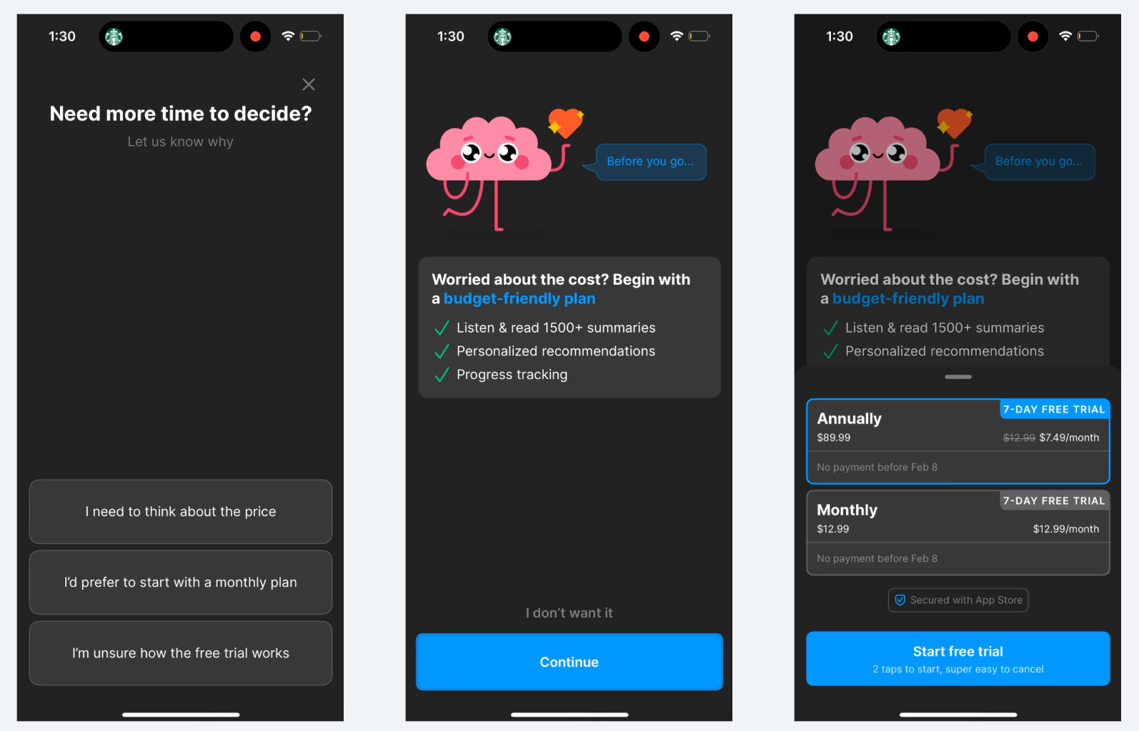
The options are:
“I need to think about the price”
“I’d prefer to start with a monthly plan”
“I’m unsure how the free trial works”
I selected, “I need to think about the price”
Interestingly, there isn’t a discount shown compared to the first paywall.
Maybe they’re testing just calling it “Budget friendly” to see if people feel differently when they compare it to the Monthly price.
The first paywall shown only shows the annual plan as an option, so they can’t show the $X.XX/month comparison.
I’ve seen other implementations of a survey post-paywall to try to personalize the 2nd offer, but this is well done.
I only picked one option, and now I need to go back and see the others!
Last example!
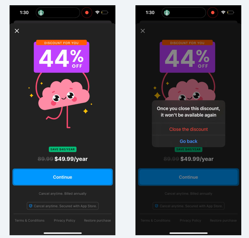
This second offer is the same as they used to have
But I think this system prompt if you close the discount is semi-new.
(And for the record, this discount is 100% available again…)
Whew…I believe those are most of the changes. Time traveling is tiring…
Okay, back into the time machine… *sets to present day*
What did we learn?
You’ll likely reach a point where it’s hard to get extra gains out of your paywall. Don’t forget about optimizing the rest of your onboarding flow.
Keep on iterating on your push opt-in style, there are likely more wins there
Headway knows a user with push notifications turned on is more likely to stay around (and pay you)
If you’ve reached a local maxima on the paywall, try iterating on the 2nd offer.
Get user-centric and ask people about their concerns to create a segmented response
Re-use popular UI from other products
Headway changed from a simple carousel view into the Story format for their first screen. I’ve seen Flo use this story format in their product a fair bit.
Re-ordering your onboarding flow can work
Headway didn’t only add or remove screens, they also re-ordered and reused screens to good effect
Obsess over copy
There are many small iterations of the same screen over the 1 year period. Keep on asking the question, “Can this be better?”
Check out the Whimsical board here to see the evolution of Headway’s onboarding flow.
📣 Want to help support and spread the word?
Go to my LinkedIn here and like, comment, or share my posts.
OR
Share this newsletter by clicking here.

Such a good read, thank you Jacob! I wonder why they didn't move the sign-up to a later point of the onboarding. I would have guessed that it's better to motivate the user upfront to show what s/he is missing and then show the sign-up.