

Chat based onboarding
See how Opal re-designed their onboarding experience

Hey there, it’s Jacob at Retention.Blog 👋
I got tired of reading high-level strategy articles, so I started writing actionable advice I would want to read.
Every week I share practical learnings you can apply to your business.
Retention.Blog is sponsored by Botsi
Opal launched a redesign of their app experience
They focused on creating more of a “chat-based” experience for new users with a much more conversational flow.
It’s not a true chatbot conversation, but feels like there is real “back and forth”
Will chat-based LLMs cause a larger shift in UX in the market?
Will new user experiences become mainly chat-based?
I’m not sure, but I know if a few big apps see strong performance with a chat-like flow, everyone will copy and follow along.
Let’s look at what’s changed.
People leave on the very first screen of your app, so what’s your hook?
Opal has a fun UX interaction of tapping and breaking apart a rock to find your “Opal”
Your very first goal when someone opens your app is to convince them to proceed to the next screen.
Video:
After that, you can start explaining and selling your product more.
💡Tip: Not enough people optimize the first screen of their new app experience. If 30% of new app opens/new installs never start onboarding, small wins there can have a big impact down-funnel.
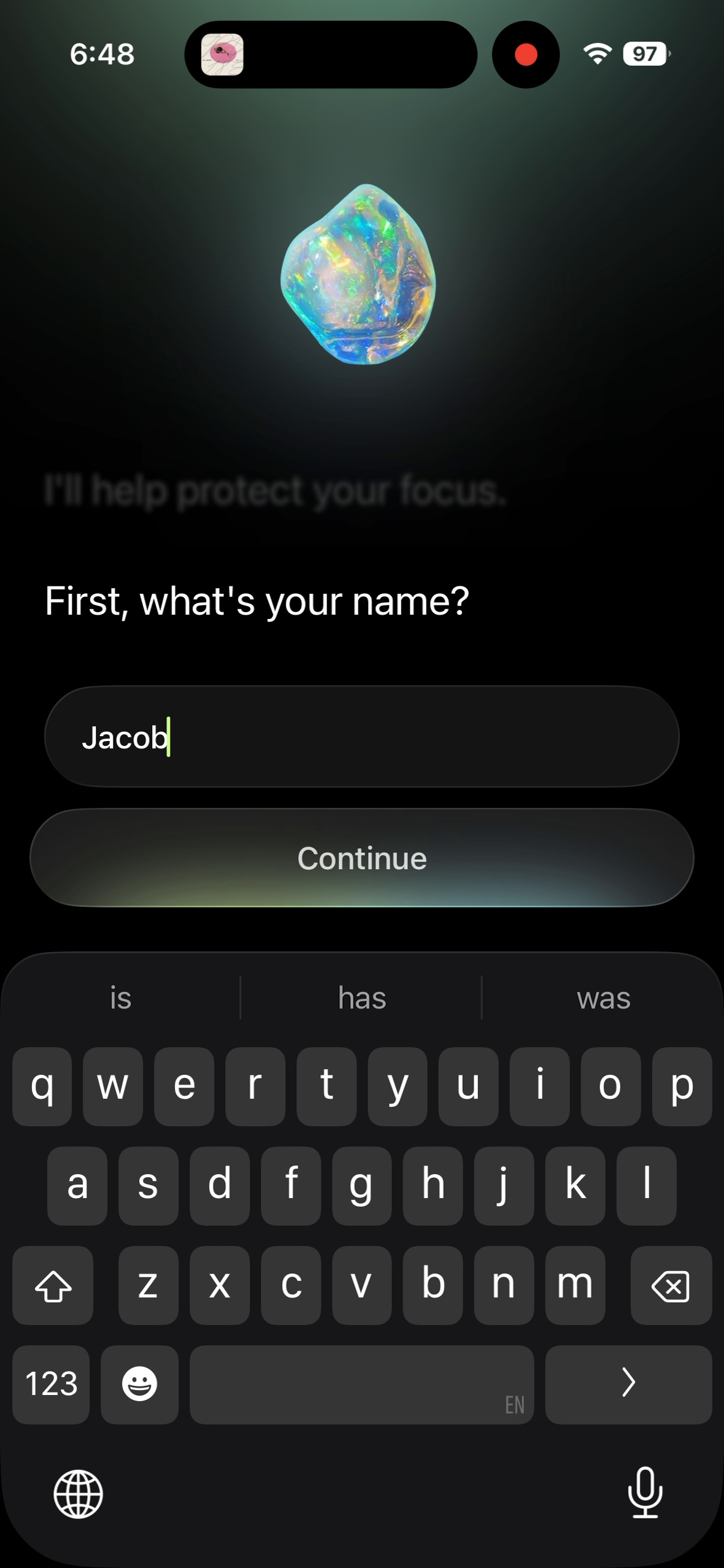
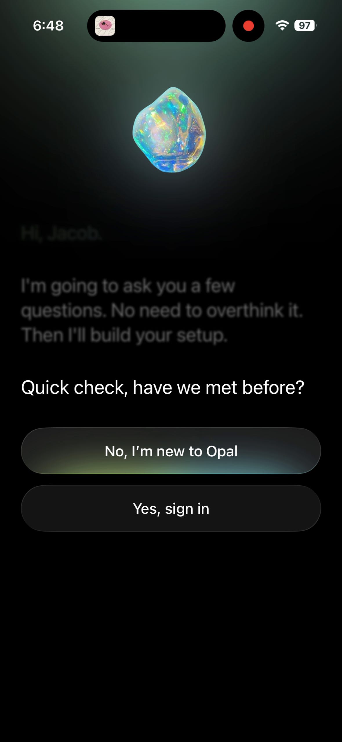
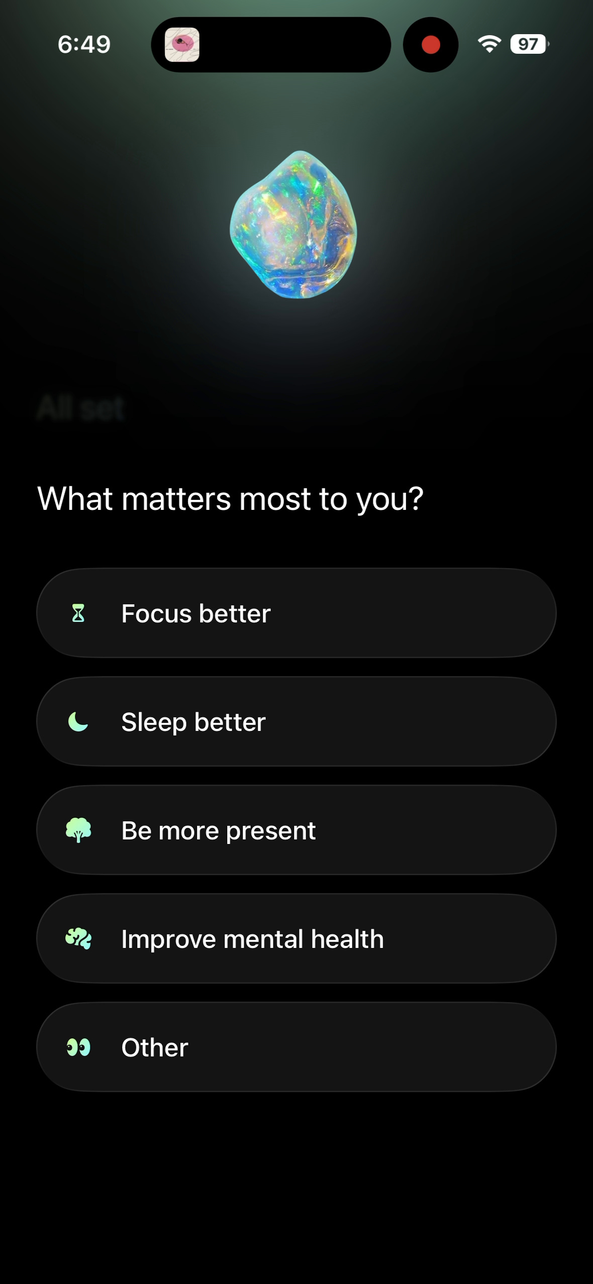
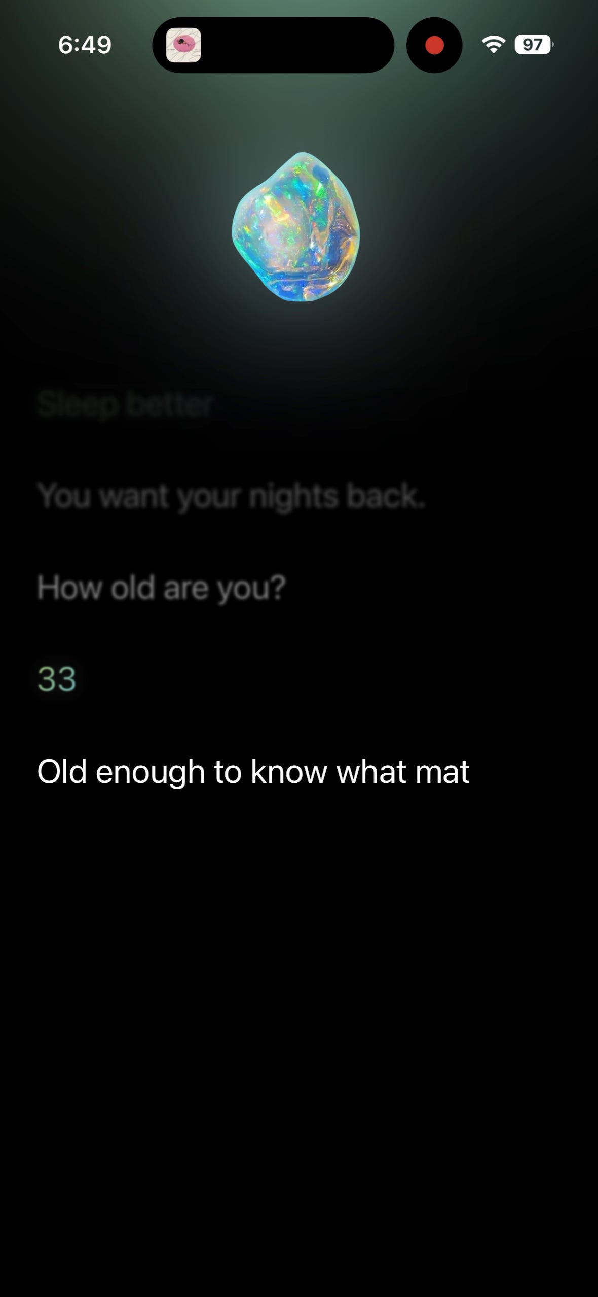
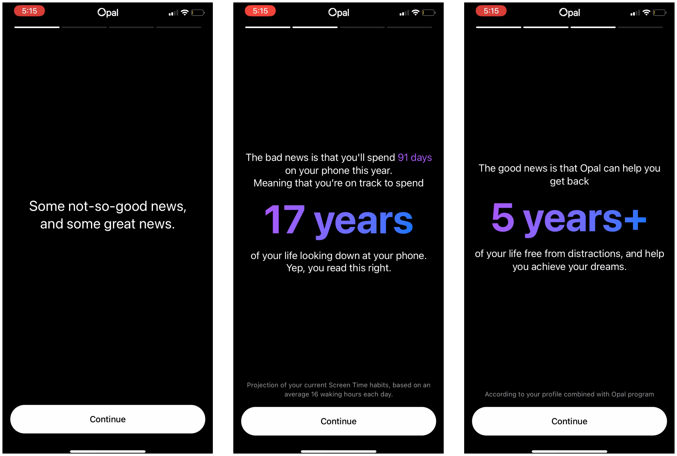
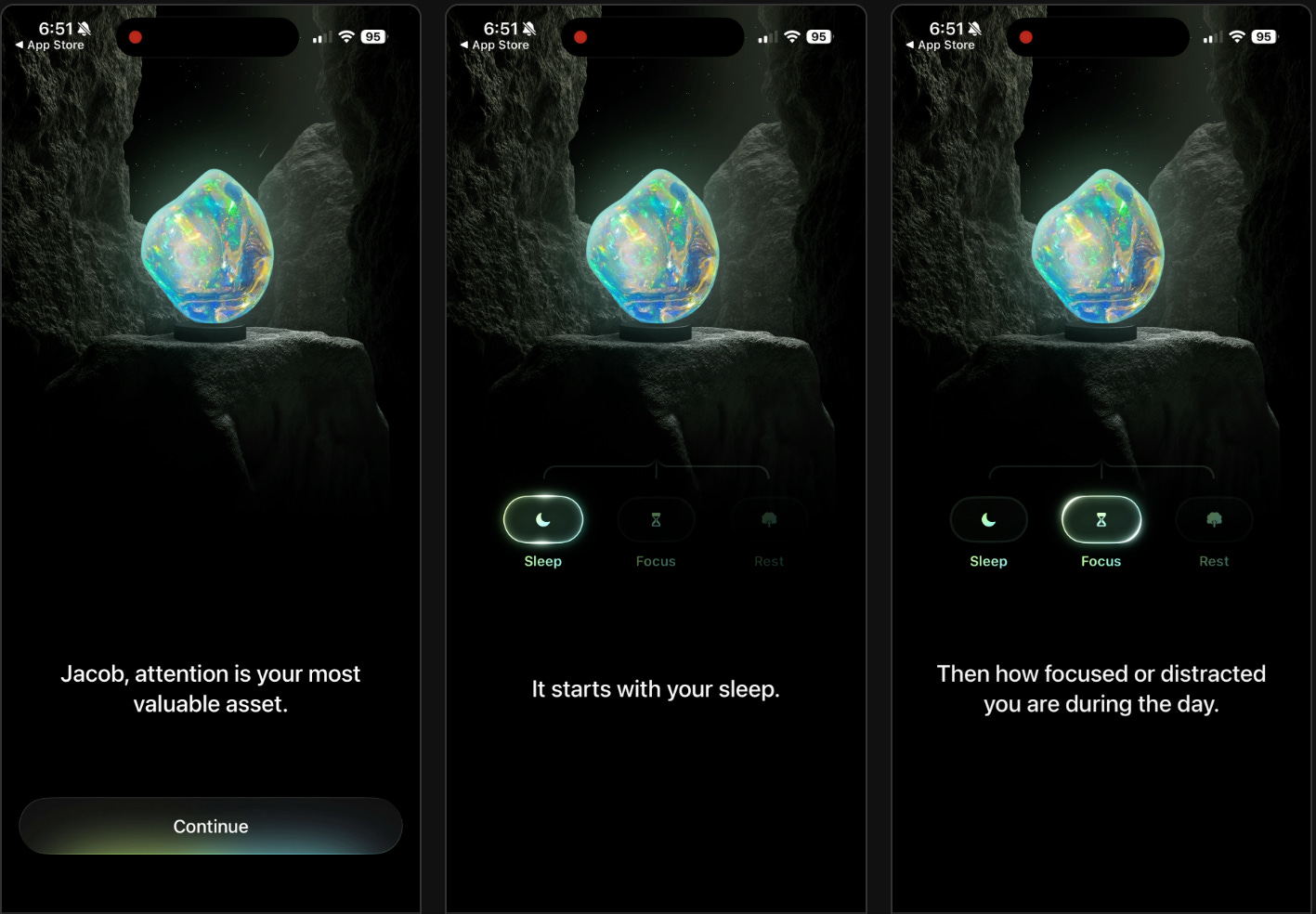
Opal now moves into their new chat-based onboarding UX:
Whats your name?

Are you new to the app?
What matters most to you?
How old are you?

What best describes you?

What’s your average screen time per day?
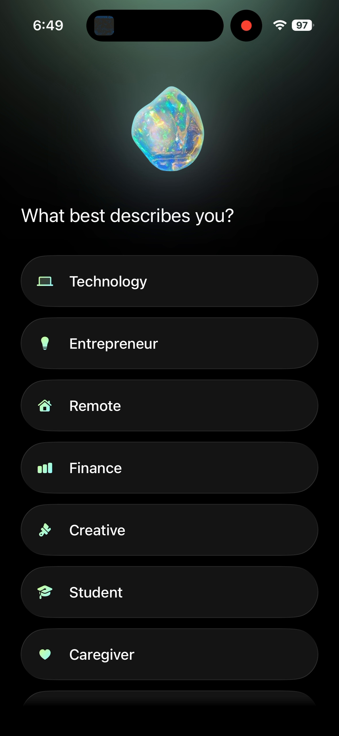
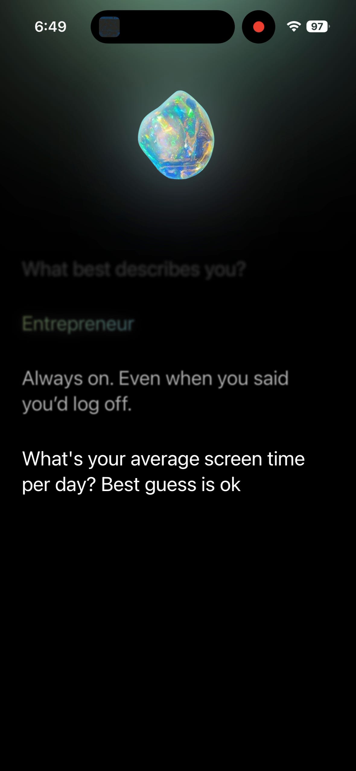
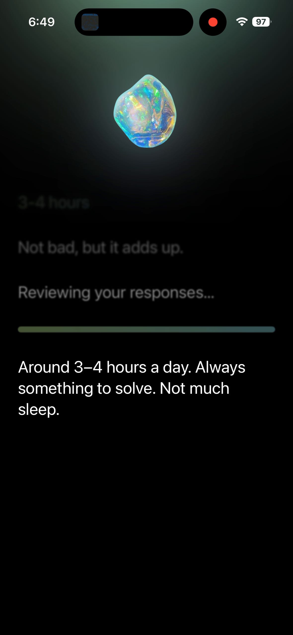
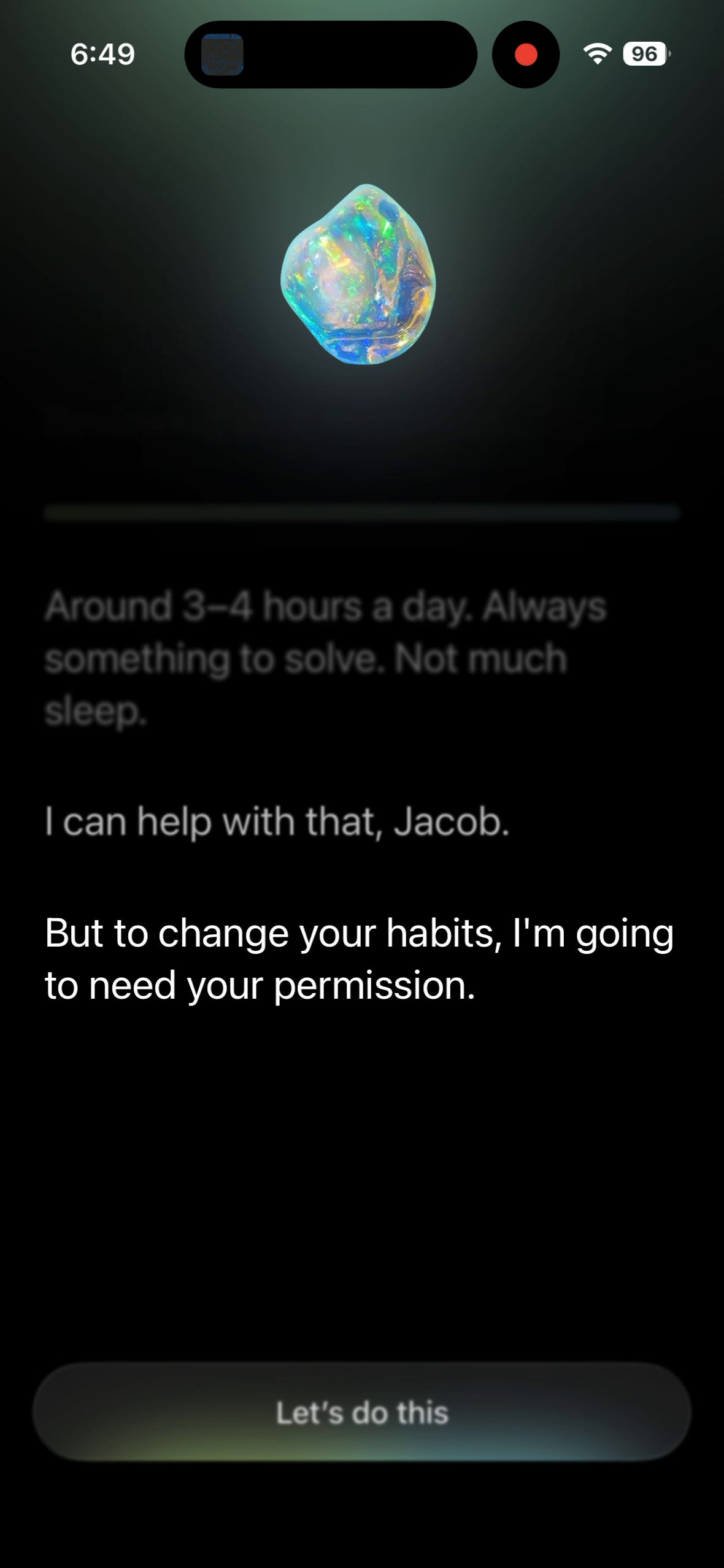
It’s an interactive style that forces the user to interact with your product more vs the standard onboarding quiz style, where someone can just “tap, tap, tap” and not read anything.
Should you test this as a new style for your onboarding / pre-paywall experience?
My take:
Yes, but only if you have a short enough flow.
It will get exhausting if you have a 50 page onboarding flow. But if there are like 5-10 questions I need to answer, you may be able to make a more dynamic and interactive experience.
And then obviously weave in some AI personalization.
🤩 Learn from a Hybrid Monetization Master
Cristian Rotari, Monetization Lead at Zing Coach, explains why hybrid monetization is more than bolting ads onto a subscription app, how to layer in-app purchases, affiliates, physical products, and partnerships without cannibalizing your core revenue, and when an app is actually ready to start.

Listen or watch on Youtube, Spotify, and Apple Podcasts:
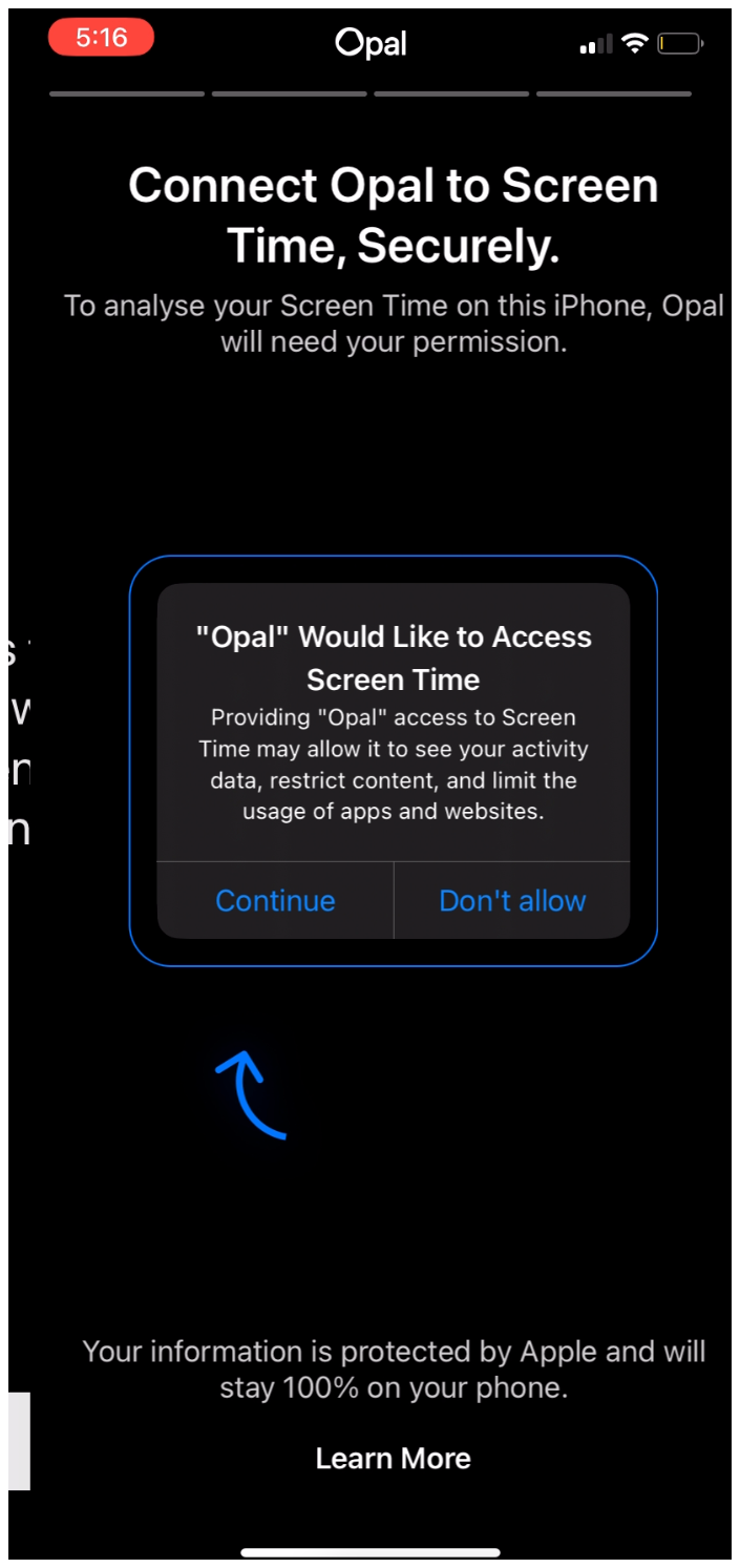
Opal Permissions
Old:
New:
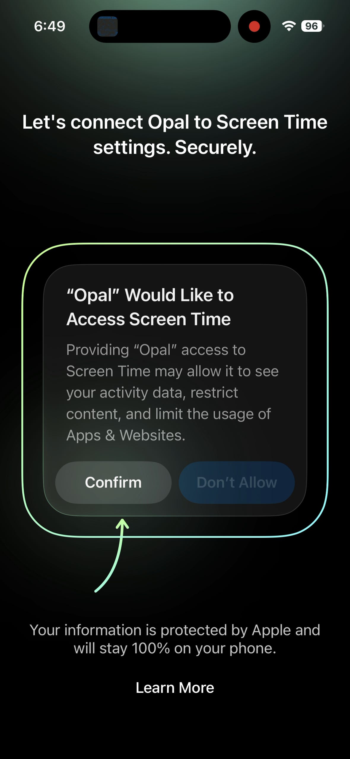
These are updated slightly, but I believe not enough apps use this style of pre-prompt for permissions.
Showing the user exactly where you need them to press.
If you need multiple permissions, I think this is one of the best styles.
If you only have to ask for push permission, I almost think you should just prompt immediately via the native prompt and most people will accept
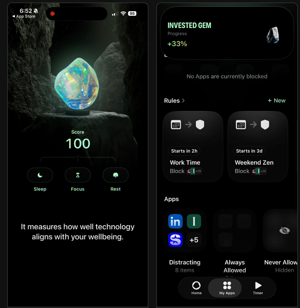
Then Opal uses the standard screen time interface to select the apps you want to block or not.
Opal aha moment
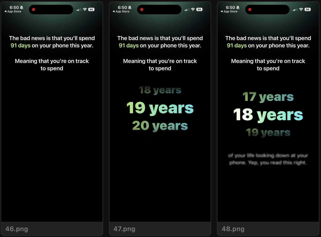
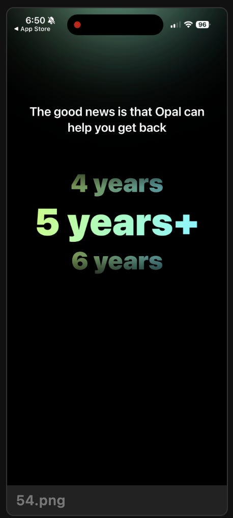
If you focus on anything in your pre-paywall experience, it should be an “aha” moment to communicate the value of your experience.
I think Opal could likely strip away everything else in their flow, just show these numbers, and probably have a similar effect and conversion rate.
Old:
“Jacob, Opal will get you back 5 years of your life”
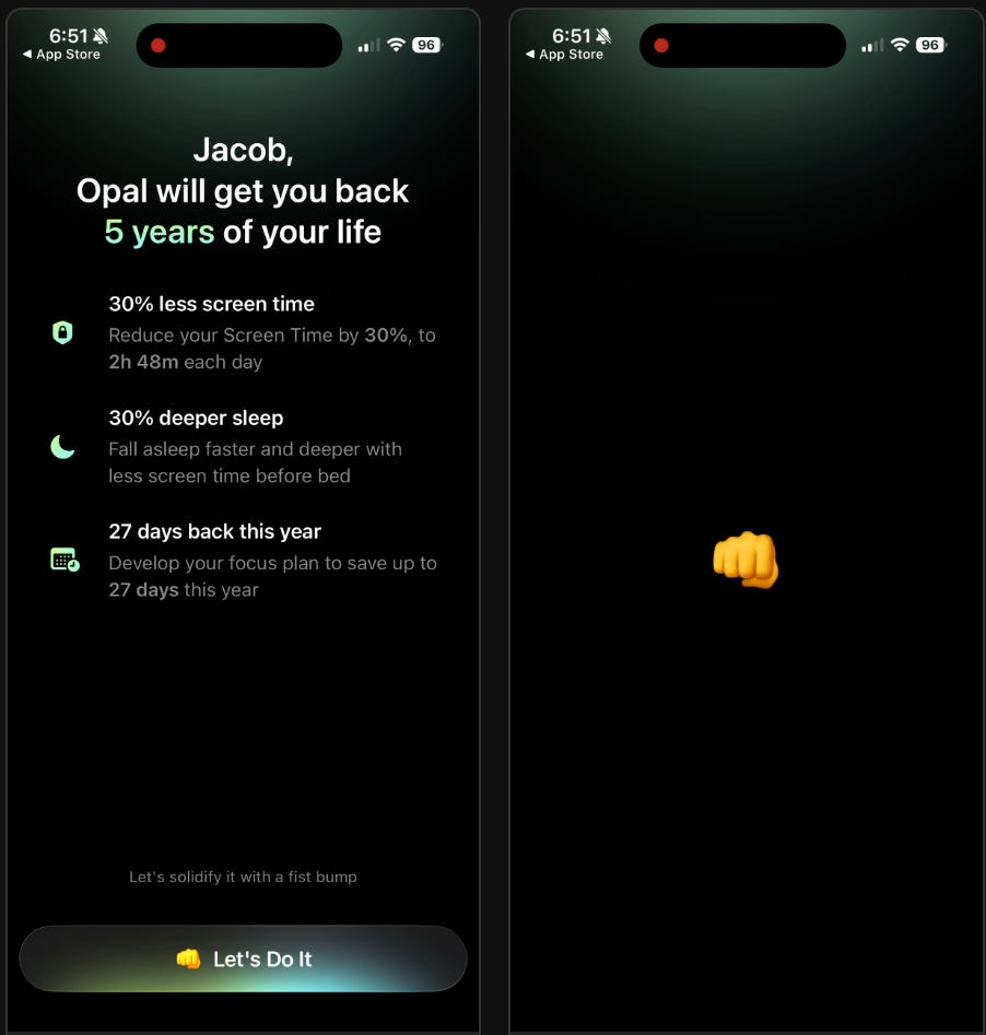
wow. that’s a lot!
Also, see the 2nd bullet is personalized because I selected Sleep as my goal originally
Paywall time!
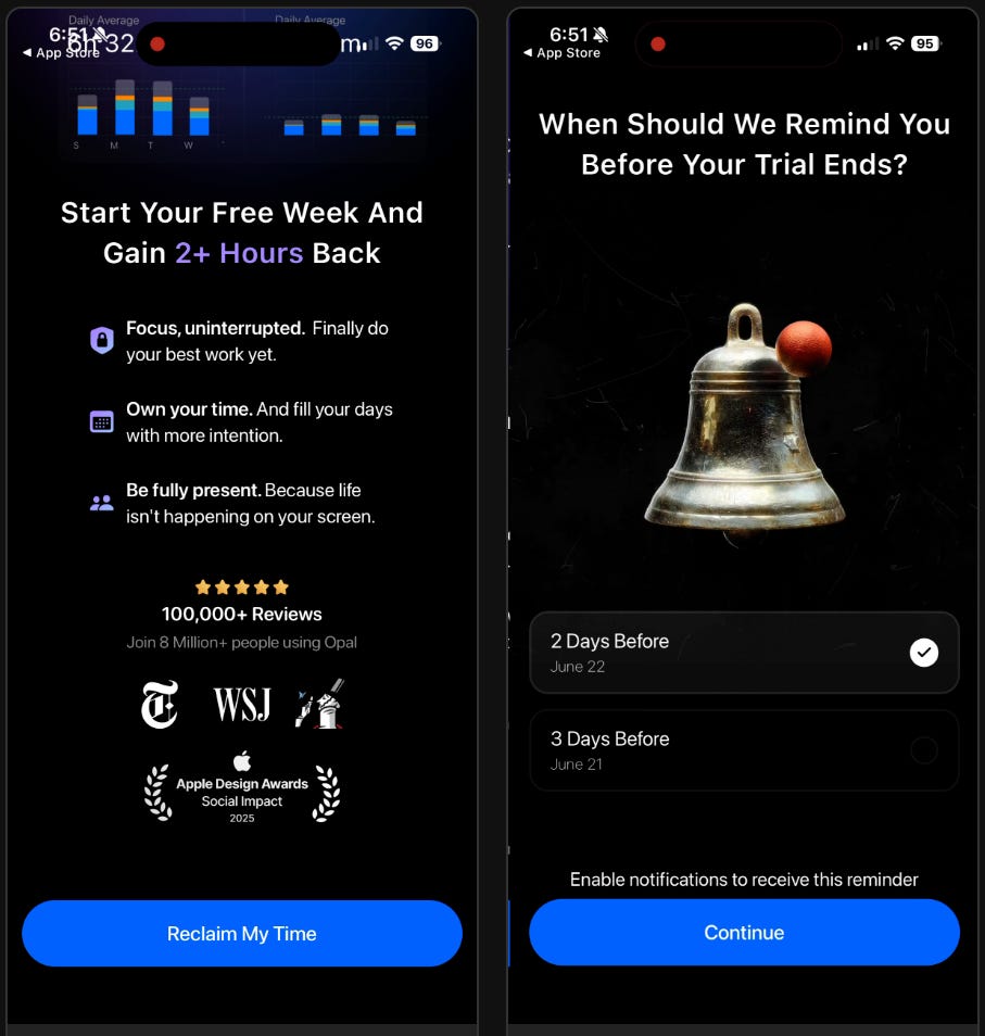
Opal starts with the first screen in their paywall flow focused on value props and social proof. And also mentions the free week trial.
Then, they ask the user about the trial reminder. Asking someone to select the day they would like their trial reminder gets them to think about the fact that they will get a reminder and to decrease immediate trial cancellations.
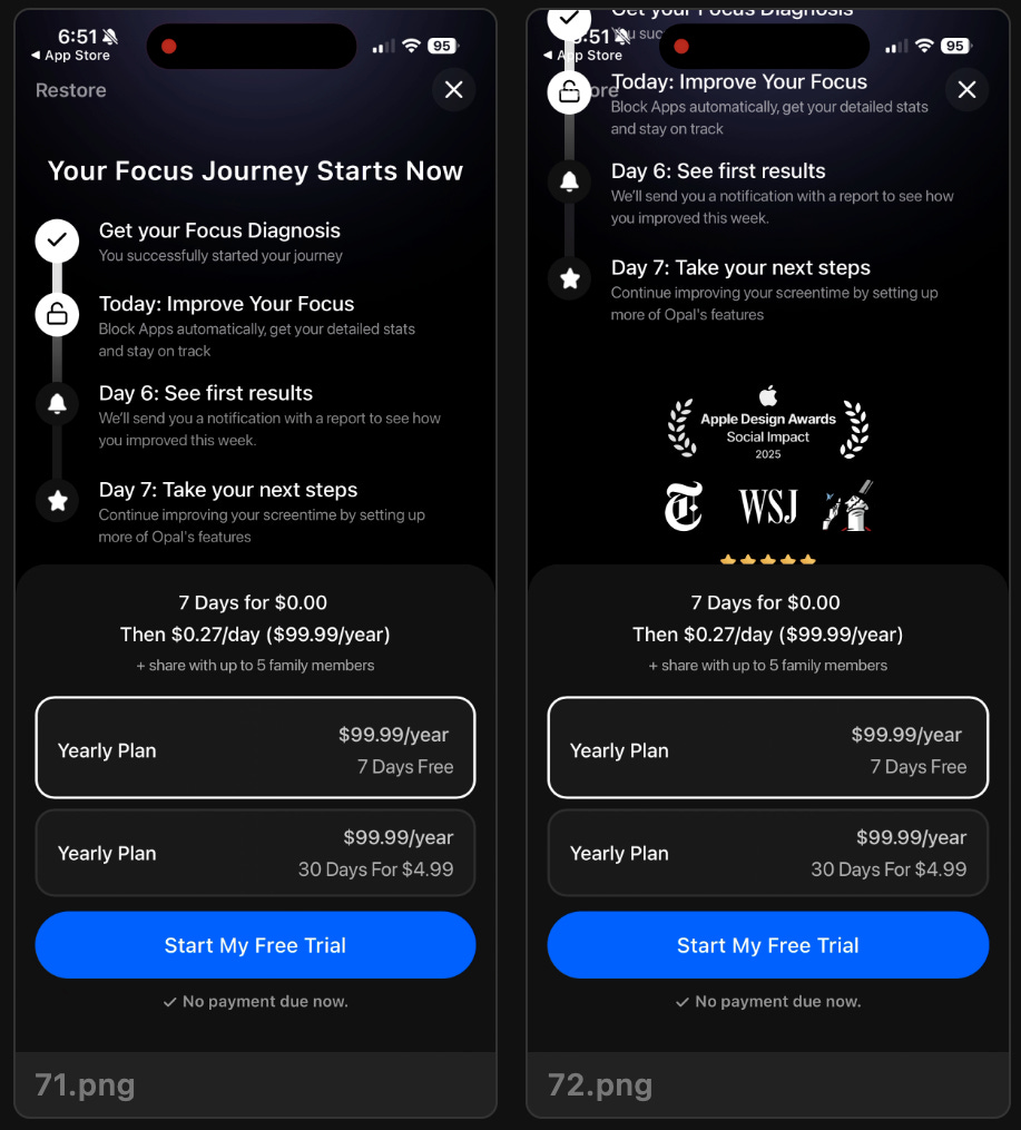
Then we see the somewhat standard trial timeline paywall.
Except the trial timeline is focused on activation and engagement in the product, not the trial/subscription lifecycle.
Interesting.
And check out the products.
They’re using the paid trial approach.
My experience here:
I’ve seen/heard that only a small percentage of users purchase the paid trial
But it moves the choice from purchase/no purchase to, “What trial type should I select?”
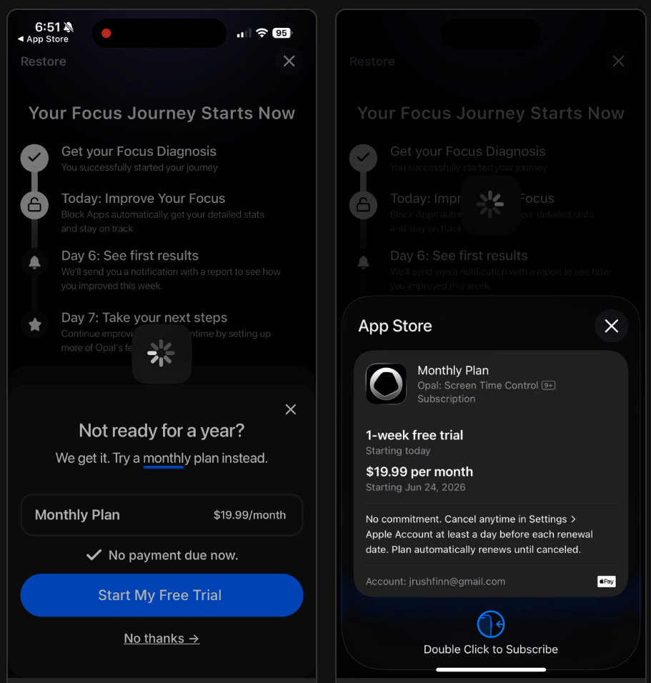
But that’s not all!
If you don’t convert on the initial paywall, they surface another offer of a monthly plan - at $19.99!
Pricey. But it does have a 1 week trial.
Post-Paywall
After the paywall we go into an activation flow that reference the goal I selected originally.
This is some nice personalization
But I think Opal is pretty poor post-paywall.
They just start blocking apps you selected and I don’t really understand to customize.
They don’t teach me how to customize for my needs.
Maybe they have a goal for “1st time screen blocks” and so this is optimizing towards getting more people to experience the screen block, but I was quite frustrated by trying to figure out how to change anything.
It automatically started blocking apps, and then after it had started, it took me forever to understand how to disable/change the settings. 🤷♂️
What do you think of their new experience?
📣 Want to help support and spread the word?
Go to my LinkedIn here and like, comment, or share my posts.
OR
