

BFCM 2024
10+ examples of sale campaigns

Hey there, it’s Jacob at Retention.Blog 👋
I got tired of reading high-level strategy articles, so I started writing actionable advice I would want to read.
Every week I share practical learnings you can apply to your business.
Check out what 12 apps did for Black Friday and Cyber Monday
Jacob, shouldn’t you have shared BFCM guidance before BFCM?
Yeah, I guess. But now you have many more real examples!
Save these for your next sale…which could be happening in a few weeks. Or in the new year.
⚠️ Warning, this is a L.A.P. (Long Ass Post)
Gmail or whatever email provider is going to cut it off about 3/4’s of the way through. Click here to read the post on the web to see it all →
Flo:

Takes a very “marketing” tone in their push notifications to get you into the app
For push, it’s okay to focus on getting people into the app with more “clicky” messages. As long as you don’t take this tone all the time, or overload users, you won’t lose trust or damage your brand
Send multiple push notifications trying to get people to purchase
Especially if they tap on one, see the paywall, but don’t convert. This can be thought of as an abandoned cart-style notification

Uses a “story” format to sell you on the sale and educate you on the value you're getting
Just getting people to the paywall often isn’t enough, this interactive format lets them have a more engaging experience that ends on the paywall

Created a custom paywall for Black Friday
And then follows up on that paywall if you don’t convert with a second prompt. They don’t discount further, but they do make you confirm. How can you turn down a crying teddy bear?!

Endel

Endel’s push notifications have a much more direct tone and rely on the discount to do the selling.
Compare this tone to the Flo notifications. Interestingly, Flo doesn’t mention the discount amount at all.
I wonder if this is because they have different discount amounts for different users and geos, but pulling all that data into the notifications would be too much work?

Endel also has a custom paywall, but it doesn’t mention Black Friday.
Possibly, they’ve used this paywall in the past for other 50% off sales
Ideally, I’d want it to mention Black Friday, but we’re always constrained by development resources

Calm

Calm adds a “Black Friday Offer” banner into the home screen
Honestly, they have too many of these little banners. Shouldn’t they prioritize the black Friday offer during this period and get rid of the other banners? It makes all of them less effective.
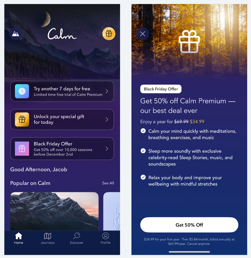
Calm is still a huge business, but they’ve lost their way a bit in terms of conversion optimization and creating great experiences.
While I’m viewing the black Friday paywall, another in-app message overlays on top of the paywall that promotes a new feature and takes me away from the paywall. At their scale, this UX issue could literally cost them hundreds of thousands of dollars.
Calm also drives a significant amount of conversions through their email → web subscription flow

I talk more about email → web subscription funnels here in this post
You can see that Calm doesn’t change much on their web landing page for different seasonal sales. They only change the discount amount
They may feel this page is pretty well optimized and changing it may decrease conversion 🤷♂️

Impulse

I didn’t get any promotion notifications from Impulse
I’m not a very active user, but I still receive other push notifications, so assumed I would receive something
They do have a custom paywall that mentions Black Friday
Their lifetime offer is slightly discounted (it’s normally $49.99 in-app), but their 3 day trial on the weekly offer is the normal price
Sometimes just changing the creative for your paywall can increase conversion. Most users don’t keep track of the exact price or discount, so they could be convinced this is a special offer

Ladder

Uses in-app messages that links to an iOS offer code in the app store
This is a worse experience for the user and for conversion because you have no control over the offer code page, so why do this?
Because you don’t need to build a new paywall!
You can launch new offers with just your lifecycle marketing tool to deploy in-app messages and link out to the offers in the app store which functions as your paywall.
Ladder first showed me the discounted annual offer
I didn’t bite on that offer, so next time they tried a different offer
It’s an interesting approach. I honestly think that making both offers available both times and letting users decide might work better? IDK
1st offer:

2nd offer:

AllTrails

Shows an in-app message when I open the app with a 50% discount
I don’t get why they don’t reference black Friday in the message. I think it inspires a sense of urgency because people know it won’t last. Maybe some “brand” reason?
The in-app message links to the discounted paywall, but the paywall doesn’t reference the specific sale, just a limited time offer.
They use this same paywall on all sale promotions which I guess allows them to launch quicker with less work? But maybe less effectively?

AllTrails also uses email promotions that links to web subscription flow pretty heavily

I think they also semi-recently started using web in-app messages on their site because I hadn’t seen these before when I checked out their web sales. But maybe I missed them in the past
You can see that I was already on the purchase page, and then a sale in-app message triggered over the purchase page…someone forget to exclude certain URLs from showing the message. Or maybe it wasn’t possible with their CRM tool
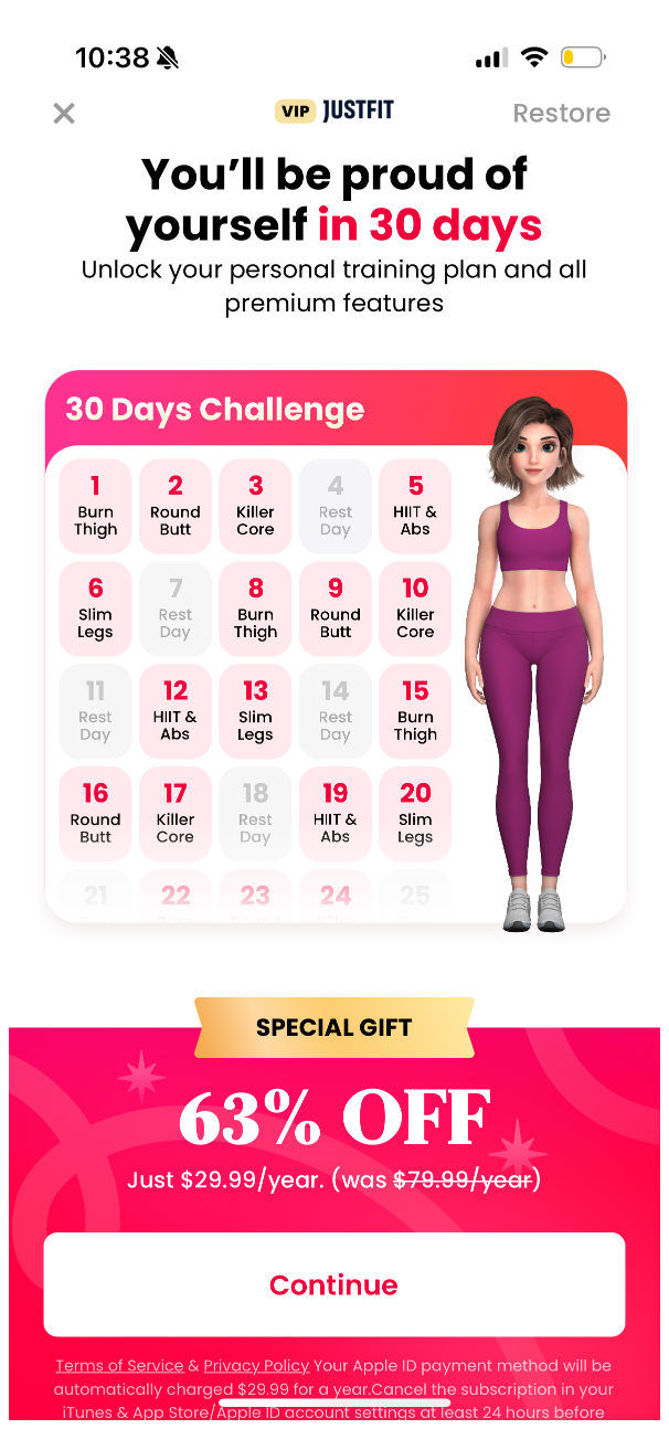
JustFit

They had a discount, but this is the same discount they always had. Nothing special for BFCM
Imprint

They didn’t have any special offer in the app
But when I checked my email, I saw a BF discount. Why? Well, because you can keep more of the revenue so some teams feel more comfortable discounting there.
Honestly, I think this is the wrong mindset and if you have the time, discount in the app, discount in the email, discount via push and you’ll likely come out ahead in the long run.

Emails linked in to this landing page:

Small note, but on landing pages it’s typically good to remove your standard web header with the links. These are more distractions for users and distracts from your offer you want people to pay attention to
Fabulous

In-app message pops up with the 60% offer
And in the home page, they have a fixed banner that has the same offer.
Sometimes if you close the initial sale paywall in-app, it can be hard to find the deal again. This is obviously a mistake, but we often forget about BFCM sales until too late and are scrambling to figure out how to get something live on time.
Don’t forget to test your message on different devices, because the paywall image background conflicts with the white text a bit and makes it harder to read. Not impossible at all, just not ideal


I’d bet Fabulous also sent some email promotions, but they stop sending you messages if you’re inactive in-app and I only recently opened the app to see their BFCM offers.
Flightly

When I opened Flightly to check out their offers, first saw their “Product Update Overview” for version 4.2.
I’m sure on every major new version they do something like this, but did it hurt sale conversion?

After I closed the “Product Update” I saw this paywall
This paywall is obviously custom for BFCM, but it’s a touch confusing since the offer is only actually available for the annual plan.
I figure this out eventually based on the button colors, but it could be a little more explicit
Also, take a look a the discount, instead of the discount, they’re giving you 3 extra months? It’s not super clear what the value of that is.
Annual is $47.99, that means $4 per month, or $12 free? Or 25% more? The point is don’t make your users do the math.
And they have the countdown timer. I didn’t stay around to see if the offer actually disappears after an hour

The countdown timer does persist once I close the paywall. It’s a nice touch to drive extra sense of urgency and make sure you don’t forget

Babbel

Babbel will never miss a chance for a sale, so you know they’re showing up for BFCM

They usually always focus on their email → web subscription flow.


😮💨 Phew, we’re almost to the end
RISE

RISE also did not have a discount in the app when I checked it out.
They only offer the discount with Email → Web Subscription flow

This landing page is solid as it incorporates their benefits and the trial timeline.
But I don’t love that the purchase button is so far below the fold.
I do like that they default to Apple Pay button as the primary CTA and don’t even show the credit card field.

My favorite LinkedIn posts and comments from the week
11 Black Friday Segments to Print Money this week, for subscription businesses 🤑 by Nick Candler
📊✨ November Analytics Recap: Highlights Across Analytics, BI, and Data Science 📈 by Olga Berezovsky
“I mostly talk about CRM and monetization, but here are some takeaways from the strategies I used in ASA to grow an app from $0 to $200K ARR in just six months.” by Vahe Baghdasaryan
📣 Want to help support and spread the word?
Go to my LinkedIn here and like, comment, or share my posts.
OR
