

Email + Web Subscription
= more money and more subscribers

Hey there, it’s Jacob at Retention.Blog 👋
I got tired of reading high-level strategy articles, so I started writing actionable advice I would want to read.
Every Tuesday week (usually on Tuesdays, I’m sorry I’m late this week…) I share practical learnings you can apply to your business.
Thinking about web subscriptions, but don’t know where to start?
It doesn’t have to be difficult.
Building an entirely new onboarding flow on the web for your product can be a lot of work.
It’s much easier to start directing existing free app users to a purchase page on web.
Steps:
Get a Stripe account
Use a tool like RevenueCat to manage your subscriptions
Set up the integration between Stripe and RevenueCat
Create a Stripe product and subscription
Send users to the Stripe checkout page
It can really be that easy.
Send some emails to free users and direct them to the Stripe page.
Long-term, you’ll want to build a real landing page to improve conversion vs. sending directly to the default Stripe checkout page.
But these quick tests can give you a sense of the overall opportunity.
What do you look for in the test?
Conversion rate
Cancellation rates (trial and subscription)
Renewal rates
Total ARPU
Your goal should be to see higher renewal rates and higher total ARPU.
When starting off with a new tactic, you’ll usually have lower conversion rates, but estimate how much you could improve with optimization.
If your mobile funnel and web funnel are even in revenue to start, that’s a great place to be! Higher renewal rates should make it a winning tactic in the long run.
If your conversion rates are lower for web, try to figure out what level of discount you can offer. The higher take-home revenue percent (and higher renewals) should allow for some level of discount.
What can fully built-out web subscription campaigns look like?
Let’s check out 4 examples:
Calm has been using web subscriptions for quite a while.
All of their email sales direct to the web and they feature a CTA in their weekly newsletter.
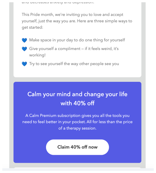
Calm feels comfortable offering this 40% discount on the web.
They used to offer it to all new users as a conversion tactic to get them to go straight to an annual plan, but now I only see it on web.
Tactics:
Simple tagline: “Sleep more and stress less”
Emphasizes the 40% offer
Feature social proof above the fold (on both desktop and mobile web)
On desktop they have more stats you can see about the effectiveness
CTA button: “Claim discount”
Desktop
Mobile

Babbel loves promoting their lifetime offer to me

Notes:
Uses a huge number to hook you in: “$400 off”
Shows you multiple subscription options on the landing page and all of them have some discount
My theory is users get lured in by the “$400 off” but end up buying the annual or 24-month subscriptions.
I’m a free inactive user, so there’s a lower subscription revenue cannibalization risk.
In plain English: I’m probably not going to stick around long, so might as well get a big purchase from me upfront
Tactics:
Social proof: 15 million subscriptions purchased
The countdown timer at the top of the page corresponds to the sale
Interestingly, the timer is at 0 now but the sale is still available.
I like this approach because why stop people from buying a subscription if the sale is over? The time limit is all arbitrary. Who knows when someone actually looks at their email
Babbel can show these huge savings because they compare all the prices to the maximum monthly price.
And their prices are already inflated so the standard offer includes a discount
Desktop

Mobile

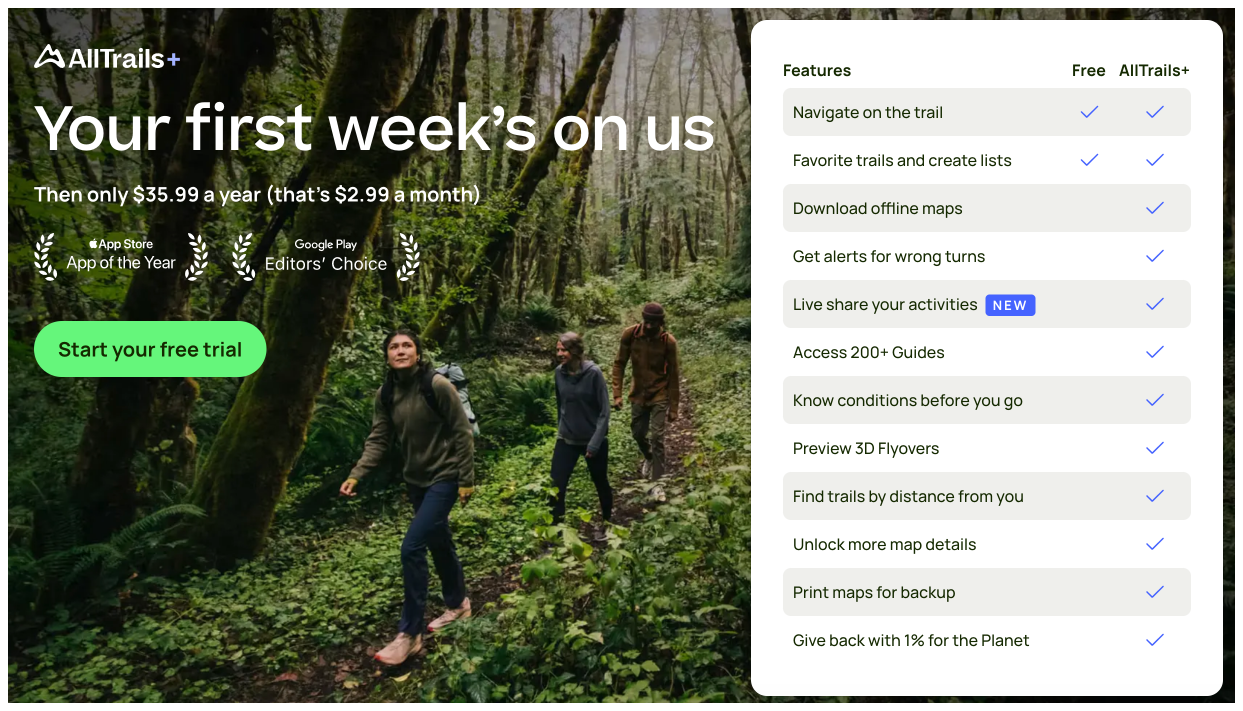
AllTrails runs seasonal sales about 4 times a year

Notes:
They heavily promote these sales via email and these emails link to their web landing page
AllTrails started out as a web-only product and then later moved on to mobile, so they have a pretty built-out web experience
For each sale, they send around 4 emails
1 sale announcement with the “Limited time” language
1 sale ending soon
1 sale last day
1 sale last chance
Notice a theme? They all try to build a sense of urgency to drive action
Their sale lasts about a week and they send 2 emails on the last day
This aligns with my experience that the “last chance” sale messages and the last day of the sale can drive 30-50% of the total revenue. It’s usually a large spike at the announcement and then a large spike at the end
Unfortunately, I didn’t click on these emails in time to see their sale landing page. When I did click it was just their standard landing page
They use coupon codes
The coupon code is passed automatically to the landing page, but they also insert it into the header of the email. I’m guessing this is in case your browser or some privacy tool strips the UTM parameters from the link or the link breaks somehow
Tactics:
Heavy sense of urgency with the sale offers
Visually exciting email creative with the “Save 50%” in huge letters to capture your attention
In the last two emails they switch to large text too for the “Last day” and “Last chance” copy
Driving mainly web purchases - I’m curious if they offer the sale in the app too
Does anyone know? Can you leave a comment?
Desktop
Mobile

Fabulous uses email heavily for monetization for free users
I’ve talked about Fabulous before here - check out 24 different emails

Notes and Tactics:
And of course, all their emails lead to their web subscription page
Fabulous is offering a 30-day trial, but positions it differently to emphasize the value you’re receiving for free
“93% of users would recommend” is a powerful stat
Fabulous also uses the countdown timer. Babbel had it linked to the sale time, but Fabulous seems to always use it
In this countdown timer they use “Free trial” language vs “Premium Pass” - probably more work than it’s worth to have that copy match 1:1
Notice when you view the landing page on mobile Apple Pay is the top option
Apple Pay is the key to getting these offers to convert well. Don’t even bother trying to sell web subscriptions if you don’t enable Apple Pay. It’s super easy to accept with Stripe
Desktop

Mobile

Summary of tactics to use in your email → web subscription flows:
Offer some form of discount or promotion in the email
Use a sense of urgency for the promotion to drive more action
This sense of urgency can be a limited-time sale or countdown timer on your landing page
Call out whatever social proof you have at your disposal
It’s fine to start out the default Stripe check out page, but you really want to create a custom lander that you can test and optimize
You need to use Apple Pay (Or Google Pay…or whatever the hell they’re calling it now)
None of this works without having Apple Pay as an option on mobile
Use success or satisfaction stats to prove your value to customers
If you’re running a seasonal sale campaign, send 4 emails
Announcement email, ending soon, last day, and last chance
Show off large discounts by making an expensive monthly or weekly plan so you can make your annual plan look very attractive
Lifetime can be a cool offer because you can offer huge discount and it’s a big purchase, but offer them other options as well
Think about your targeting for lifetime since it could potentially cannibalize subscription revenue
Now get out there and convert and retain some users!
Check out the Whimsical board here to see the full onboarding
📣 Want to help support and spread the word?
Go to my LinkedIn here and like, comment, or share my post.
OR
Share this newsletter by clicking here.
