Visual Diversity
Don't be boring
Hey there, it’s Jacob at Retention.Blog 👋
I got tired of reading high-level strategy articles, so I started writing actionable advice I would want to read.
Every week I share practical learnings you can apply to your business.
How do you stand out?
We all learn from others, use proven tactics, and follow best practices.
If we’re doing the same things as others, how do we get people to pay attention and remember our product?
How about your visual identity? E.g. how does your app look and feel?
They say first impressions matter. Well, what your app looks like is the first thing people notice.
Your goal is not to appeal to everyone.
If you’re creating something for everyone, you’re actually creating it for no one.
What are some different interesting visual elements and patterns apps use to create a unique and distinct feel?
(I’m not a designer, so take everything with a grain of salt.)
UI elements are often standardized, so it’s rare to see truly distinctive or different UI elements.
And I don’t think you actually want to be too different because your users will have to relearn how to interact with your product.
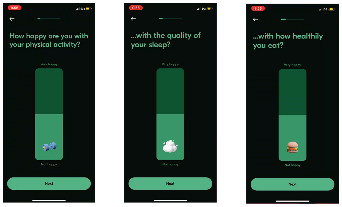
One super simple way I think is a nice change from the norm: sliders for selecting something on a scale.
I like how VOS, a mental health app, uses them during their onboarding flow
I don’t see a lot of apps doing it, but it is still intuitively obvious how to use it.
Another quick UI element mention:
ME+ has added this signature/contract element before their paywall.
Other apps use the hold-down to commit interaction (Flo, Fabulous, Headway, Opal, etc.) but this slight modification makes it a distinct experience.
Innovation isn’t always coming up with something completely new, it’s usually a small twist on something that already exists in the world.
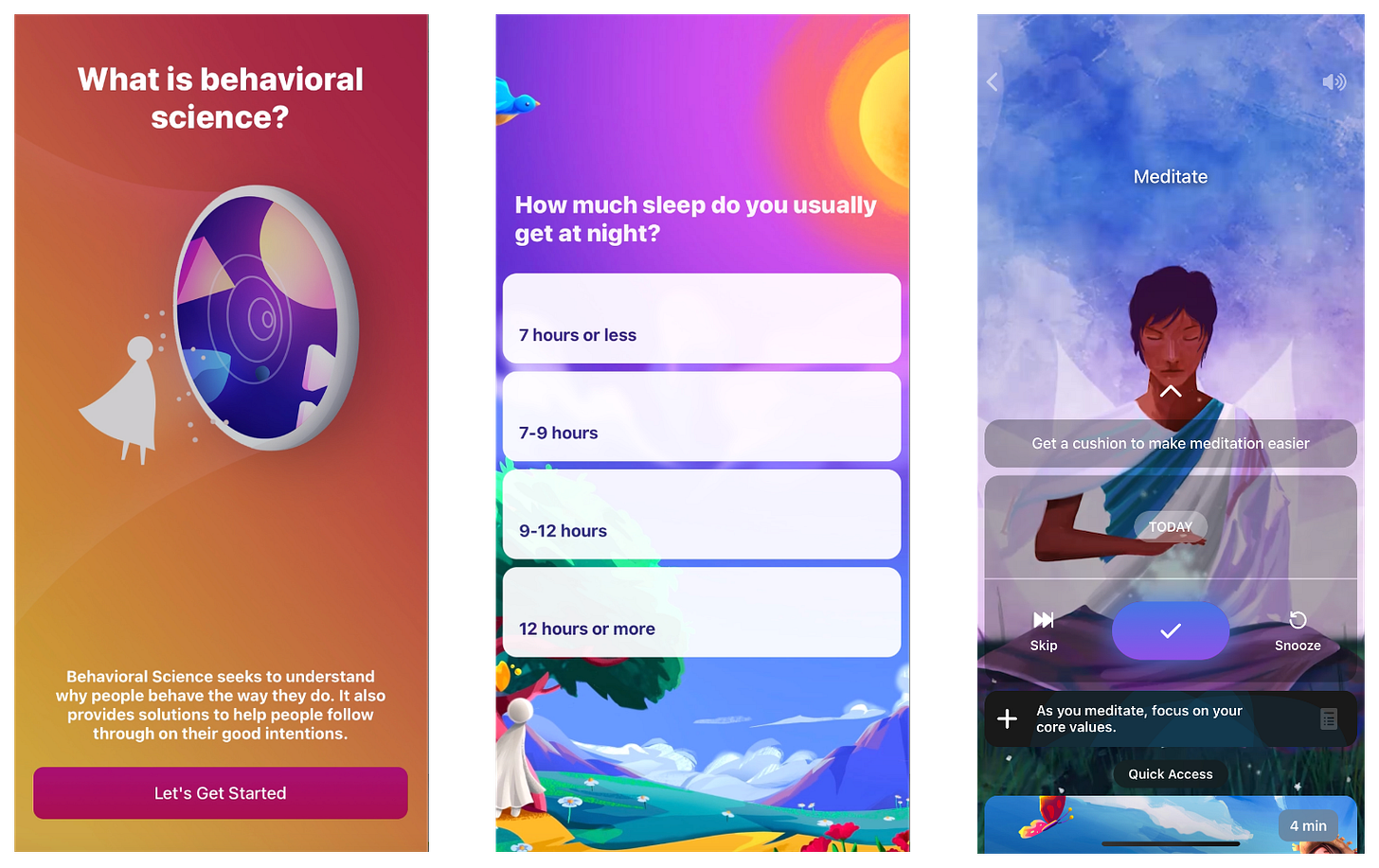
Color is another amazing way to stand out
Fabulous is one of the most colorful apps out there.
They build their brand on delightful bright and vibrant colors.
Every button and element has a beautiful illustration as the background or icon.
This doesn’t happen by accident. They’ve put meaningful time and resources into creating this look and feel.
But this level of creativity integrated into your UI is hard (maybe easier with AI image creation now, but that’s a different topic…)
You can also use the absence of color to stand out
Endel has created a striking visual style by making the entire app in black and white.
A core component is helping with sleep, so this style makes sense. They also focus on…focus, so this simplicity aligns with their product’s goals.
They make it work by pairing the black-and-white style with well-crafted iconography and simple, but clean and fun illustrations.
If you haven’t tried Endel, check it out. It’s certainly an experience.
Incoming cliché phrase alert: Remember, a great way to stand out is to zig when everyone is zagging.
Don’t just do the opposite aimlessly - be thoughtful and targeted about when you decide to be different.
Develop a point of view and take risks.
An opinionated product has a much better chance of developing loyal fans than something that just follows all the best practices.
Let’s continue with the theme of being different.
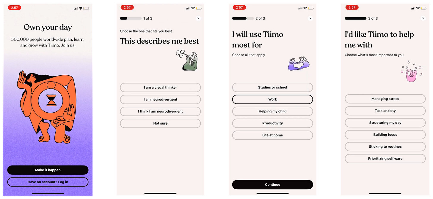
I’ve recently discovered Tiimo.
Tiimo is a daily planning app made for neurodivergent individuals.
They’ve added color and Dali-esque illustrations throughout to give the app a very exciting feel.
Whatever they’re paying the illustrator who created these, they should pay them more because it really makes the app.
If these were more generic illustrations, it wouldn’t work. But since these illustrations are so interesting and odd, they instantly create a strong visual identity.
These few screenshots don’t do it justice.
What have we learned so far? Be different and don’t be boring…easier said than done.
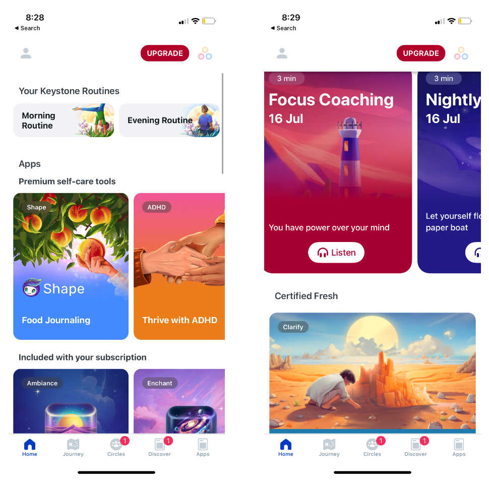
The last example I have is Calm.
Most of the Calm app is pretty blah.
They have such a large audience and user base that they’re not trying to be unique anymore.
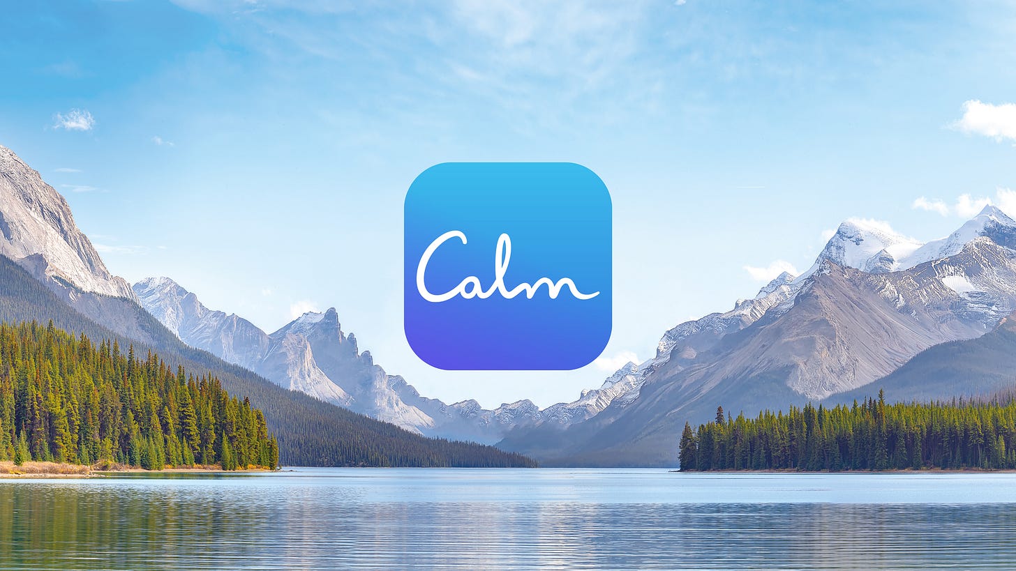
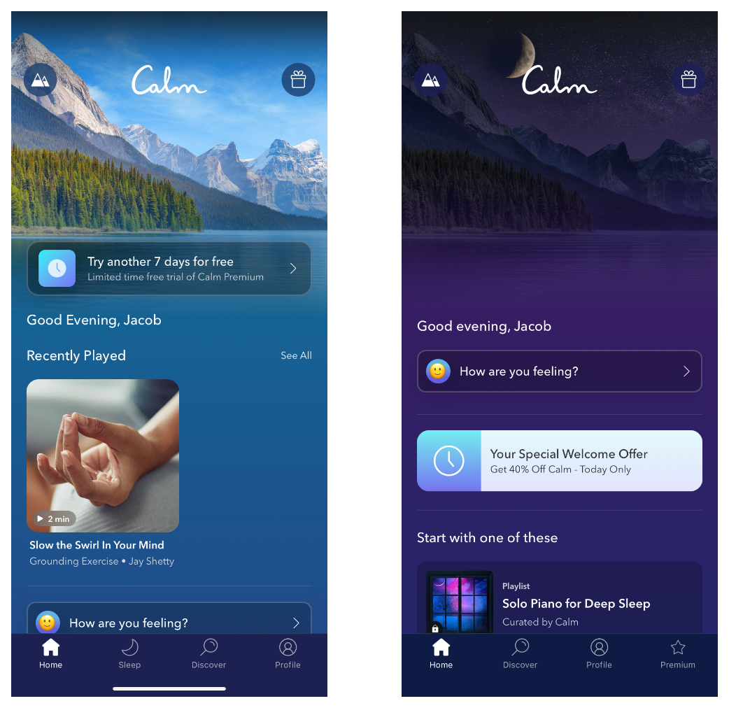
The most striking visual part of their app is the homepage with the large sweeping landscape shot of the snowcapped mountains in the background overlooking a peaceful blue lake.
When you load the app you can listen to the natural soundscape of this mountain lake.
Their visual identity transports you to a place of “calm”
This scene is everywhere on both the web and the app.
It’s a striking image and they’ve had it for 8+ years. I think the exact design of the mountain lake has changed a bit, but it’s still generally the same background.
You can, of course, change the background, but this mountain lake is the default for everyone.
There is something to be said for repetition to develop a visual identity.
Repetition could be enough on its own, but it’s much nicer to have repetition of a beautiful image vs something boring.
There isn’t a science to creating a visual identity for your product, but you know it when you see it.
Most of the products you love have a distinctive look and feel.
It’s great to copy elements of other products that work well, but you have to differentiate somewhere.
Try to create a product you love to use and look at, and it’s likely others will too.
What’s your favorite app that has a distinct visual identity? Let me know.
📣 Want to help support and spread the word?
Go to my LinkedIn here and like, comment, or share my post.
OR
Share this newsletter by clicking here.





Cool examples! I had never seen a "rating" answer like VOS, and would be very curious if they tested it against a more classic rating (and the results).