The most important email
Probably the most impactful too
Hey there, it’s Jacob at Retention.Blog 👋
I got tired of reading high-level strategy articles, so I started writing actionable advice I would want to read.
Every week I share practical learnings you can apply to your business.
Welcome Emails
The most important and impactful email you’re going to send.
But not all Welcome emails are created equal.
You’ve got lengthy, educational emails.
Or action-driving engaging emails.
Or discount and sales emails.
Why is this the most important email?
Because every 👏 single 👏 new 👏 user 👏 gets it! (sorry, I kind of hate that emoji trend, I promise I won’t use it again)
Your welcome email is:
The first touch with your brand,
The email that reaches the most people
The highest chance for conversion
Probably, some of the highest open and click rates
Early user interactions have a disproportionate impact on outcomes. This is true with onboarding, and this is also true with early user comms.
So how do we make a good welcome email?
First, segment based on whether a user has started a trial or made a purchase.
You’re wasting an opportunity if you’re not using your first email to get free users to convert to premium or subscribe.
Let’s look through a few examples of free welcome emails, and then we can go into other styles.
Calm
Calm sends two free welcome emails within the first day, both offering a 40% discount.
They have slightly different messages but with the same general concept: “Here’s a discount”
What’s the best way to retain a user? Get them to pay.
Fabulous
Fabulous takes a similar approach if you haven’t converted, but instead of offering a discount, they offer a longer trial
They have great positioning of their 30-day trial, calling it: “Your personal 30-day pass” - much more attractive than a trial, right?
They insert other value props, social proof tactics, and also a testimonial at the bottom of the email
You don’t need to offer a discount or a longer trial.
Do you have any data that says if a user completes a core action of your product, they’re X% more likely to pay?
Then you should probably be trying to get as many people to do that action as possible, right?
This is what myfitnesspal does.
Here are their first two emails.
Every CTA is about “Start Tracking Today”
They take multiple different motivational tactics to promote tracking
Testimonials, educational tips on how to start, stats on effectiveness, and more
I think myfitnesspal sends this same email to all new users regardless of premium status.
Instead, they likely segment on activity. I’d receive a different email if I had already started tracking my food
You can also try both:
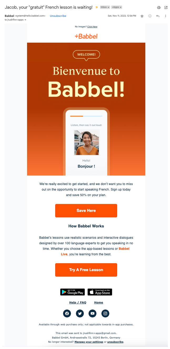
Babbel offers a discount for new users but also has a secondary CTA for starting your free lesson in case you’re not ready to purchase yet.
I like this because getting the purchase makes your business run, but providing alternative options to drive engagement and usage is a great secondary choice.
The language and image personalization is cool too.
From my experience, small personalized elements like that work well, but if you try to do large-scale personalized emails based on a bunch of things, it’s much harder to get right.
Rocket Money uses a tactic I kind of love.
Instead of asking you to pay, they show their immediate value.
During onboarding you had to connect your bank account, so they pull through the amount of subscriptions you're paying.
They don’t tell which ones exactly, but it’s a big enough number. There’s no way I’m not opening the app to see them!
Great use of personalization to show their potential value and get you curious.
This is the first email I got from Headway.
And to be honest, I’m not sure if this is a Welcome email or if I added my email sometime after I first checked out the app.
Either way, I like the tactic!
Who doesn’t love a quiz?
It brings the personalized value of the app into email. They show you that you can pick what topics you want and learn about them.
It’s way better and more engaging than saying something like “Open the app”
I’d definitely try this out as a Welcome email for new users who haven’t done anything yet.
Duolingo is great at keeping their comms short and sweet.
Technically, this isn’t a welcome email, it’s a “Welcome back” email, but pretty close right?!
Motivation on why you should come back
Personalization in the image with the French flag
CTA above the fold
So what did we learn?
Segment based on free vs paying users
Figure out whether you should be driving towards a purchase immediately or if completing a core action drives better outcomes in the long run
Reiterate your value prop
Make the next step from the email easy and engaging
Keep the CTA above the fold
Insert small levels of personalization, but don’t go too crazy
One thing we didn’t touch upon are “Welcome to Premium” emails. These are triggered after someone purchases or subscribes.
📣 Want to help support and spread the word?
Go to my LinkedIn here and like, comment, or share my posts.
OR
Share this newsletter by clicking here.


