$4m+ in April on 1m downloads
What can we learn from JustFit?
Hey there, it’s Jacob at Retention.Blog 👋
I got tired of reading high-level strategy articles, so I started writing actionable advice I would want to read.
Every Tuesday week (usually on Tuesdays, I’m sorry I’m late this week…) I share practical learnings you can apply to your business.
JustFit made $4m+ in April on an estimated 1 million downloads.
If you add in Android it’s nearly $5m!
Most consumer products make most of their money from new users.
How does JustFit monetize new users so well?
We’ve got a good one today, so let’s dive in!
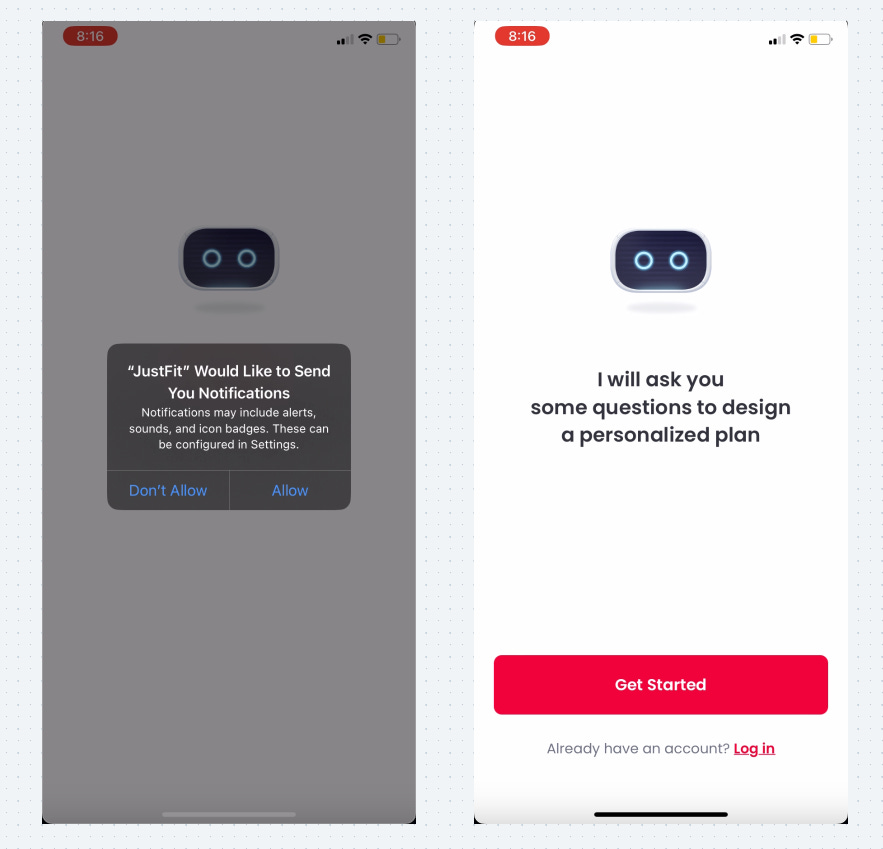
Ask for push notification opt-in immediately
People are so accustomed to seeing this prompt that they probably don’t read it and just press “Allow”
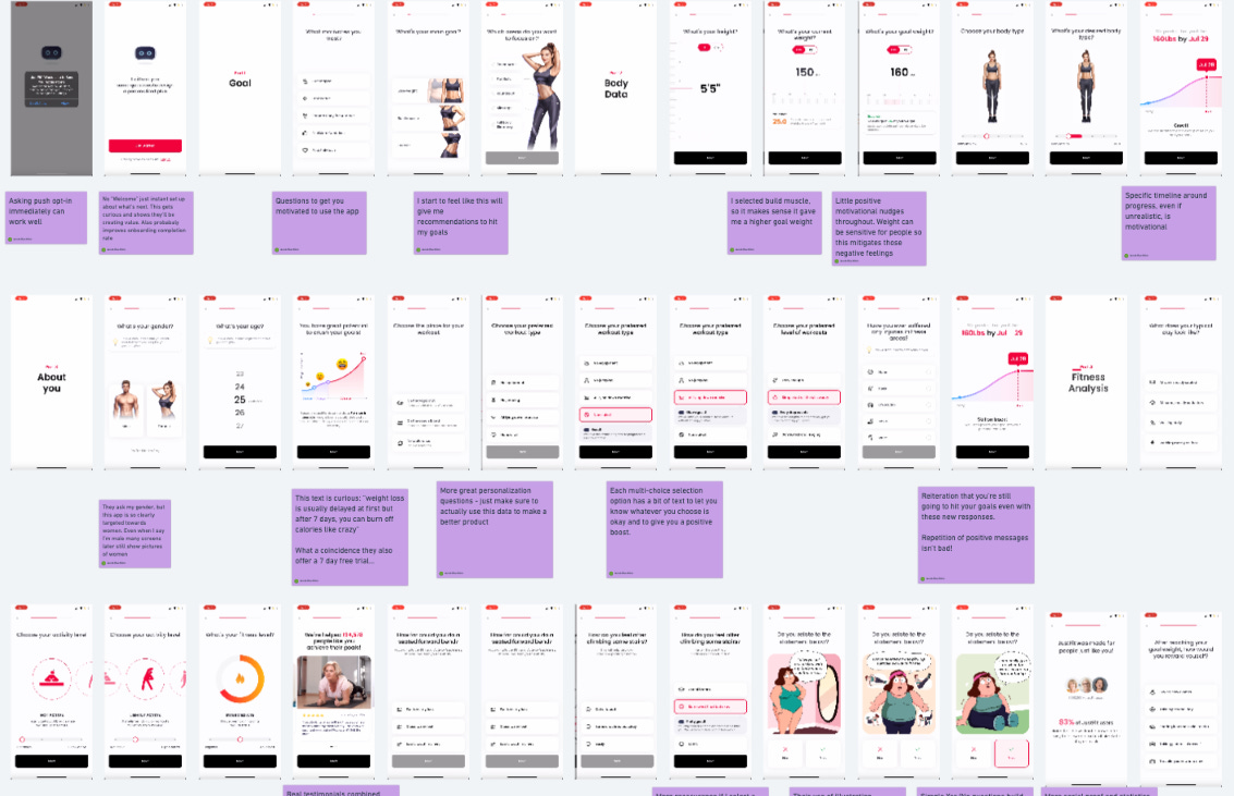
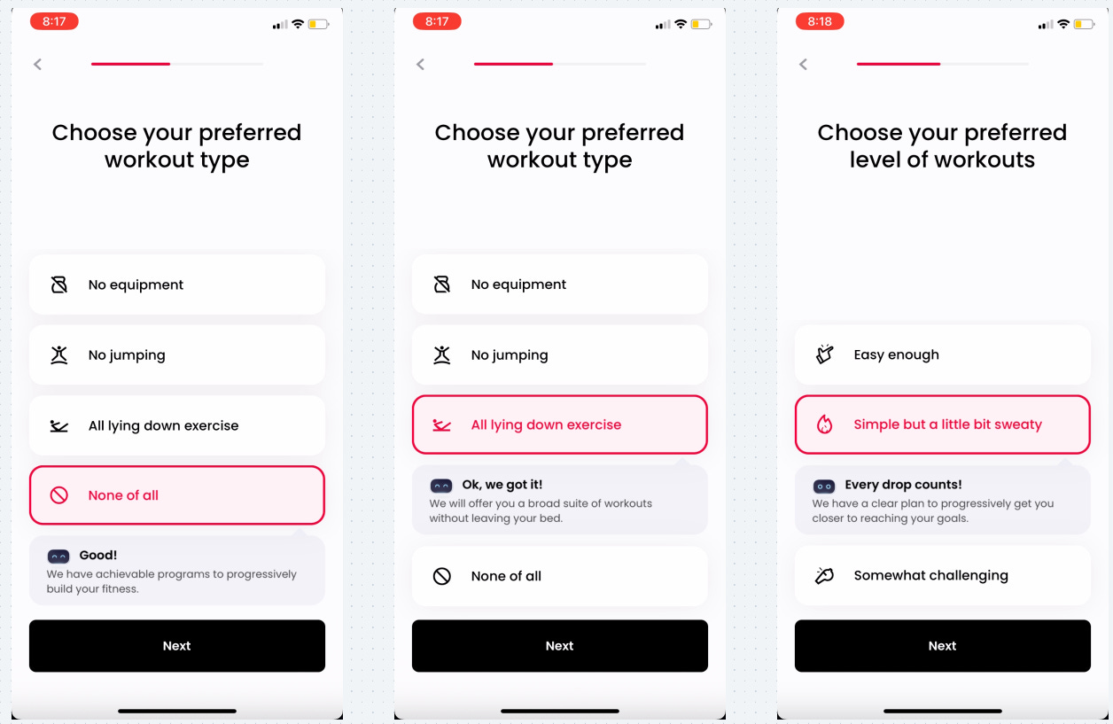
JustFit has a very long onboarding flow with ~60 screens (!)
They give you context that all these questions are designed to personalize your plan. This will likely boost the onboarding completion rate
Early questions talk about goals to start getting you excited about progress
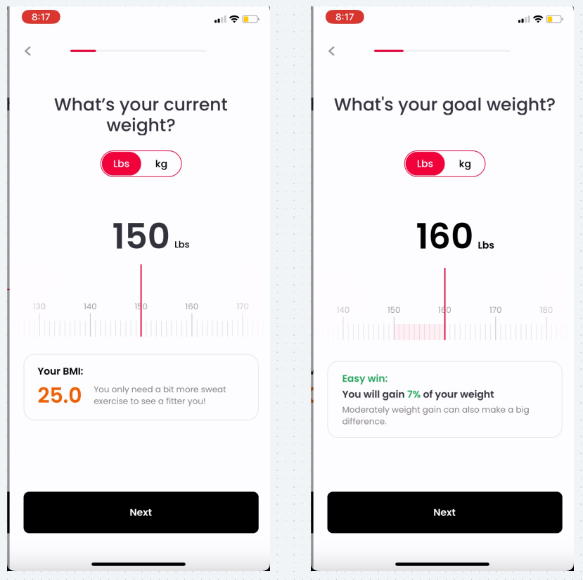
When they ask about your weight, they have positive nudges since weight is often a sensitive topic
Do you have negative or sensitive questions you need to ask your users?
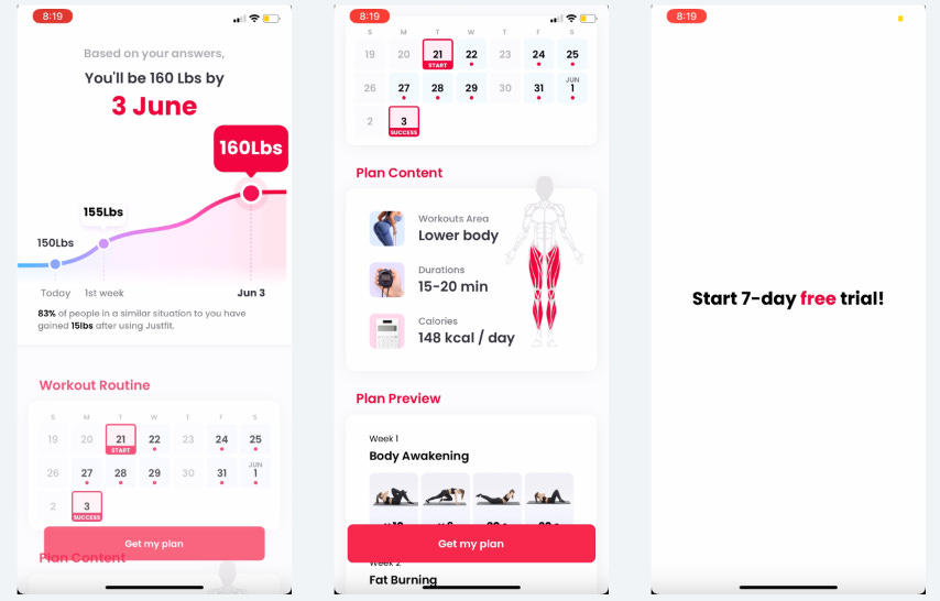
About 10 screens in they show you a graph that predicts your progress by a specific date
Even if this is unrealistic it helps motivate me with a tangible timeline around progress. Specific is good
They know their target demo and customize the app for them
They ask me what my gender is, but the app is so obviously focused on women
Even though I selected male, most pictures later are still of women
If you make a product for everyone, you’re actually making it for no one
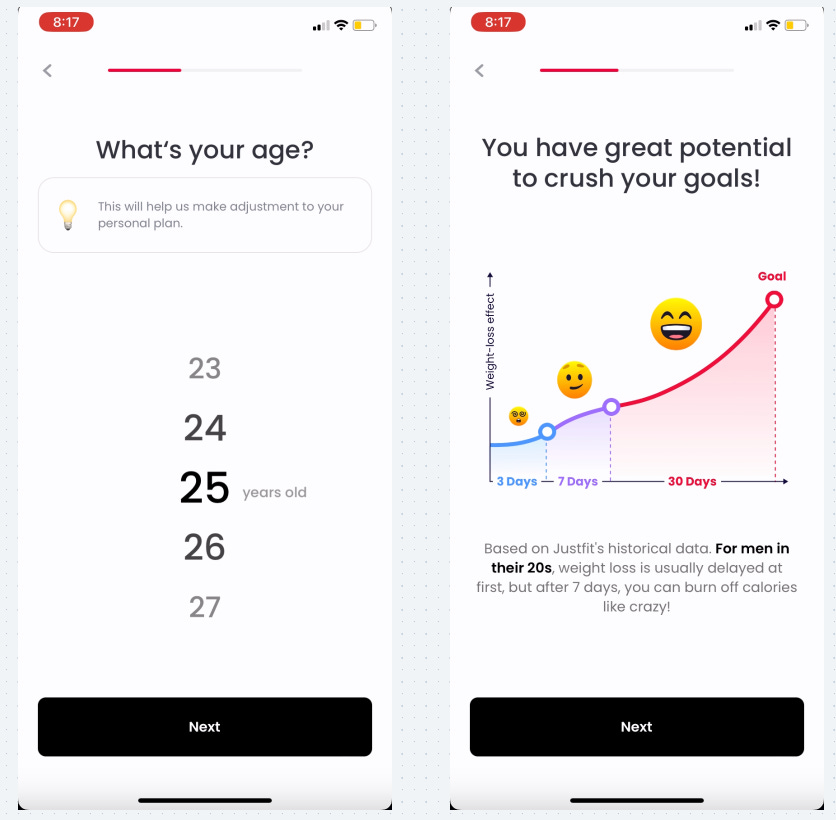
Many positive motivational graphs showing the progress I can achieve in 30 days
Specific tangible progress is what people want - show they can achieve it
Something interesting I noticed is that they say you’ll start seeing weight loss after 7 days. (upper right) Coincidentally, that’s the same length as the free trial…
They personalized the text using “men” since I selected Male, but I also selected weight gain initially so the personalization breaks down a little. Very few people are usually selecting weight gain that they probably don’t care
Too many questions?
If the questions are simple and motivational, there will be little drop-off past the first few screens and it will help sell the value of the app
Each multi-choice selection option has a bit of text to let you know whatever you choose is okay and to give you a positive boost.
How can you manage user emotions?
Flo does this expertly well - check out their tactics here.
They reiterate that with these new questions, I’m still on track to hit my goals with the same graph
Lesson: Repetition of positive messages isn’t bad!
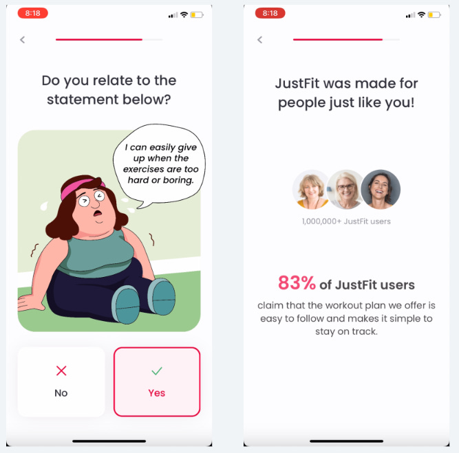
At about the 30th screen, they show a combo social proof + testimonial screen.
Including this social proof and testimonials is important later on in the funnel to reduce drop-off. Honestly, these are great everywhere, but if you only have a few insert them later in the flow
Their use of illustration combined with real-world photography usually goes against best practices to create a consistent feel for the user
It’s not the end of the world, but it does feel a bit odd
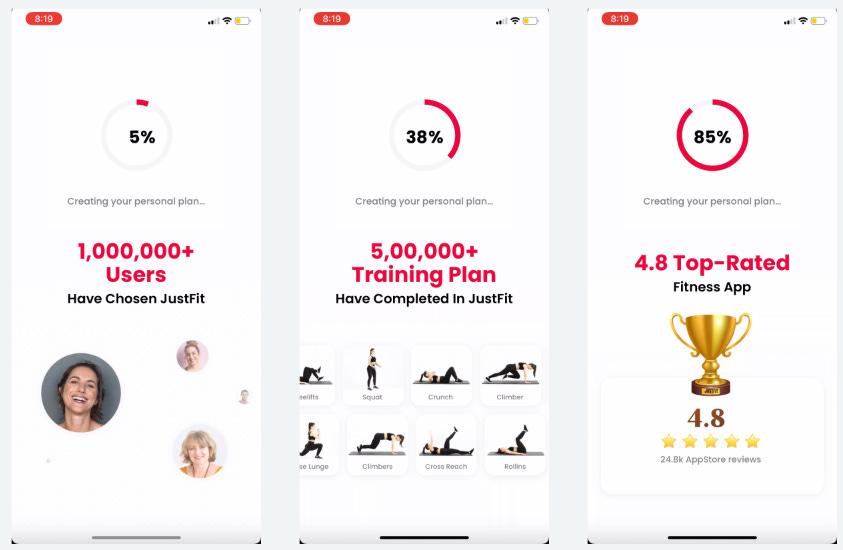
And more social proof and statistics
When you read the text below the “83%” it doesn’t actually talk about results - are big numbers more important than substance? Unfortunately, maybe.
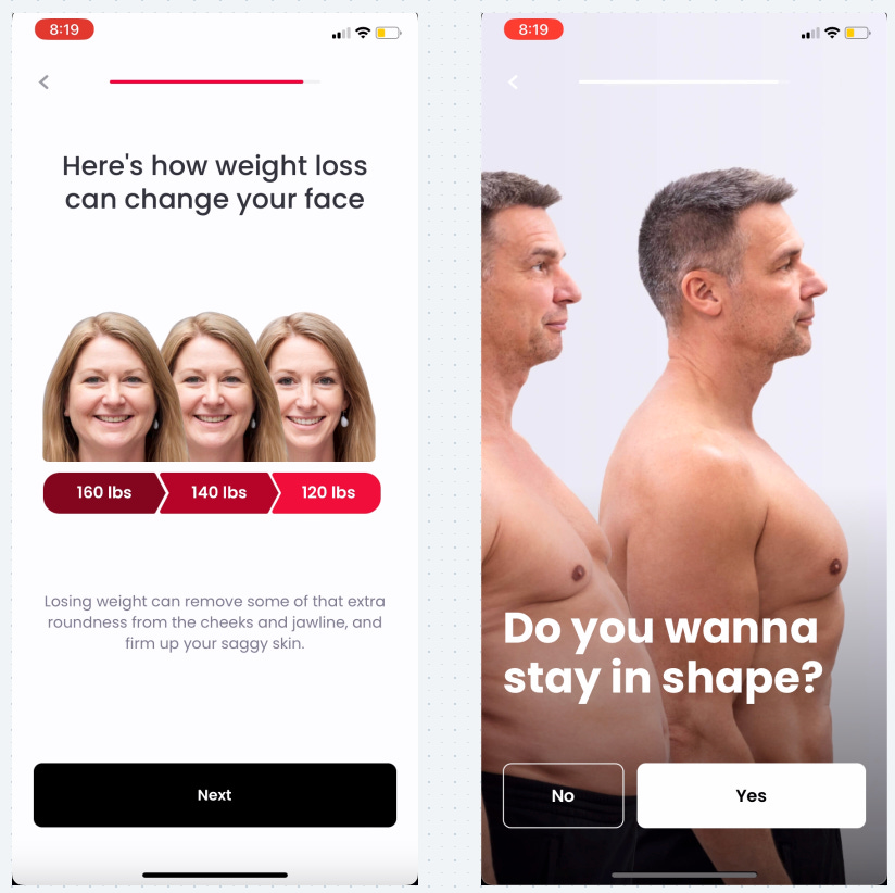
We’re getting close to the paywall, now is the time to build up investment and positive feelings
They show a “before and after” of weight loss
They ask about rewarding yourself when you reach your goals
They use obvious and easy “Yes/No” questions that everyone says yes to
“Do you wanna stay in shape?” - “Uh, duh.”
On to the paywall!
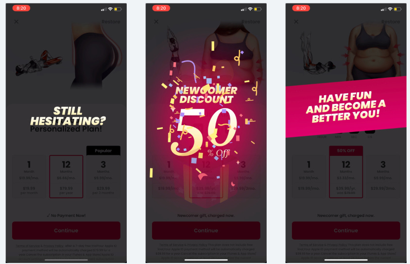
The initial paywall shows a nice animation of how much better my butt will look
The initial offer directs me toward the annual plan with the 7-day trial
But wait, I paused for 5-10 seconds, and without tapping anything the paywall changed to offer 50% off!
But it also changes that 50% off to a no-trial plan
This is really interesting because trials definitely don’t convert at 50%, especially for people who hesitate. So getting someone to convert immediately with the discount is likely more valuable.
Interesting thought: Is time on paywall before pressing “start trial” a negative signal for trial conversion?
When I still don’t convert on this second offer, I get one more discounted offer for 63% off
63% off to get the offer to 29.99. Round price points like this will usually convert better. And still no trial.
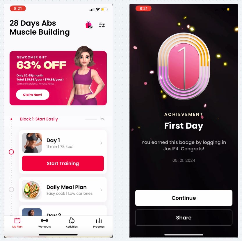
They dedicate a huge portion of the home screen to the purchase banner
And before I do anything I get an achievement!
This is great because it educates users that achievements exist, makes you feel positive, and is an early opportunity to share.
They’re hitting the majority of new users with the “Share” button increasing the potential for organic acquisition
Whew! That was a long one. I hope you learned something :) My biggest takeaway is the discount paywall triggered after 5-10 sec of inactivity on the initial paywall.
Check out the Whimsical board here to see the full onboarding
📣 Want to help support and spread the word?
Go to my LinkedIn here and like, comment, or share my post.
OR
Share this newsletter by clicking here.


