

UX and UI I love
3 examples to get you inspired because the details matter

Hey there, it’s Jacob at Retention.Blog 👋
I got tired of reading high-level strategy articles, so I started writing actionable advice I would want to read.
Every week I share practical learnings you can apply to your business.
We’re going to look at three apps and a few different UX elements I love.
All three of these examples touch upon critical interaction points in the user journey.
Copilot
What to steal: Push notification opt-in flow
Fabulous
What to steal: Post-paywall activation flow
Ladder
What to steal: Video explainers and intros
Let’s dive in.
App #1: Copilot: Track & Budget Money
What to steal: Push notification opt-in flow


From Appfigures
Copilot is a money management and budgeting app.
This is such a competitive space, and still, there is always room for something better. I’m not sure how many budgeting apps you’ve tried, but I’ve never found one I truly loved.
Copilot was an Apple Design Award Finalist in 2024, so let’s see what we can learn!
Today we’re looking at their push opt-in flow
(I’ll include a link below to their full onboarding flow)
What do I love?
Shows you exactly what you’re getting with real mocks of notifications
Breaks down all the different notifications
Easily swiping across to look at all of them at your own pace
Two different navigation methods: swiping or pressing “Next”
Simple explanation of the benefits of the notification
Once I press “On” for a specific notification, then the Apple push prompt appears
Just asking if I want notifications I’m likely to say “No thanks”
But if you ask me if I want to know exactly when I get paid or to help me prevent overdraft fees, I’ll say “Sign me up!”
It’s quite a big difference, right?
I want these benefits and a push opt-in is just the mechanism to get those benefits. Step into your user’s shoes and figure out what truly helps them.

And a video of this entire interaction because it’s quite slick:
Recording of the whole onboarding UX →
App #2: Next, we have Fabulous: Daily Habit Tracker
What to steal: Post-paywall activation flow


From Appfigures, I have their revenue here from IAPs, but this is likely 1-2 orders of magnitude off due to revenue coming from web to app flows.
Fabulous has fabulous really great user guidance and onboarding UX to teach people about their app. They have a lot going on, so it’s important to get this right to set them up for long-term success.

After the first paywall, they prime you for taking your “first steps”
You’ll see that they hold your hand through the entire process to make you don’t get lost.

Then they set up a simple habit based on information I provided previously
And look how it’s framed: “I accept the challenge” This is much more motivating.
Fabulous also starts to explain their Journeys feature.

Before starting a journey, they explain to you the whole path so you have context and the correct expectations on what’s coming up
This helps communicate the value of the app. It shows how much depth the product has and could make you more likely to convert.

It’s always obvious what to do next. They have simple prompts with friendly language and use the pulsing spotlight so next steps are intuitive.

This intuitive explanation and guidance continues through tracking your first habit.
Through every point, there is additional context added.
And it’s an interactive tutorial. You actually have to do the actions to progress which makes you much more likely to remember in the future.


This approach continues for quite some time as you dive deeper into the app.
Usually, the more time a user spends on their first session in the app, the more likely they are to retain and convert.
Want to explore Fabulous more? Check out this Whimsical board. It’s slightly out of date, but generally correct and has a lot of the app and marketing.
App #3: LADDER Strength Training Plans
What to steal: Video explainers and intros


From Appfigures
Ladder is absolutely crushing it.
They have web-to-app flows as well, so this revenue is also likely underreported.
I love their high-quality introduction videos integrated into the app.
If you haven’t checked them, go download the app today to get the full experience.
They have stellar design, but the in-depth video guidance gives them an extra perception of quality.
Users don’t consciously think about whether something has good design, or feels “of quality” but it 100% influences the purchase and usage decision.
People don’t compare your app to other fitness apps, they compare your product to every single other consumer experience in the world today. The bar is high to really wow people.
See the copy: “Ladder is different”
This is all people want to know, “Why should I care about your product?”

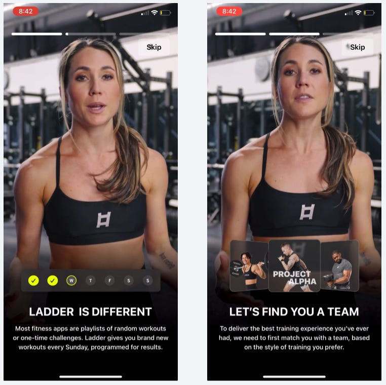
I know it’s not simple to put together video content like this, but engaging high-quality animations or video can really make a difference in perception.
Think about if it makes sense for your app.
Want more on Ladder?
I did a full breakdown of Ladder’s reverse trial and onboarding in a past newsletter:

I hope this was helpful and inspiring!
Let me know your thoughts and feedback in the comments.
LinkedIn Highlights
I won’t have this section every week, but when I can, I’ll try to call out interesting content I saw:
Ketty Slonimsky, Chief Growth Officer at Palta, shared a banger to get you inspired:

📣 Want to help support and spread the word?
Go to my LinkedIn here and like, comment, or share my post.
OR
Share this newsletter by clicking here.
