

Top 25 Tips of 2025
Best of the Best

Hey there, it’s Jacob at Retention.Blog 👋
I got tired of reading high-level strategy articles, so I started writing actionable advice I would want to read.
Every week I share practical learnings you can apply to your business.
I went back through the last year and pulled out my favorite tips from about 50 newsletters.
I wrote ~50 newsletters in 2025 and only have 25 tips, so every newsletter didn’t make the cut. It’s the best of the best!
🔗 Your email client will cut off somewhere half way through this newsletter, so click here to open on web to see everything and prevent that in the first place.

Ahead is an amazing app, and there’s tons to learn from them. They do an amazing job of looking at tactics that work, and then adapting them for their product. So here is our first tip:
1. Don’t just copy competitors, understand the why
Rather than blindly replicating what others are doing, break down the goal behind a tactic before adapting it to your own product.
Why is this tactic effective for this product?
Does it leverage any psychology?
Does it align with my product’s core value and audience?
2. Try micro-commitments early in the user journey
Ahead shows how subtle interactions like “draw a checkmark to continue” instead of a simple “Next” tap can increase engagement before a paywall. These micro-commitments increase investment and buy-in to improve the chance of making it through onboarding and converting.

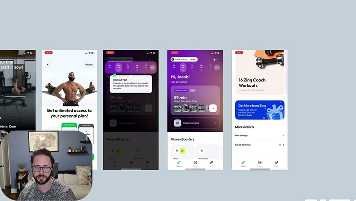
Next we have a breakdown of how Headway evolved their onboarding overtime
3. Evolve onboarding incrementally. Start simple, then iterate toward richer flows
Headway’s onboarding didn’t start as a lengthy, personalized experience. It grew over time through deliberate iterations.
Don’t look at large apps and jump right into a 50 screen onboarding. The chance of that working are much lower.

4. Don’t activate lifecycle marketing until the rest of your funnel is strong
The ceiling for revenue uplift from lifecycle marketing is limited because most subscription apps convert on Day 0 or never at all, so lifecycle work only moves the needle so far.
Fix your product conversion and onboarding first. Strong early engagement gives lifecycle campaigns something to amplify. Campaigns won’t overcome a weak core funnel.
Only invest in a lifecycle tool, and possibly a person to manage it, once you can reliably convert a good baseline of trial users. Retention Blog
For smaller apps, start simple with product-triggered messages (e.g., push reminders, basic email triggers) before layered lifecycle sequences or heavy automation.
If you don’t have a freemium product, the base of active free users you’re able to convert will be even lower

5. Build meaningful 2nd offers instead of giving up after the first paywall
Even though the first paywall is critical, most users (90%+) don’t convert. There’s still value in trying to convert them with another offer.
Offer a limited-time discount or alternative pricing: Think inexpensive lifetime deals or discounted plans for users who didn’t subscribe initially (e.g., a low-cost lifetime price can appeal to price-sensitive segments).
Re-engage with contextual messages on app open: Show value reminders or alternative paywalls explaining key benefits more deeply. Someone opening your app again is a high intent signal!

6. Extend onboarding into the post-paywall experience
Too many apps stop their onboarding after the paywall and drop their users and some complex home screen. Goodbye users.
Actionable ways to apply this:
Transition users into a guided first task after they pass the paywall take them straight into a meaningful activity (like a “first lesson,” setup step, or personalization question) instead of dumping them on a blank dashboard.
Repeat value messaging where it counts — reinforce what they just paid for by showing how to use key features step by step (not just generic screens).
Personalize the next screens based on onboarding choices (e.g., interests or goals) so users feel the app was designed with their needs in mind
(look at the article to see how Imprint evolved their post-paywall flow. It’s good)

7. Add a HDYHAU question to your onboarding
This newsletter is worth reading through in full. Or at least reading the quotes from Sylvain, Thomas, Jakub. Quite informative.
“How did you hear about us?” (HDYHAU) question doesn’t replace traditional attribution (like SKAN, App Store Connect sources, or modeling), but it adds another valuable perspective to what your tools show you — especially in a post-ATT world where last-click data is imperfect.

8. Make your paywall more interactive
Instead of a single static paywall screen, consider using multi-screen, story-like experiences (similar to Instagram Stories) for your offers. In the example from Flo, they:
Trigger the interactive offer from multiple entry points (e.g., in-app banner, push notifications),
Use curiosity-inducing copy like “Reveal your discount”, and
Allow users who already know what they want (e.g., a discount) to skip ahead.
Stop showing the same static paywall every time. Get creative.
Widgets and Live Activities

Are you only using push notifications to improve retention for your app?
9. Use widgets and Live Activities to stay top-of-mind
Actionable ways to implement:
✔ Build a core value widget that shows meaningful metrics (like goal progress, streaks, minutes used, etc.) — not just branding.
✔ Use Live Activities for real-time events tied to user activities (e.g., a meditation timer, session tracker, or countdown to next recommended action).
✔ Prompt users contextually to add the widget — for example, after they complete a meaningful first action or hit a milestone — rather than as a generic signup ask.

10. You can now offer alternative purchase flows and capture more revenue outside of Apple’s IAP
Man, do you remember the excitement and hoopla around this?
Some apps are using this effectively, but certainly not a majority. And remember, this is still US apps only.
✔ Start with post-initial paywall upsells (e.g., discounted upgrades or alternative plans) rather than replacing your primary IAP flow right away. This can limit risk while you understand impacts.
✔ If you’re under $1M in revenue, don’t bother. It’s likely a distraction and the lower conversion rate from directing to web will probably make it not worth it.
There is still a lot of opportunity here and I’m not 100% sure of all the best practices.
Gmail cuts off right about here for me, click here to read the rest on web →

11. Use strategic plan structuring to nudge better subscription choices
Nebula’s subscription tiers illustrate a deliberate pricing structure:
Weekly plan with a 3-day free trial (likely converts users who are unsure).
A 3-month plan without a trial priced slightly below the year (acting as a price decoy).
Yearly plan with a good value proposition.
Because the 3-month plan isn’t a strong value play versus yearly, it likely makes the yearly plan look more attractive — boosting higher-value conversions.
They also use a secondary offer with a free trial tied to the yearly price if users skip the first paywall

12. Structure your A/B tests properly
Key parts of a rigorous test:
✔ Calculate sample size and test duration in advance
Don’t guess, estimate how many users you need based on baseline conversion and expected lift.
Consider your minimum detectable effect so you don’t end tests before there’s enough data
✔ Test one thing at a time
Isolate variables (e.g., just copy, or just layout) so results are attributable to a single change.
Avoid overlapping experiments that can muddy results by splitting your audience unintentionally
✔ Don’t stop early, even if you hit statistical significance early
Let the test run for the full pre-determined length — results can swing day-to-day if you stop too soon
✔ Randomize audiences and check tracking
Make sure your experiment assigns users randomly and consistently (the same user should always see the same variant).
Double-check that all events you plan to measure (e.g., trial starts, key actions) are being tracked before you launch. Discovering you don’t have all the data after you go to measure and analyze really sucks.

13. Segment users by early behavior to tailor pricing offers
Instead of one paywall for everyone, look at how users behave in the first session or onboarding.
Actions you can try:
Low-engagement segment: Users who skip onboarding questions or don’t take core actions → show a discounted offer or extended trial.
High-engagement segment: Users who complete key actions early → show your standard or premium plan without discount.
Apologies for the interruption - this is a good opportunity for a Botsi plug:
I shared this on LinkedIn, but I'm excited so you'll have to excuse me sharing again!

Model training took a few weeks, but when we deployed the trained model, there was a pretty obvious impact.

On average, revenue is up 21% and new subscribers are up 11.6% since we've deployed.

We typically launch models as an A/B test, so 50% of your new users get your baseline paywall, and 50% of your new users will see Botsi AI Pricing.

This way, we can be confident in the true incremental impact.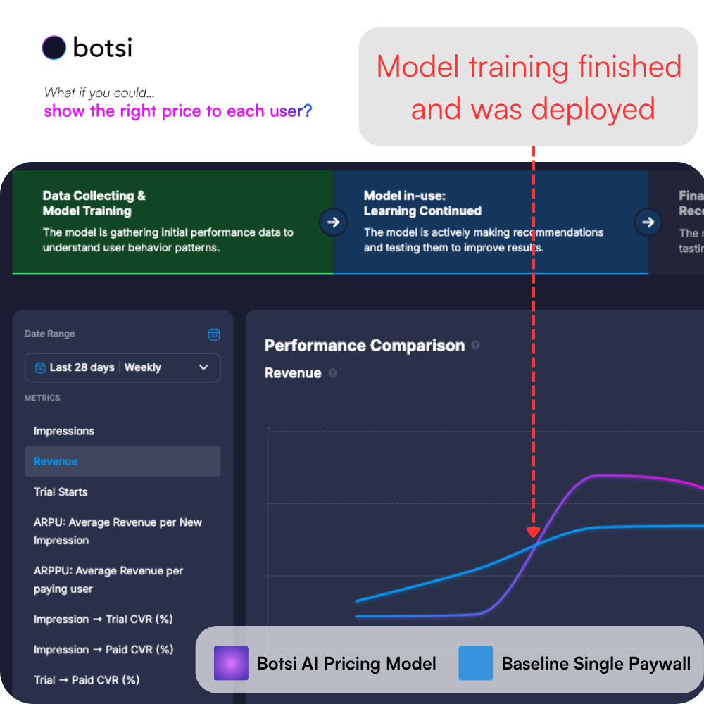
Read more here ->

Okay, back to your regular scheduled programming...
14. Break down core KPIs by segment (don’t look at averages)
Evaluate retention, conversion, activation, ARPU, renewal, and cancellation rates for each segment. Averages are always wrong and deceptive
Platform: iOS vs Android vs Web
Geo/demographics: Country, age bracket
Attribution source: Organic vs paid channels
Zero-party data segments: Onboarding questions like “What’s your goal?”
Behavioral segments: First 30-minute actions, feature usage patterns
15. Use cohorts to isolate changes over time
Segment users by install date (cohorts) when you analyze retention and conversion — this tells you whether product or marketing changes actually move the needle.
Actionable steps:
Build weekly/monthly retention cohorts and track changes after product updates or campaign launches.
Compare segments like “users from ASA campaigns in Week X” vs “users from another channel in Week X.”
Look for patterns in drop-offs, not just overall retention %.

16. Add lock icons to premium features
What to do
Place a lock symbol on content/features that require a subscription.
Do this throughout the app in menus, lists, cards, etc.
Why this matters
This reminds free users what they’re missing — which tends to bump trial starts and conversions.
In experiments from the field (e.g., Mojo team), simply showing locks increased free-to-paid conversion
17. Add more “Unlock/Upgrade” CTAs throughout the app
What to do
Don’t limit “Subscribe” or “Get Premium” buttons to the paywall — also include them in:
Settings screens
Feature screens (e.g., text editors, dashboards)
Profile tabs
Sidebar or footer on major pages
Why this matters
The post points out that additional CTAs in context catch free users when they’re already motivated— e.g., when trying to use a premium feature.
18. Label your app or screens as “Free Edition” in multiple spots
What to do
Add “Free Edition” messaging in app headers, home screens, or near feature names where free users see it often.
Why this works
Subconsciously reinforces the idea that the experience is limited — and that there’s more to get.
Think of it as light scarcity framing without being pushy.
19. Offer a second free trial to returning users
If you have a freemium app, a decent free user base, and/or free users returning to your app, try giving them a second free trial.
Don’t do this immediately after they completed their first free trial, but if you have a decent base of free users who already completed a trial, it doesn’t really hurt you to offer them another one. It’s unlikely they’re going to convert without some type of offer, so this can be good instead of offering another discount.

20. Follow up immediately with an offer after new users exit your app
Right after a new user closes the app without converting, send a push notification that includes a discount.
New users have the highest intent and may just need a nudge or reminder.
21. Send a second offer the next day
People forget. If someone doesn’t act on the first conversion push, follow up the next day with the same offer. This simple repetition can capture users who were simply distracted or wanted more time.
22. Personalize goal inputs continuously through onboarding and paywall screens
Zing asks users to choose their personal goal early (e.g., muscle gain) and then re-uses that same phrase everywhere — in onboarding screens and on the paywall — to reinforce relevance. Simple string personalization usually boosts engagement and conversion
How to apply this:
Capture one or two zero-party data points early (e.g., specific user goals or preferences).
Surface that data repeatedly in flows — in guidance, contextual micro-copy, and on the paywall itself (e.g., “Your X plan is tailored for [goal]”).

23. Define a Specific Activation Metric (not just “activated”)
Activation should not be vague. It should be a quantitative metric tied to user behavior that predicts long-term retention and value. It’s not enough to say “user onboarded”; you must define a metric that correlates with later retention and monetization.
Read the post to actually learn how to do it, but here’s a quick summary:
✔ Brainstorm a set of candidate events that users might complete early and that signal value received (e.g., “completed first core action,” “set a goal,” “finished 2 sessions”).
✔ Select events that are:
Meaningful — tied to value your app promises
Early — can be completed soon after signup
Predictive — correlated with longer-term retention Retention Blog
✔ Combine events into a defined activation metric (e.g., “completed 2 core actions within the first week”).

24. Test the placement of account creation in onboarding
Tiimo moved its account creation step earlier to right after the initial welcome screen instead of just before the paywall.
Placing this ask when users still have high initial intent can increase account signup without sacrificing paywall conversion later.
Another good option can be moving account creation to after the paywall. Either way, test the placement to figure out how to maximize conversion
25. Invest in a distinct visual identity
Tiimo uses engaging, memorable imagery and custom illustrations that communicate personality and differentiation in a crowded category.
If you’re trying to build a brand, you have to feel unique and different. If you don’t care about building a memorable brand, you can ignore this :)
How people feel when using your product is what they remember. Spend an unreasonable amount of time on design and it’ll pay off.
Wow! What a year!
It’s was pretty darn cool to go back through the last year of content and pull out my favorite tips.
I have a list of 2-3x more than what I shared here, but I tried to pull out the most actionable items.
That’s what I promise in this newsletter, so I gotta keep my promises!
Out of any newsletter over the last year,
this one is worth sharing!
Thank you all for your support this year ❤️
Onward!

Good stuff. Looking forward to more in 2026!
Great insights! Thanks Jacob