


Hey there, it’s Jacob at Retention.Blog 👋
I got tired of reading high-level strategy articles, so I started writing actionable advice I would want to read.
Every week I share practical learnings you can apply to your business.
Retention.Blog is sponsored by Botsi
Learn from the designer who built Tinder’s dynamic paywalls
I usually never do this.
Today, I’m actually going to pull out insights from another person’s work.
This was a designer at Tinder’s portfolio site showcasing her work.
Nhu Luong has been a product designer at Slack, Tinder, and Linktree
“She’s inspired by the disorganized nature of the small web, the natural usability of game UI, and the charming design language of vintage stationery. Her skills have been flexible across her past experiences owning her problem spaces at Slack, Tinder, and Linktree. She turns mundane digital experiences into impactful, high-converting frameworks, changing utility flows into premium consumer moments.”
I came across this site when exploring different dynamic paywalls and what other apps were doing.
It’s a pretty cool overview of a few years of work building out Tinder’s dynamic paywalls.
The site is pretty sweet, so feel free to go check it out here:
https://www.nhufield.net/work-pages/tinder-dyno
Live in or around NYC?
Like talking to people about app growth? Like free food and drinks?
Come to Botsi’s Happy Hour on August 19th!

I’m going to try to summarize and share some takeaways for you
First off, I want you to notice just how Tinder is thinking about the different elements of the paywalls in the different optimization sections.
This is how you should think about testing and optimizing your paywall as well.
Are you going to be ready to move to dynamic paywall quite yet? TBD.
But this is going to be the first step you need to do: modularize the different elements.
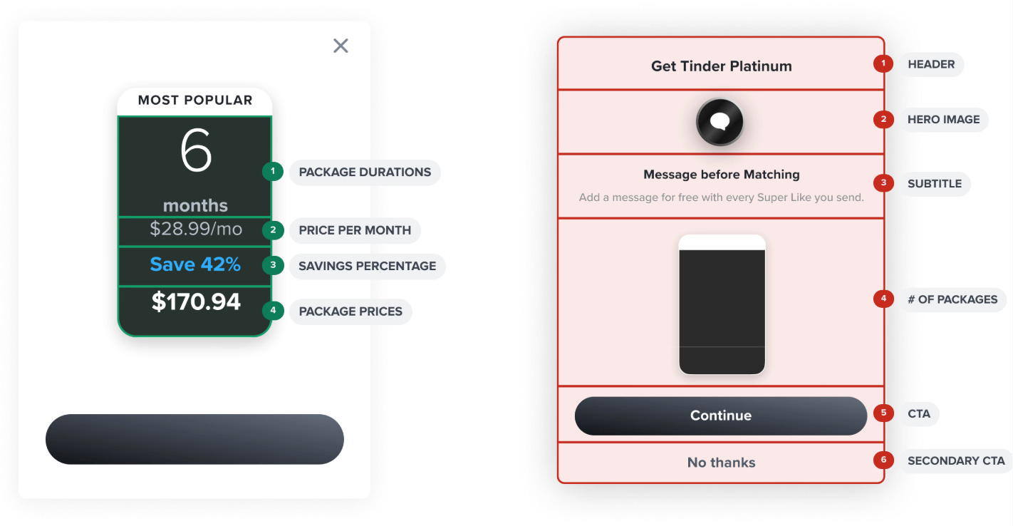
Originally, Tinder only had the dynamic elements broken out by the kind of price and package elements. They had package durations, price per month, savings percentage and the actual price as different elements they could edit.
They had to create a header element, hero image elements, message copy element, then continue with the packages, and CTA, and any secondary CTA.
How did they figure out what to build?
Before moving to full dynamic elements, they would A/B test two new designs to make sure, on the whole, the designs worked well and worked better.
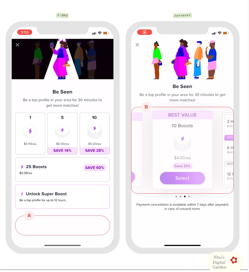
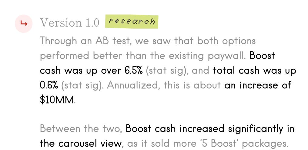
These learnings are great.
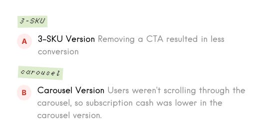
On the version with the three SKUs, they removed the CTA.
This resulted in fewer conversions, but then, for the carousel view, users weren’t scrolling through the carousel, so subscription cash was lower in this carousel version
CTAs matter!
How to Improve Web2App Paywall Conversion
Botsi partnered with Web2Wave on an amazing blog post that details 14 ways to improve conversion on your paywall.
I love tactical tips, so I thought my audience would be interested here as well.

Show users a visual of their outcome
…and 9 more!
👀 Read more here →
After they did a few rounds of data-driven A/B testing, they moved on to qualitative research.
Don’t ever forget the importance of actually talking to your users and getting feedback. This is important for big changes. You don’t need to do deep research for every single thing you do, but don’t forget about the qualitative side altogether.
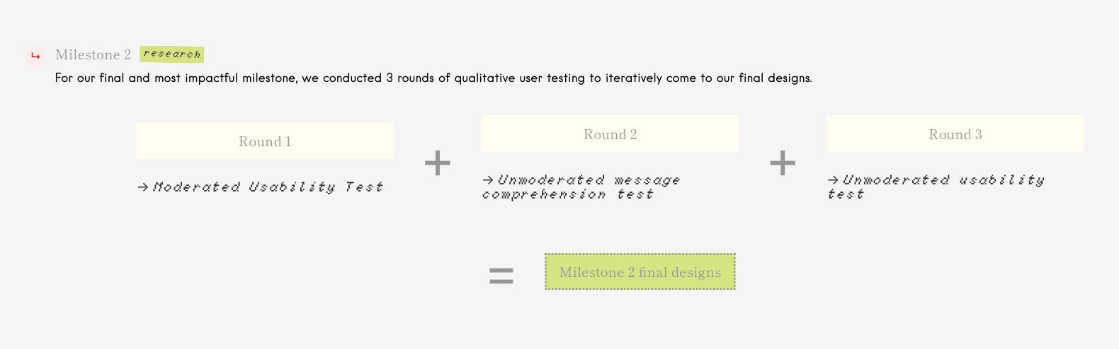
Look at the different types of testing they did:
Moderated usability test: this means someone is going through the product live with a user.
Unmoderated message comprehension tests: this means it’s asynchronous. They send something out, and they get something back.
Unmoderated usability test: A user is recording their interaction with the product
All these different tacitcs will get different insights and different inputs, so know the differentthe different types of research techniques.
It’s pretty cool to see how their paywalls are evolving over time.
Original vs New Prototypes
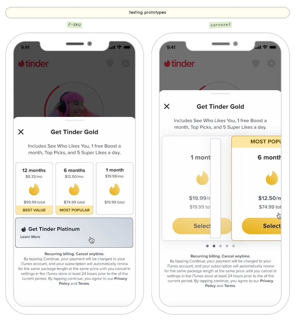
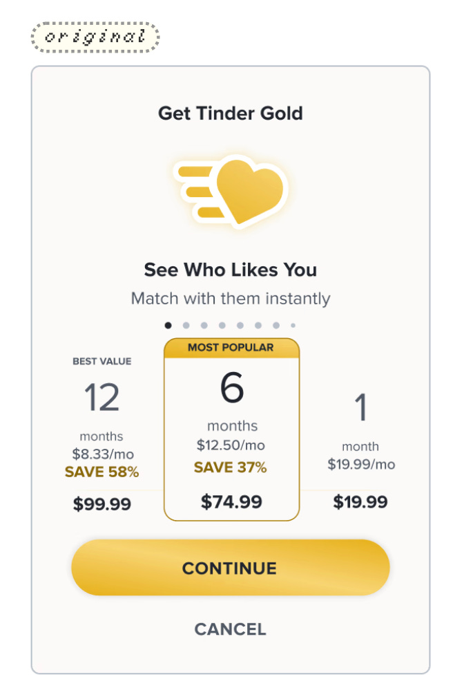
Not every app will, of course, have this many different subscription options.
Tinder has their gold plan, which drives most of the revenue, and also their platinum plan.
This confused users when they were displaying it all on one paywall.
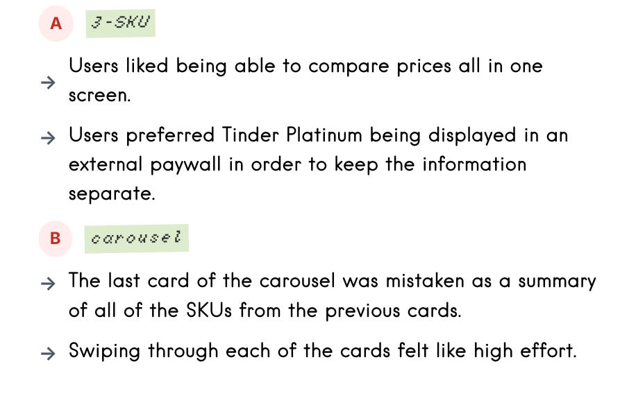
Users like being able to compare the prices all on one screen, but they preferred the Tinder Platinum being displayed on an external paywall in order to keep the information distinct and digestible.
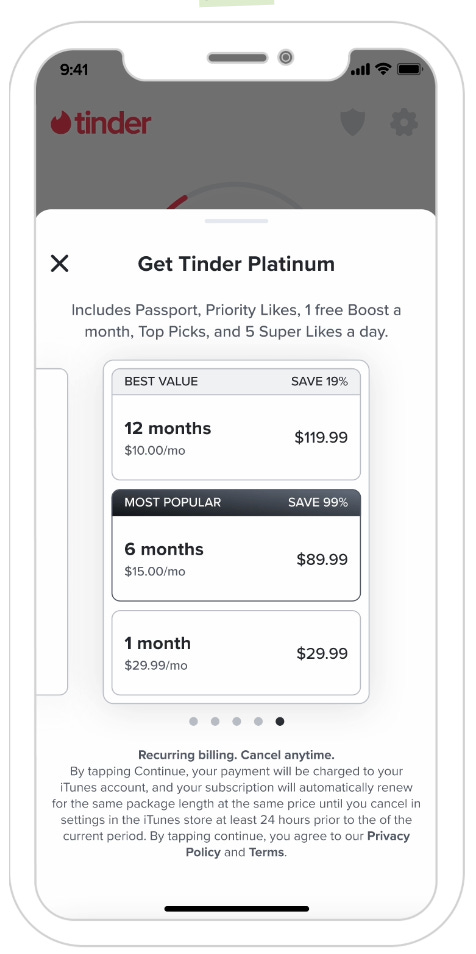
On the carousel view, the last card of the carousel was mistaken as a summary of the plan options.
Don’t just assume that every single user will read everything in detail, and so decrease the cognitive lift of actually understanding what you’re showing users whenever possible.
The most interesting thing in this whole piece are the learnings she has from each test and research phase.
A “View more plans” button can actually be a conversion win.
In these round three results, the “View more plans” CTA: no usability issues reported on the subpage, and people actually enjoy the addition of “View more plans.”
You still show people your preferred plans up front, but there are going to be some people who aren’t comfortable with those and want to choose other plans. It’s for people that have high intent, but your current options don’t exactly meet their needs
Should you have a carousel or a list of packages displayed in one view?
They said most users were successfully able to swipe or toggle between options and figure out the CTA and ultimately make the purchases for both options.
Think about how you’re designing your elements on your paywall
Do they look like they’re tappable or interactive? If they feel interactive, and aren’t in reality, this will create confusion for users
Okay, let’s see what the final results are
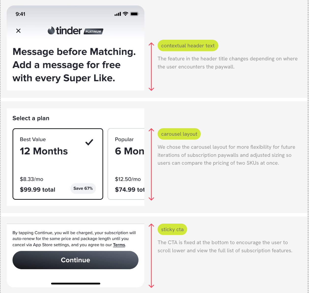
We see that the top of the paywall has a contextual header. They actually have personalized copy in the title based on where the user is coming from
Then, they ended up going with this carousel layout so they had more flexibility for future iterations of subscription paywalls, but they also left the ability to be able to compare different prices.
They did just the size of the card so you can see two prices at once.
This isn’t a revelation, but they have a sticky CTA button.
It’s fixed at the bottom of the page, so the CTA is always in view.
It also can encourage users to scroll down and see the full list of features to understand what you’re getting.
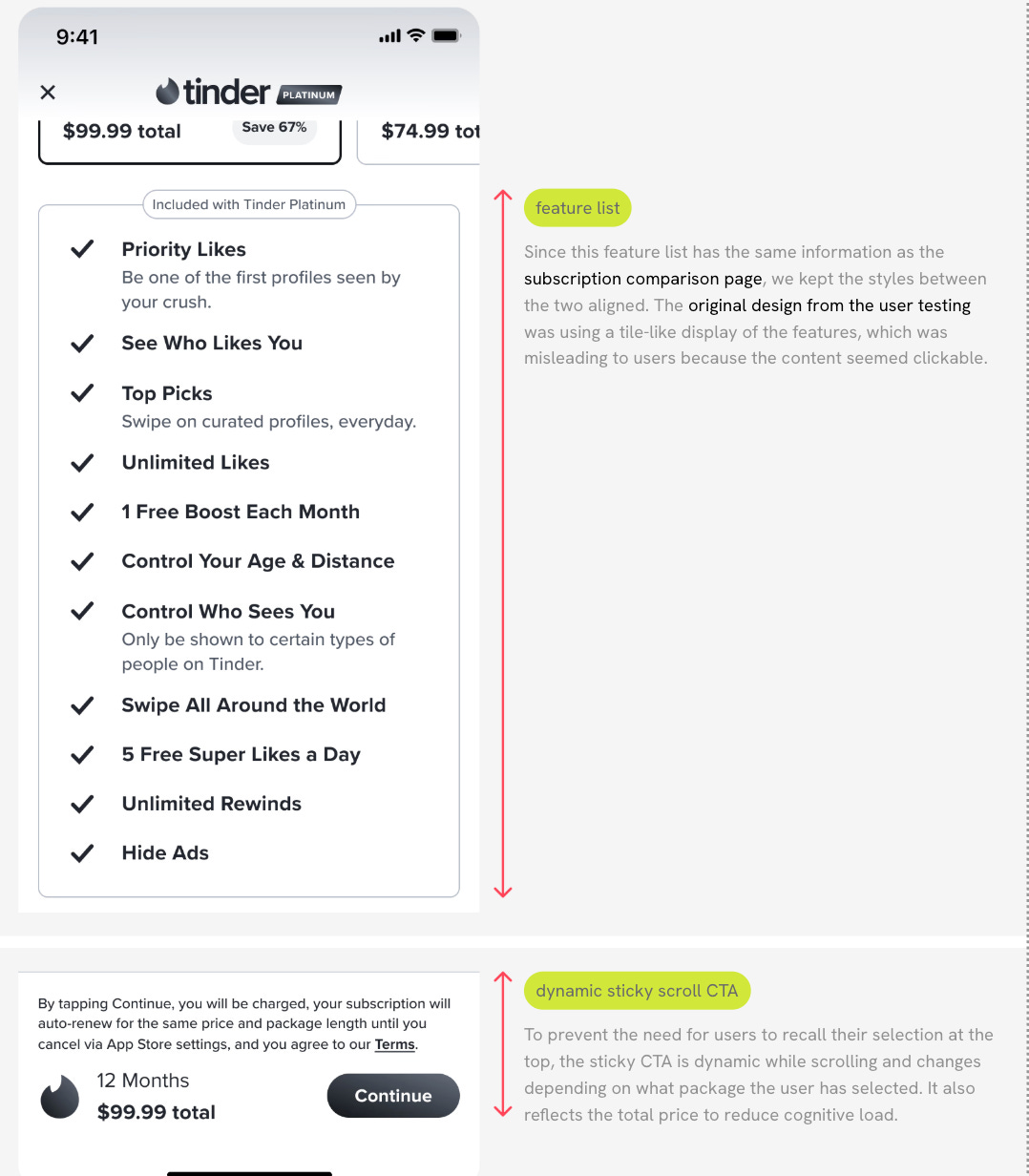
You can see they have the feature list down below the fold. They include the top little portion of it and make it visible, so people know that there’s something else to scroll to and look at.
The CTA button is still visible and sticky… but it changes when you scroll.
This is a pretty good tip if you have multiple product options and people can pre-select different options on the paywall.
When they select it, you can change the CTA button so it’s clear what their selection is and they remember it as they’re scrolling down
Let’s try to aggregate all the learnings from this entire article below
Always keep a CTA button. Even if you have multiple options, don’t think users will just tap on them. Keep a CTA button.
If you have multiple subscription tiers, make sure you have clear and understandable information about each tier and what they’re getting
Users like being able to compare prices all on one screen. Make it easy for them
Don’t overload users with information. If you have a secondary offering, It may be better to create a separate page for a new tier so there isn’t cognitive overload
Users are equally receptive to a list view or carousel view of plan options. Make sure that if you do a carousel view, users can see multiple plan options at the same time to compare prices easily.
Make the function of each element on your paywall clear and intuitive. If it appears clickable, and it’s not, this could confuse users.
Personalized contextual titles for a paywall based on where the user came from (or the user’s goal) will usually work better and improve conversions
If you have a longer scrollable paywall, make sure your CTA button is sticky so it’s always visible
And if you want users to scroll down on the paywall, give them a little hint by making something visible so they know there is more.
A “View More Plans” button is often seen as positive by users because it gives them other options. Not everyone will pick it, but if people aren’t really satisfied, they’ll self-select into that option.
Here are a quick view of what the paywalls ended up like:
📣 Want to help support and spread the word?
Go to my LinkedIn here and like, comment, or share my posts.
OR
Share this newsletter by clicking here.
