

Simply App Empire - Part 2
A macro analysis of every app and what they have in common

Hey there, it’s Jacob at Retention.Blog 👋
I got tired of reading high-level strategy articles, so I started writing actionable advice I would want to read.
Every week I share practical learnings you can apply to your business.
Retention.Blog is sponsored by Botsi
Botsi helps you show the right paywall to the right user to increase LTV by up to 70%. Learn more →
Missed the first one?

The Simply apps have so much going on, I couldn’t fit it all in one newsletter!
Today, we’ll do a macro analysis of all the apps.
And then we’ll to look at Simply Piano’s web 2 app flow versus their in-app flow.
We don’t have a lot of time, so enough waxing poetically, let’s get started.
Full cross-app synthesis: the Simply playbook
Now with all four apps, here’s the shared framework:
The universal skeleton
Every Simply app runs this sequence:
Brand/landing frame (length varies by buyer psychology)
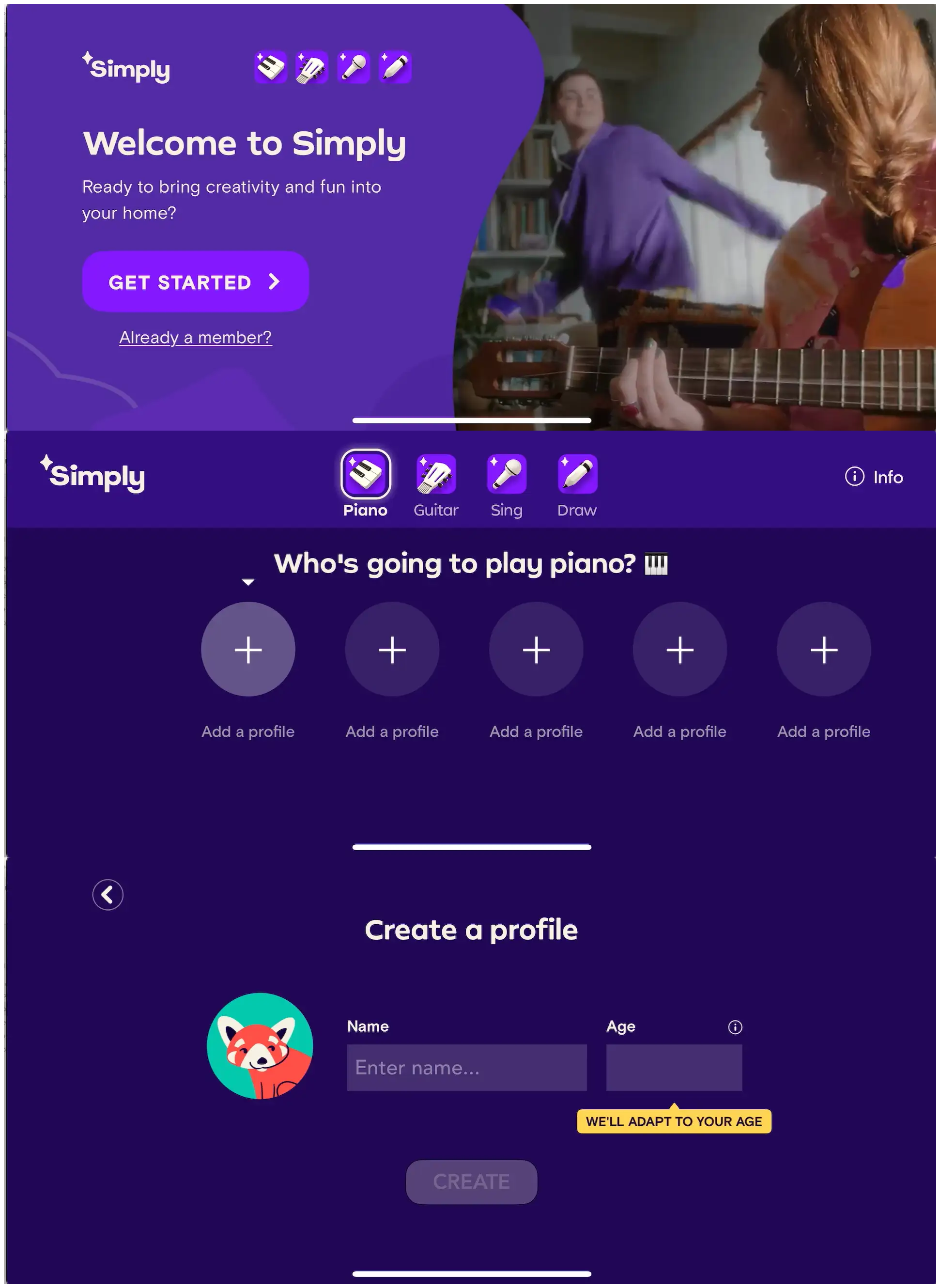
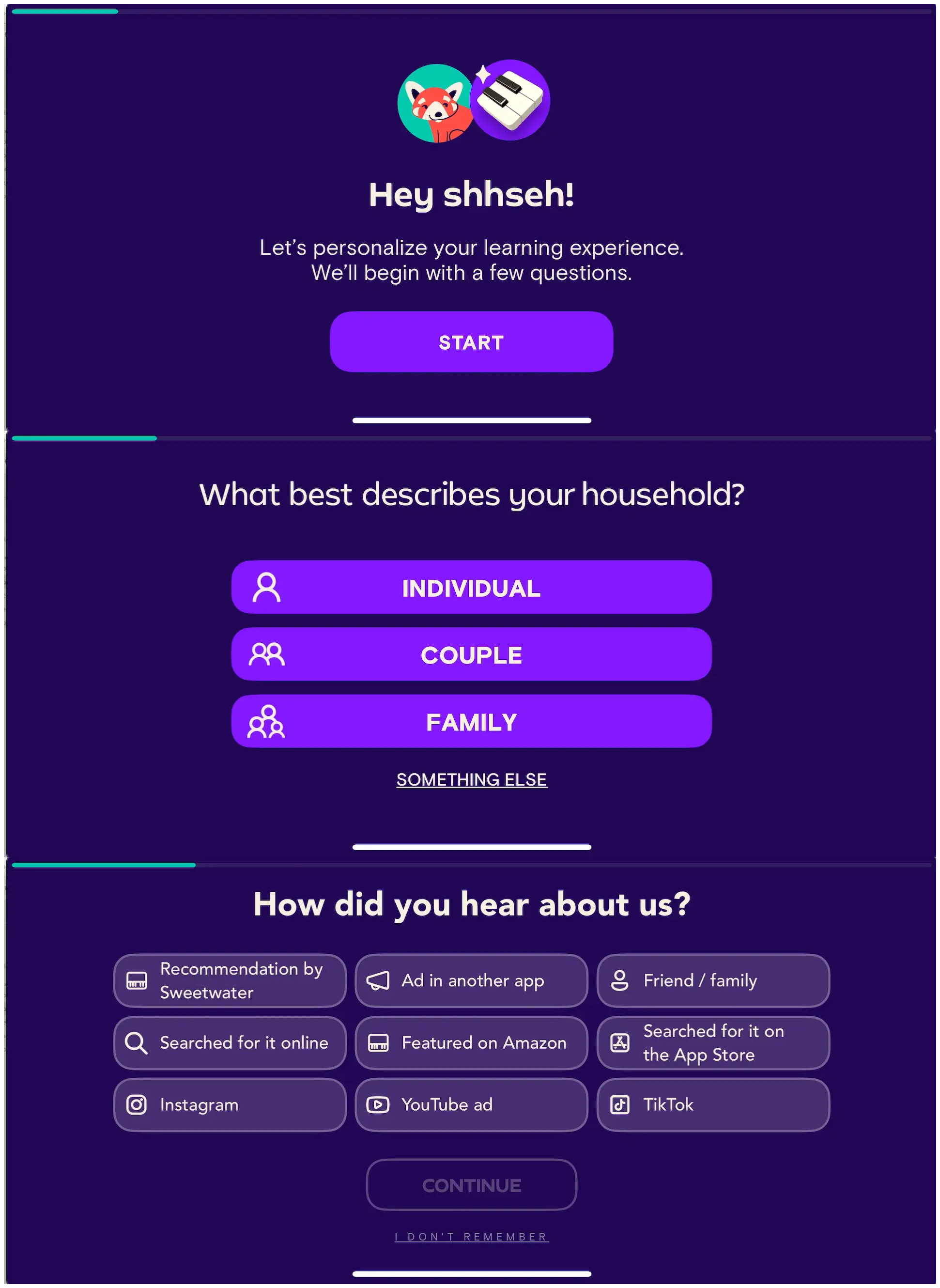
Account/profile setup (with multi-profile framing baked in early)
Attribution question (position varies by completion rate testing)
Identity ritual (name, signature, avatar, household type — app-specific but always present)
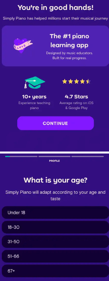
Age question framed as adaptive content, never demographics
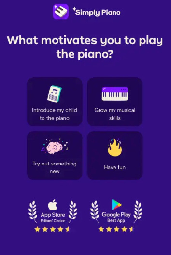
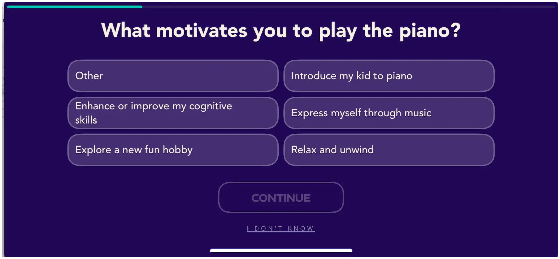
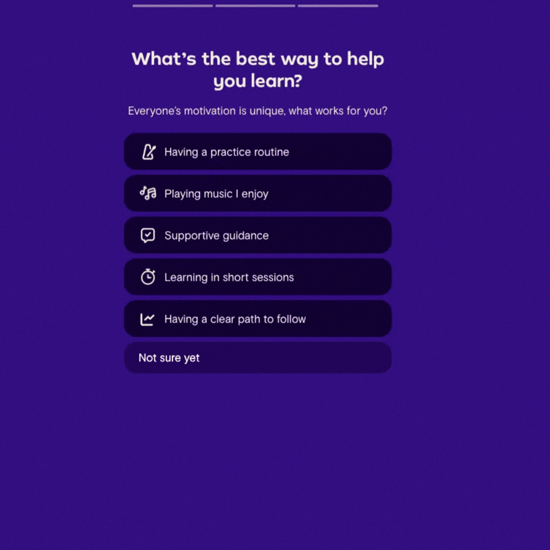
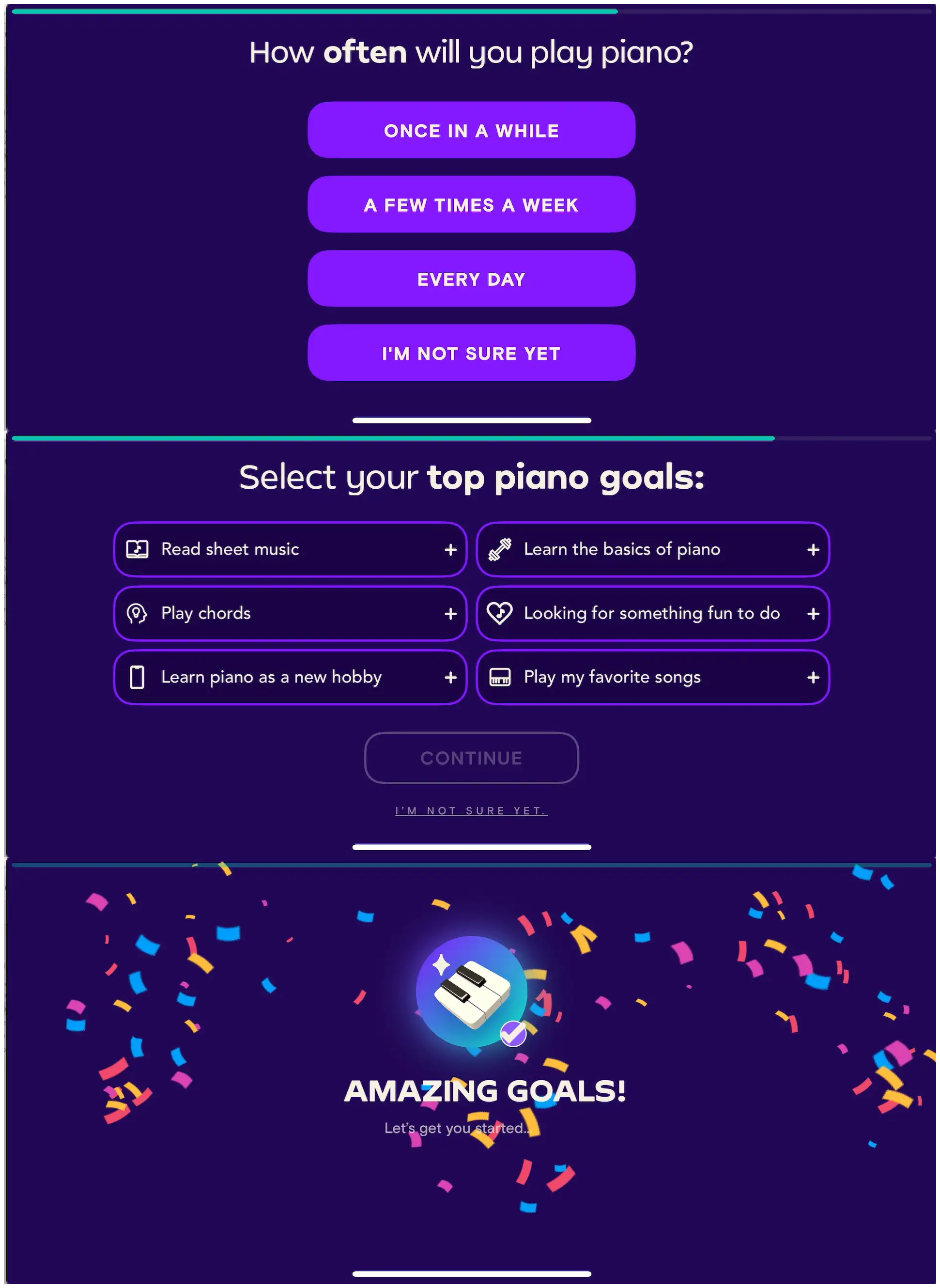
Motivation/goal multi-select (emotional + functional JTBD harvest)
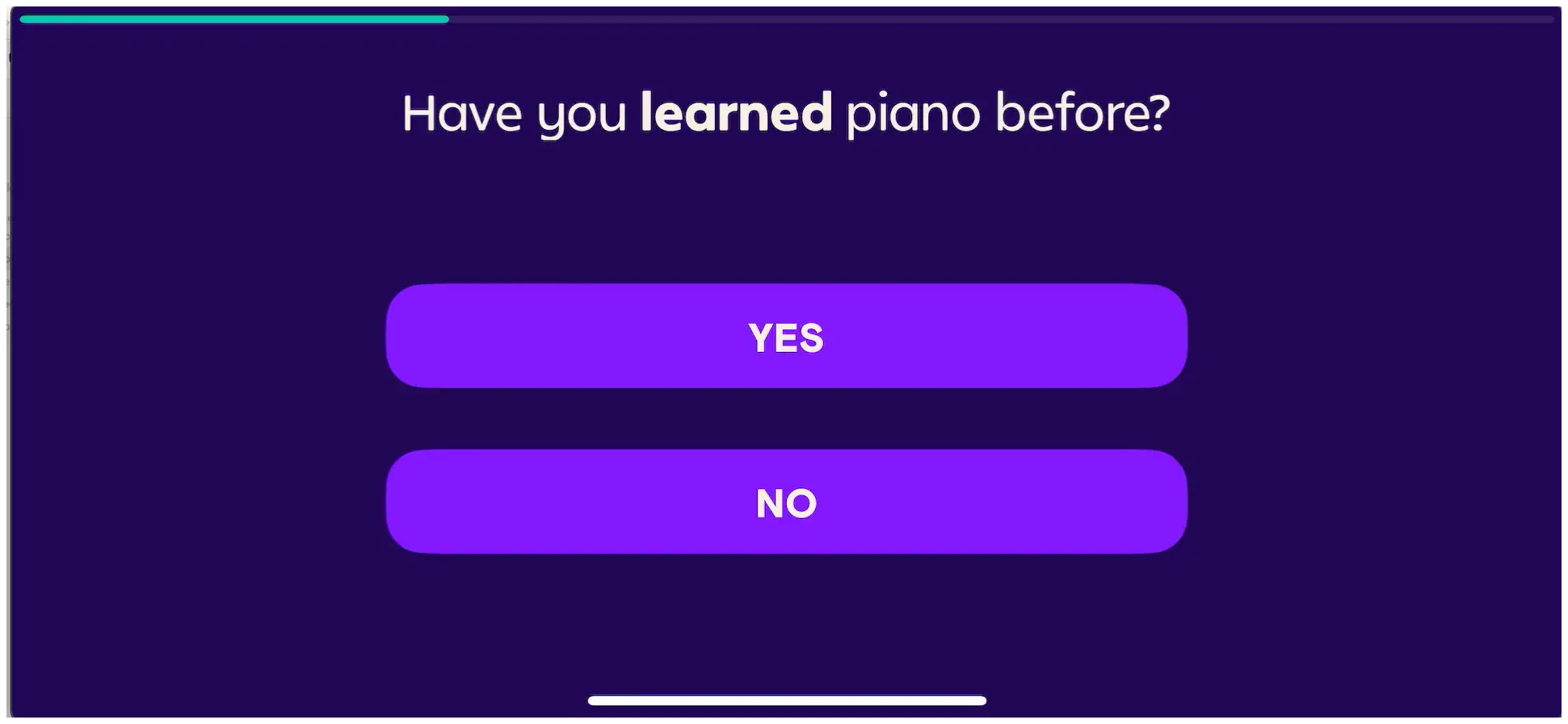
Skill self-report or probe (Piano uses both)
Practice frequency commitment (foot-in-the-door)
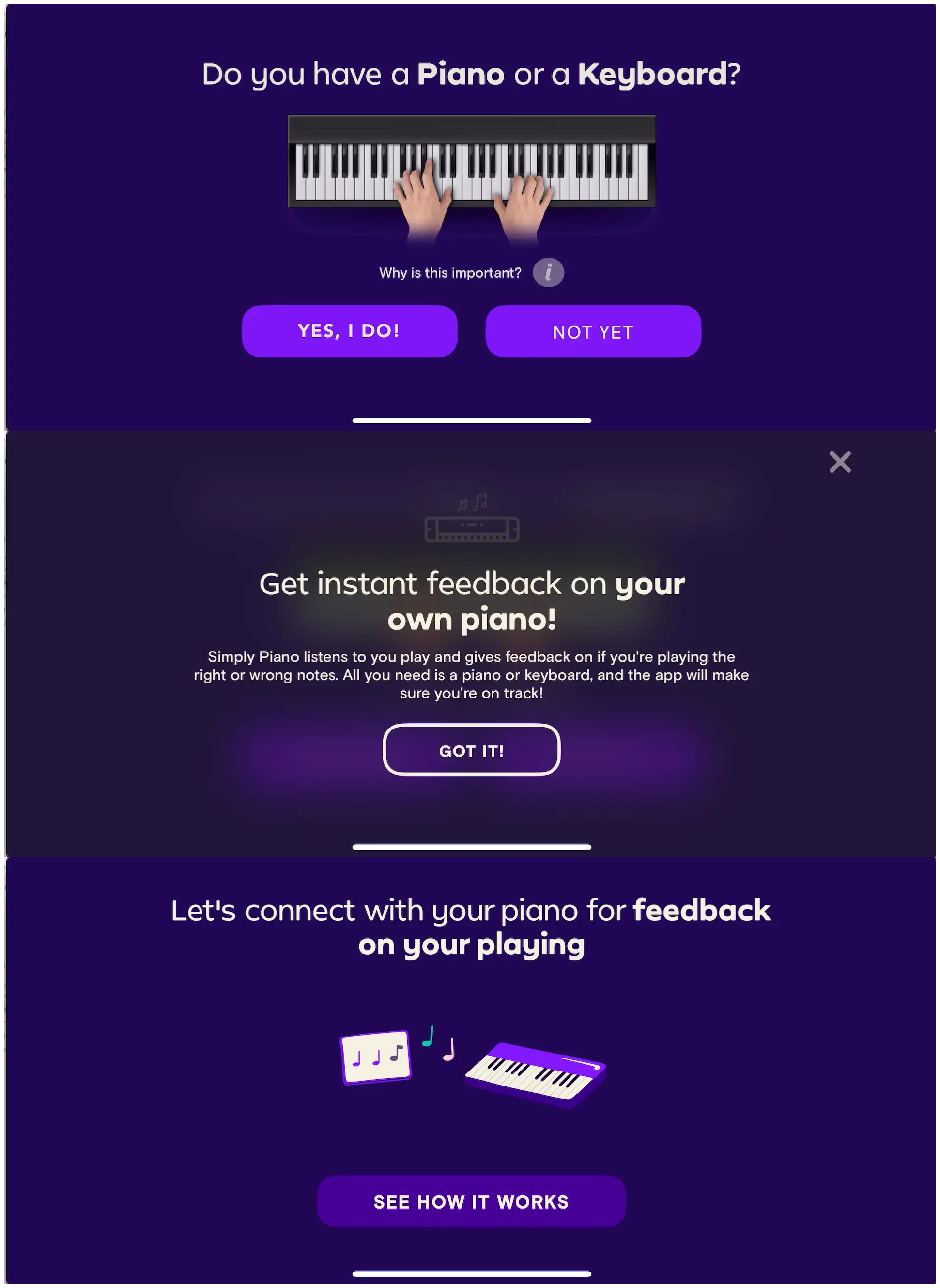
Equipment check with escape hatch (preserves funnel for no-equipment users)
Magic demo (the core AI/feedback loop, proven live)
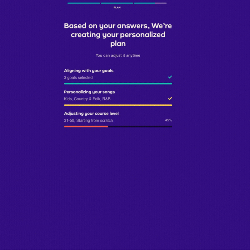
Value delivery (actual lesson content or assessment before paywall)
Emotional completion beat (celebration, medal, confetti, identity reveal)
Paywall with individual/family toggle, 12-month anchor with discount %, monthly decoy, free trial on the anchor
Curious about signal engineering and mobile measurement?
Shumel Lais, co-founder of Day30 and previously founded Appsumer (acquired by InMobi), explains why most subscription apps feed ad platforms the wrong goal, how precision and recall reshape signal selection, and what a realistic measurement maturity ladder looks like in 2026.

Listen or watch on Youtube, Spotify, and Apple Podcasts:
The five pillars of the playbook
Pillar 1: Frame every data ask as user benefit.
Age = adaptive content. Genre = personalized songs. Goals = tailored journey. They never ask for data without a framed-as-value reason. No app says “we need your age for demographics” — it’s always “your age impacts your vocal range / learning pace / experience.”
Pillar 2: Build commitment through ritual before asking for money.
Signatures, avatars, vocal range reveals, chord recognition, drawing detection, piano note detection. The user has done something real before they see a price. The sunk cost is psychological, not monetary.
Pillar 3: Prove the tech works live.
Every app has a “magic moment” where the AI/CV does something obviously impressive with the user’s real input. This is not optional in the Simply playbook. It’s the single biggest differentiator from competitors that just paywall a course library.
Pillar 4: Family plan is a portfolio strategy, not a pricing lever.
The household question (Piano), family profiles (all four), and “All Simply Apps” bundle (Guitar, Piano) are coordinated. They’re not trying to upsell individual users to family — they’re using the individual paywall to educate about the family plan’s value. LTV on a family plan across the portfolio is probably 3-5x individual.
Pillar 5: Backload the paywall, frontload the value.
Piano’s annotation confirms what the others imply: the intro lesson, skill probe, and magic demo all happen before the paywall. By the time the user sees a price, they’ve already experienced the product and built an emotional narrative about their progress.
The magic demo is the most important shared pattern across all four apps, and I didn’t say enough about it in Part 1 of the newsletter.
Every Simply app has a moment — before the paywall — where the app’s core technology performs on the user’s real input:
Sing: the vocal range test. You hum and shout into the mic. The app tells you you’re a “Bass” and shows you famous bass singers.
Guitar: chord preview and strum recognition with real-time feedback.
Draw: take a picture of your drawing. The AI detects and grades it.
Piano: connect your phone to your real piano, play a key three times, the app confirms “we can hear you perfectly.”
This is not the same as a free first lesson. A free first lesson shows you the content. The magic demo proves the technology.
Any skepticism the user had about whether a phone app can actually teach them music/art got destroyed by their own experience with it.
If your product has real-time feedback, AI magic, or smart detection — make the user experience it before you ask them to pay.
20 minutes is the portfolio-standard outcome claim
Guitar: “You’ll be playing a song with these chords in about 20 minutes!”
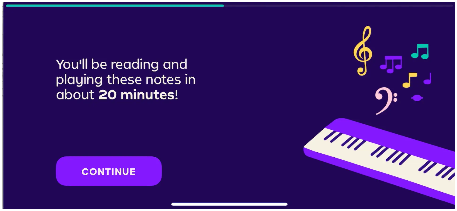
Piano: “You’ll be reading and playing these notes in about 20 minutes!”
“20 minutes” is a tested threshold. Long enough to feel real. Short enough to feel painless.
Pick your version of 20 minutes. Whatever your product is, what can the user credibly achieve in 20 minutes of first use?
Put that number on the screen.
What’s different by app (and why)
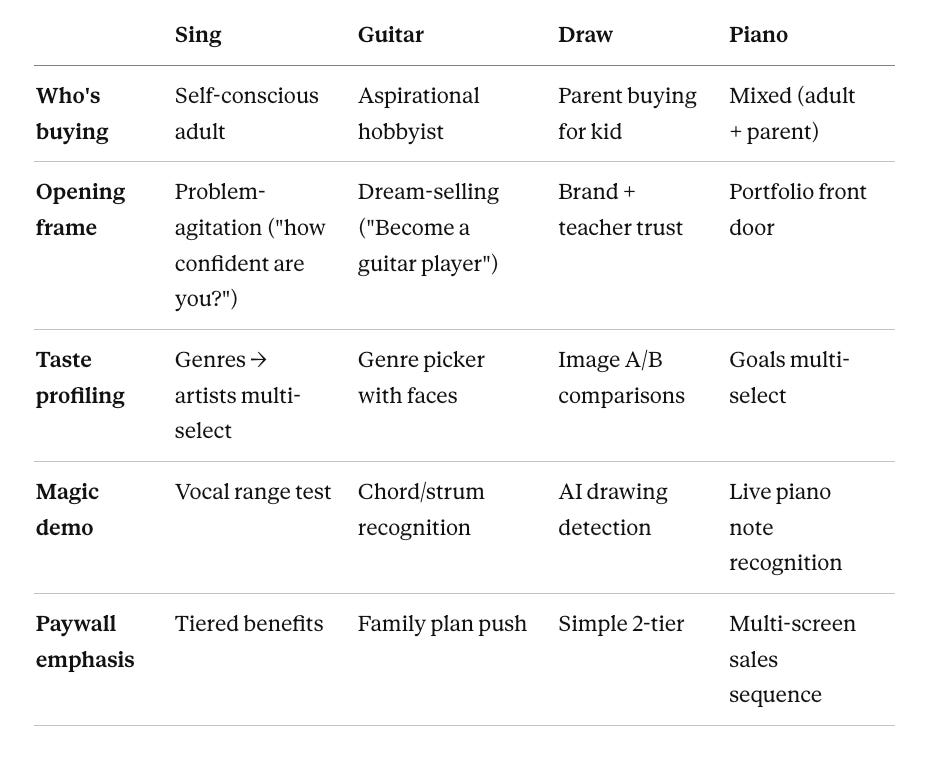
A few things worth calling out:
Sing opens with problem-agitation. Guitar opens with aspiration. People who want to sing are often insecure about their voice. People who want to play guitar are excited hobbyists. Meeting people where they are.
Draw opens with a teacher video. Because the buyer is a parent, not the user. Parents want to trust the teacher, not be sold to.
Piano’s landing is the whole portfolio. Because it’s the flagship — the front door for the whole business.
Attribution position varies. Sing frontloads “how did you hear about us?” to screen 1. Guitar pushes it 8 screens in. Draw puts it after a full identity ritual. Piano lands in the middle.
One last pattern to remember
Simply’s paywalls don’t work because the paywalls are well-designed (they really aren’t).
They work because by the time you see them, you’ve already played your first notes on your real piano.
The sale happens before the paywall.
The paywall just collects.
WEB FUNNEL TIME!!
Web Funnel
When I look at their Facebook ad library, they have the majority of ads leading to web, so this has to be a major acquisition driver for them.
Web:
Mobile:
On web, we need hook them, and hook them fast, so we want super simple questions to get them to make some investment
On mobile, they’ve already downloaded the app, so it’s okay if the first thing we do is ask them to create an account or profile
And they do tell you they adapt to your age, so it doesn’t feel like a creepy question
Web:
Mobile:
You can see on web, they need to do more selling and motivated with awards, social proof, and more.
On mobile, they don’t seem to make as much effort on “Selling” and focus on asking questions to show personalized value.
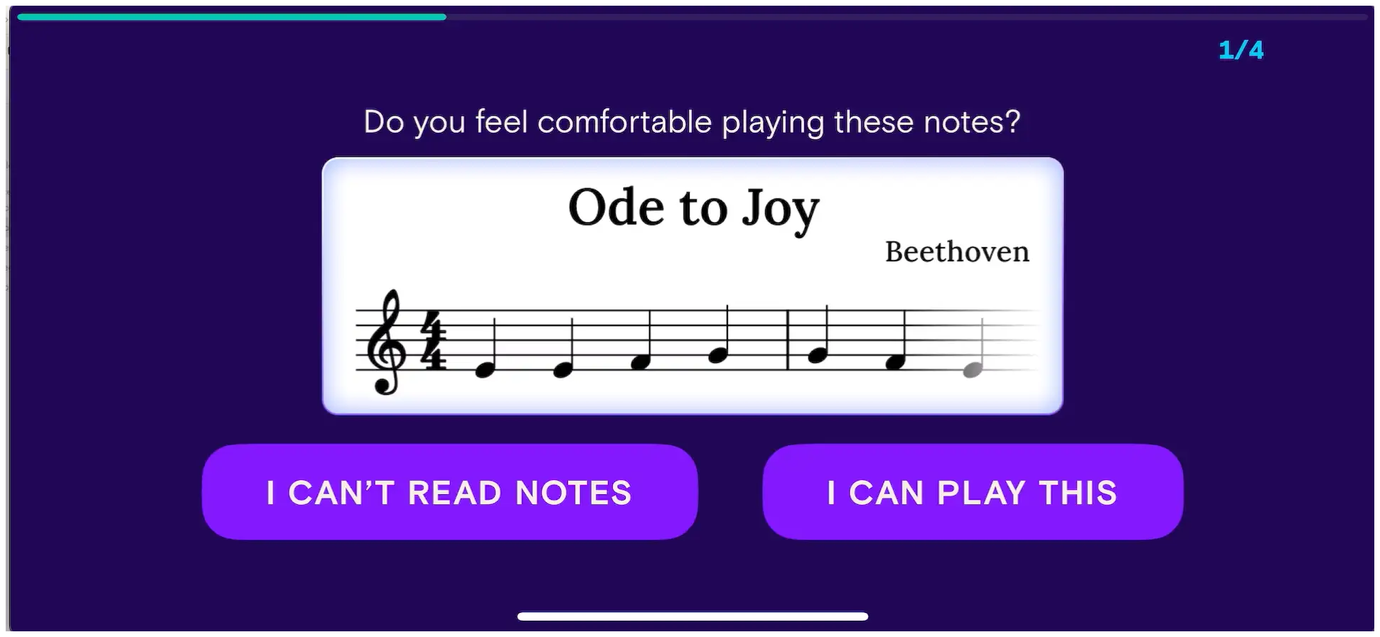
^ These two screens are important to review - they ask a question about your knowledge and experience. Then follow up convincing that you’ll get value fast!
This is the exact format they use in other apps (Simply Guitar):
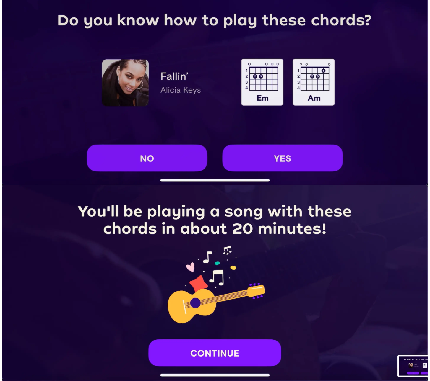
People need to know they get results quickly.
Web:
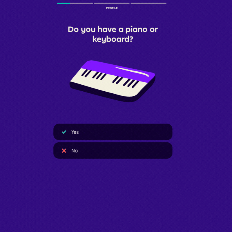
“Do you have a piano or a keyboard
“Do you have any previous experience playing piano?”
“No worries you’re in the right place!”
“What kind of learning style do you enjoy?”
“How often do you estimate you’ll practice?”
“Every learner starts somewhere different”
“Unlock new possibilities with the Simply Method”
“What would you like to achieve?”
“Awesome choices!”
You can see with the web flow, Simply Piano does a lot of:
Ask a question
Follow up with reassurance and/or positive encouragement
As opposed to mobile, it’s very tactical to get the info they need to personalize your experience.
The web flow as about 27 screens, while the mobile only around 15 because you actually start experiencing the product.
On web, you need to create more engaging flow since it’s so easy for someone to leave. It’s easy to leave on mobile as well, but your use has already taken the time to download the app, so they must have some level of higher intent.
From Sylvain Gauchet’s Growth Gems:

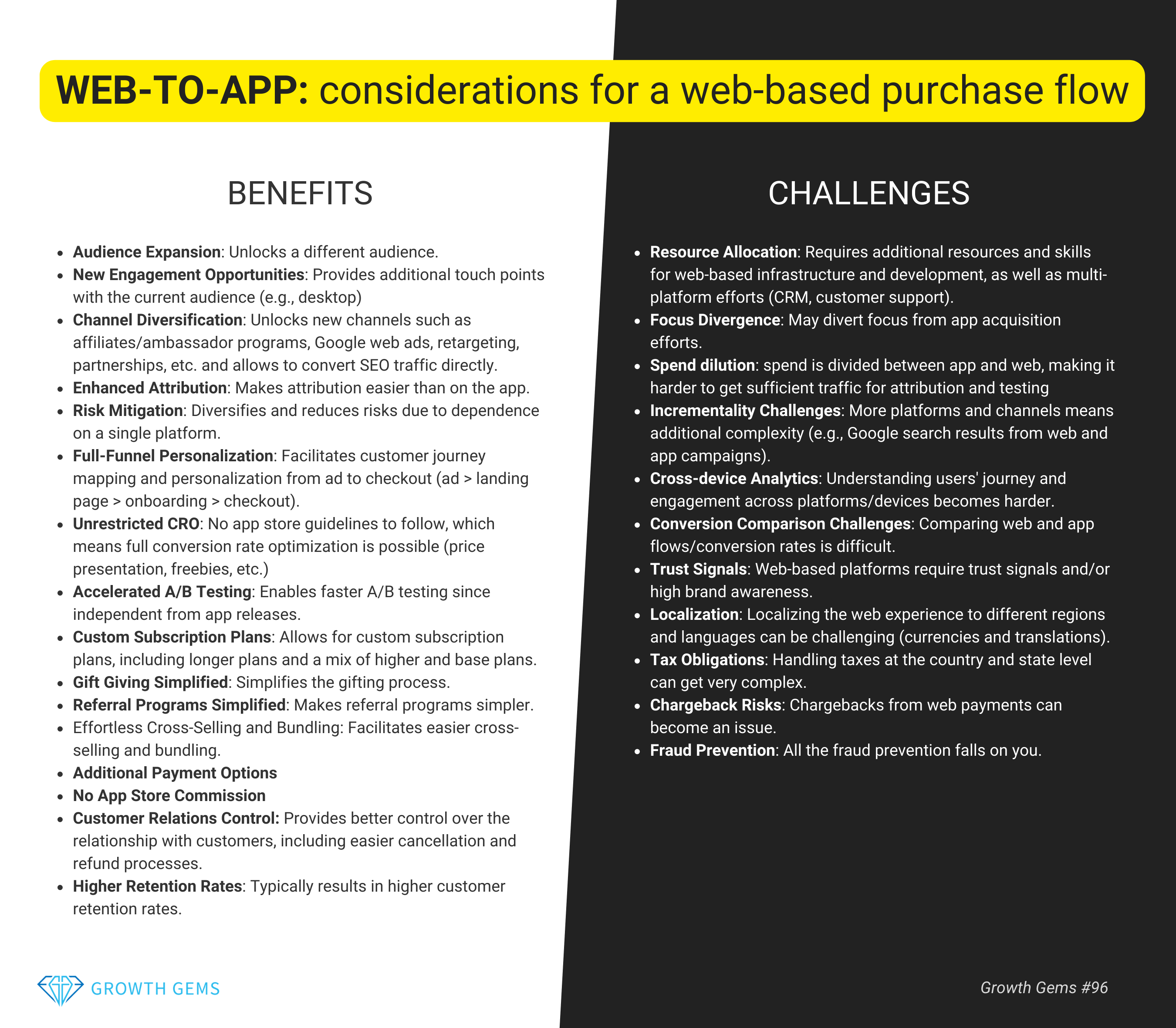
Before you just go diving into a web subscription flow, this has tons of useful info to think about in terms of pros and cons.
Next steps in the web flow:
Back to mobile UI:
You can see that they still ask some of the same questions across both flows, but the order of the questions is often different
On the web side, they still have like 10 screens and the paywall and then you have to download the app to truly experience the product.
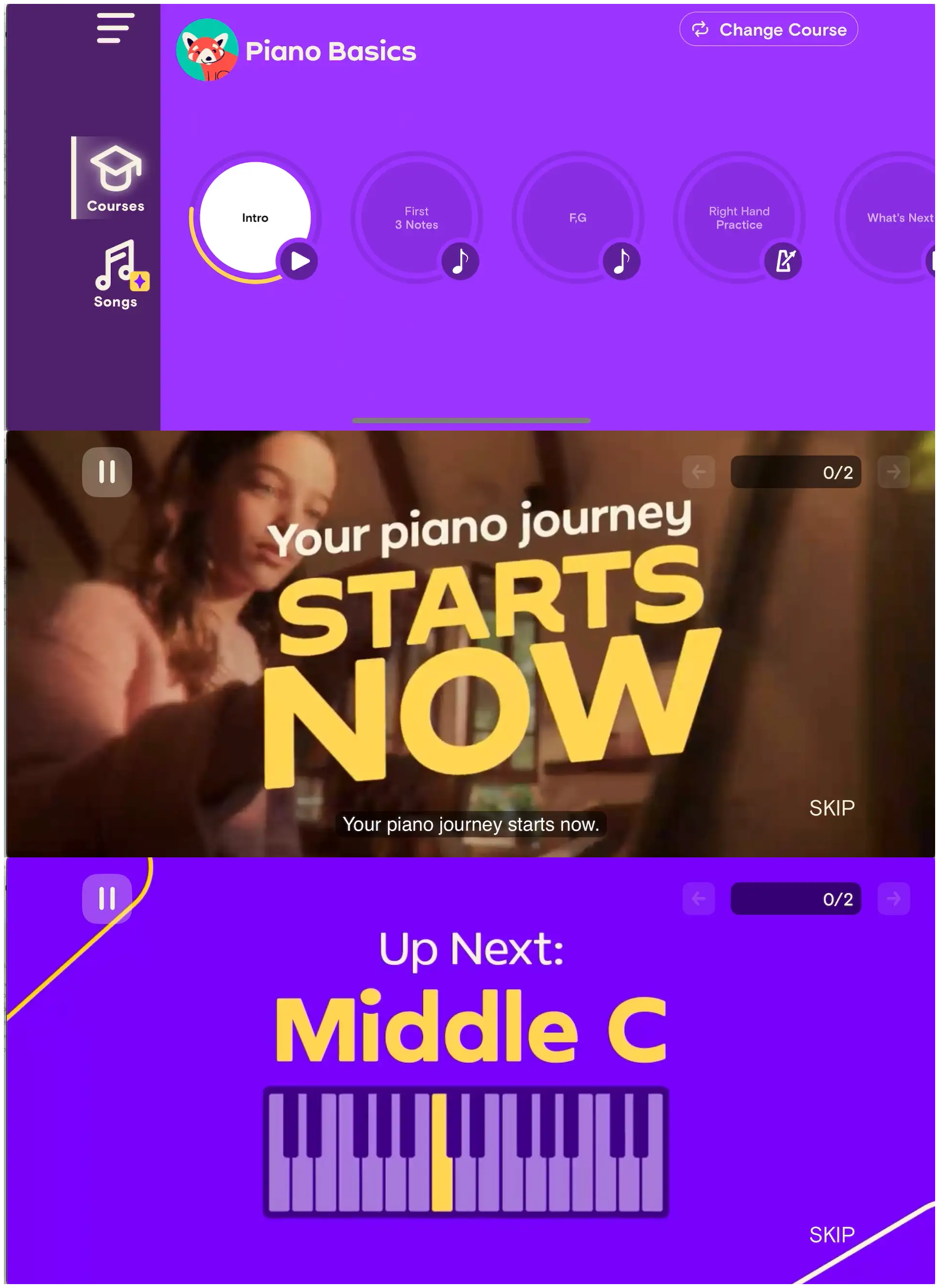
Simply Piano on mobile doesn’t waste much time and gets right into!
The number one message from Part 1 of exploring Simply is:
Show value early and get users invested before the paywall!
The showing of value on mobile is much easier because you’re already in the product!
Okay, here is the web flow:
As you can see, Simply has to try much harder to show value in the onboarding before you even see the product.
I think they likely do a good job of this based on the scale of their business, but this requires a longer onboarding.
and the web paywall:
When we look at the mobile version, it feels like they’re not even trying to convert you.
But then we get into the actual product.
They’ve invested in a very strong experience, and high quality video.
High quality video or animations can much such a large difference in terms of perception of your product.
Similar to the other products, Simply Piano invests in the following formula on mobile:
Step 1: Create a truly valuable and great product.
Step 2: Create a simple onboarding flow with simple personalization
Step 3: Give people the first lesson free
Step 4: Lock subsequent lessons behind a paywall
Here’s the updated formula
The Part 1 formula was good. Here’s what Piano adds:
Create a truly valuable and great product
Focus the product on one core use case
If you have multiple apps, use the biggest one as the portfolio front door
Ask about household composition early to pre-commit to family plan later
Create an onboarding flow with simple personalization
Use a skill probe, not just a skill question
Sell users that they’ll receive value quickly (~20 minutes)
Add high-quality video as part of onboarding
Prove your tech works with the user’s real input before the paywall — this is the magic demo
Give people the first lesson free
Personalize the first lesson to their level
Create high-quality interactive experiences that keep people engaged
Turn the paywall into a multi-screen sales sequence, not a single price page
Show individual and family side-by-side, with family offering obvious extra value
Lock subsequent lessons behind a paywall
Price the app as a premium product, because it is
So what did we learn?
If you have a great product, don’t be afraid to let it shine.
You don’t need to convert everyone in your onboarding funnel, you can let them experience the product, and then ask them to pay for once they understand the value.
But web 2 app is different than mobile onboarding. You may need to sell a little harder than you’re used to in web subscription flows.
Here is a Whimsical board with all the screenshots →

📣 Want to help support and spread the word?
Go to my LinkedIn here and like, comment, or share my posts.
OR
