Practice more gratitude
A public walk through of a new app
Hey there, it’s Jacob at Retention.Blog 👋
I got tired of reading high-level strategy articles, so I started writing actionable advice I would want to read.
Every week I share practical learnings you can apply to your business.
We’re doing something different this week.
I talked with a founder and asked if he was interested in me sharing some suggestions in public.
He agreed! (Hi Devin 👋)
The new user experience is usually the most impactful for monetization and retention so I focused here.
Onboarding and the new user experience touch everyone and most trial starts happen on the first session, so this is your highest leverage point.
Let’s start at the beginning!
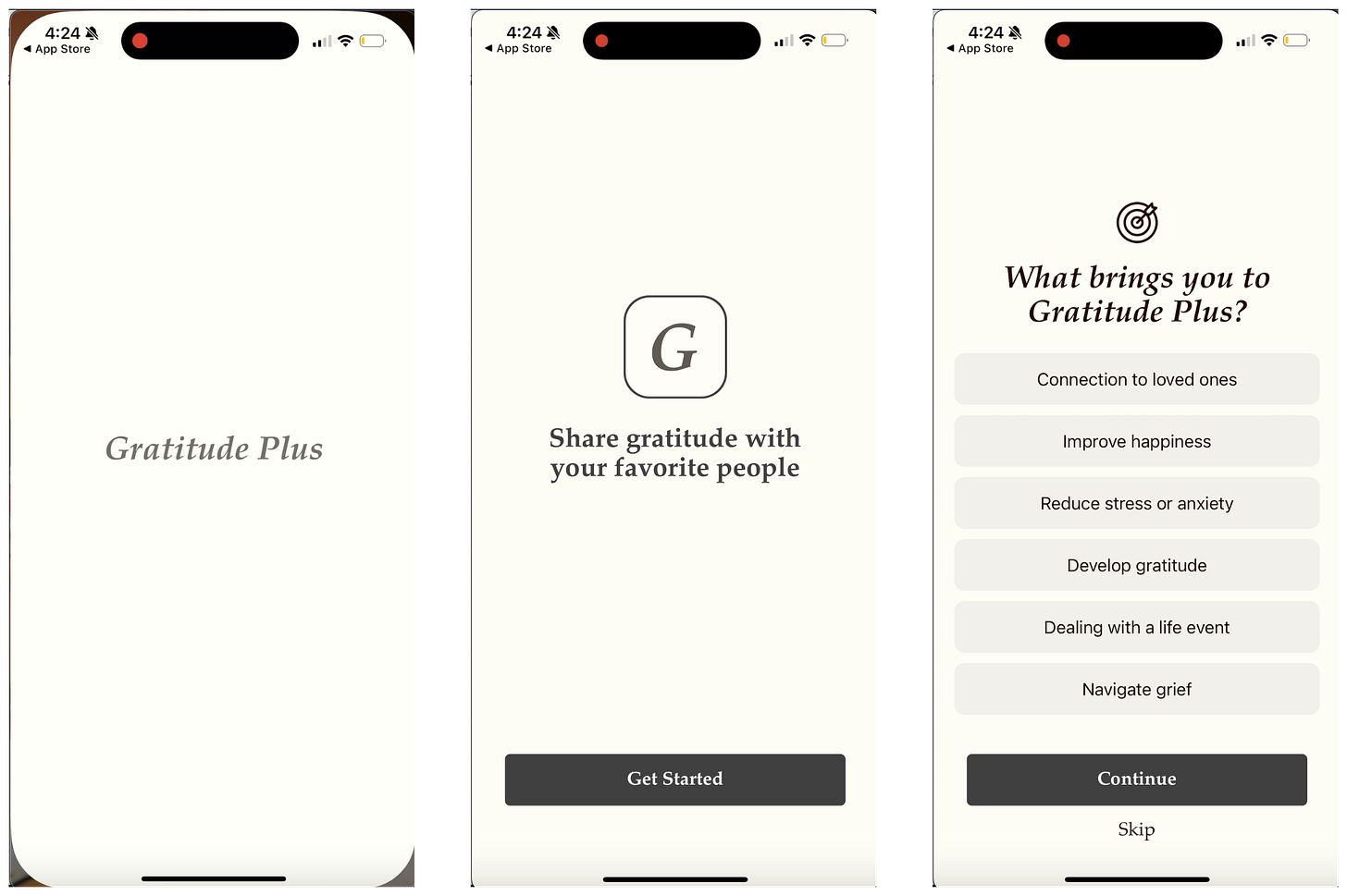
First impression: I’d love to see some social proof
My main goal for the beginning of onboarding is to get people excited. How do we instill more emotion?
I checked their app store preview screens, and I think they could incorporate some elements from there into this initial “Welcome” screen:
Which do you find more exciting?
Humans make decisions based on emotion and then we try to rationalize our decisions with logic later.
Emotion first → reinforce with logic
Next screen: “What brings you to Gratitude Plus?”
I love asking people about their goals, but I’m not confident it’s the right question to start with
Easing in with a very simple question is often better.
If it’s the first question people won’t take the time to truly think about it and just tap “Next”
A small detail: I don’t love including the text “Skip” as a separate line
If people see the “Skip” they’re more likely to skip (duh)
But if we think that our questions improve the user experience or improve conversion, why do we want to let people skip?
If we really want to give people the option, we can do two things:
Allow users to Skip on the same button and change the button text to “Continue” once they select an option
Keep the text as “Continue” and make it tappable regardless of whether they select an option or not
Gratitude Plus then moves into a question on age and a standard HDYHAU.
“We use this information to improve the app for you” - this should be featured more prominently.
This message is important for users to see and right now it’s crammed into the bottom of the screen. Showing this at the beginning of onboarding makes users more comfortable with answering questions.
More importantly, there are 3 screens of asking questions without showing any value.
A few ways to improve these first few screens:
Ask a simple question first:
“What’s your name?”
“Have you used a gratitude journal before?”
After asking about goals, reinforce that you can help with those goals
“What brings you to Gratitude Plus? Improve happiness.”
“Great! Gratitude Plus users report on average feeling 3x people.”
Asking about age gives a nice opportunity to reinforce you’re the right product for them:
“How old are you?”
“You’re in the right place. We’ve helped 35,562 people your age.”
Get specific with this number^
Hmm, account creation is next?
A few issues:
I don’t really understand the value yet, so I’m not sure if I’m ready to create an account
“Create an account to save your progress” - what progress? 3 questions?
If I select “Email”, “Name”, “Email”, and “Password” are on one screen.
It’s usually best to break these up on 3 separate screens to reduce cognitive load
And most importantly, we’re going to lose a lot of users at account creation.
This results in a lower install → trial/subscription conversion rate since they’ll never come back.
Most people: “Ugh, I have to create an account to see anything? No thanks, bye.”
Can you make up for losing 20% of new users because you can now win back people with email? Very doubtful.
Then we have push opt-in.
Asking users to select their reminder time is a great approach!
But asking users to create an account and then to opt-in to push immediately after will reduce opt-in rates.
We all get tired of answering questions and giving info, so we start to lose steam. Try to alternate between asking questions and providing value.
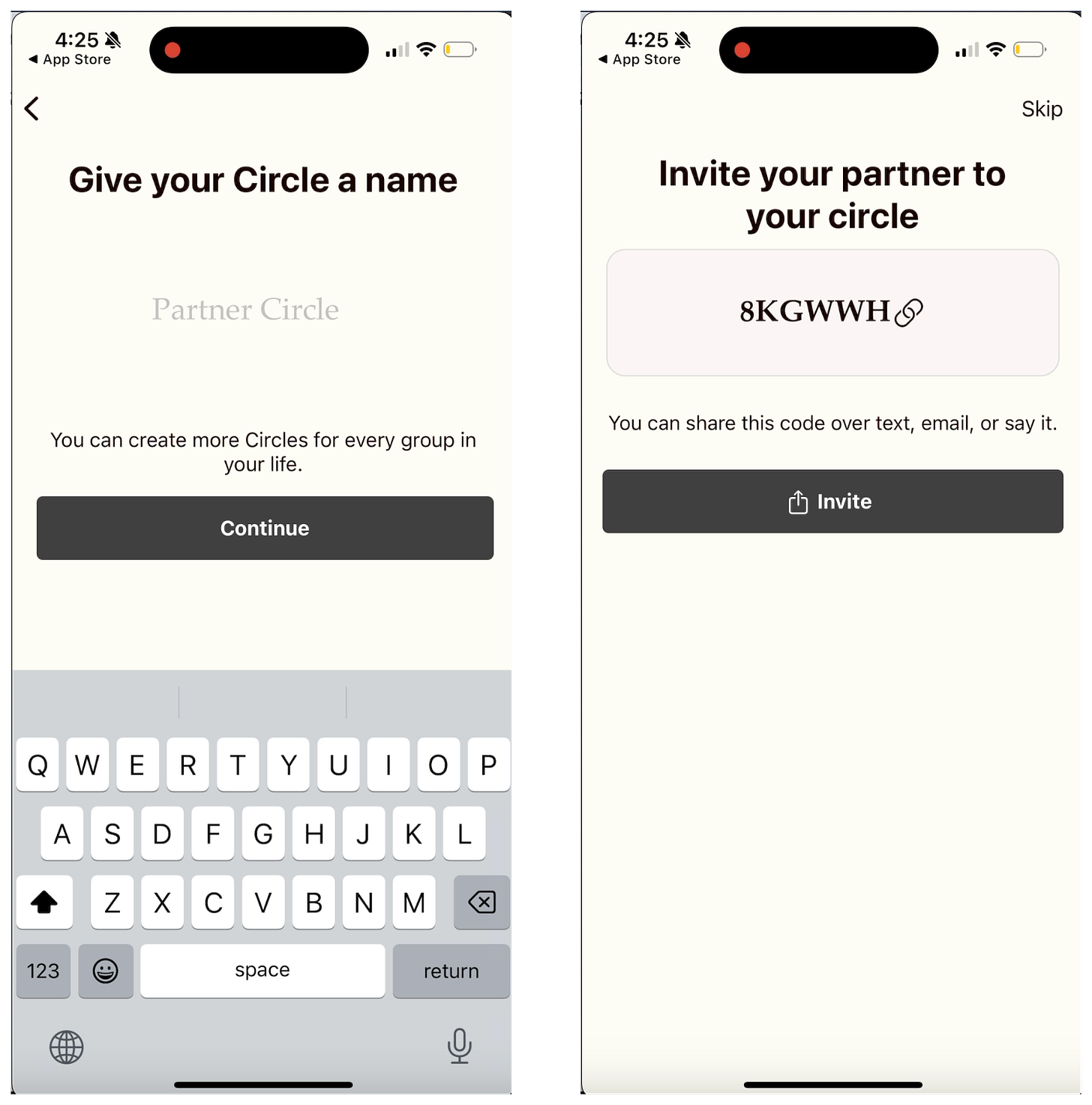
Let’s create a Circle!
Circles seem like a cool feature! I think I understand it, but I’m not 100% sure
I selected “Partner”, so I kinda expected it to be “What’s your partner’s name?” not “Give your Circle a name”
Also, the “Join with invite code” option should be at the very beginning of onboarding. If someone sent me an invite code, I’d be looking to input it immediately. A custom new user flow for invitees might make sense.
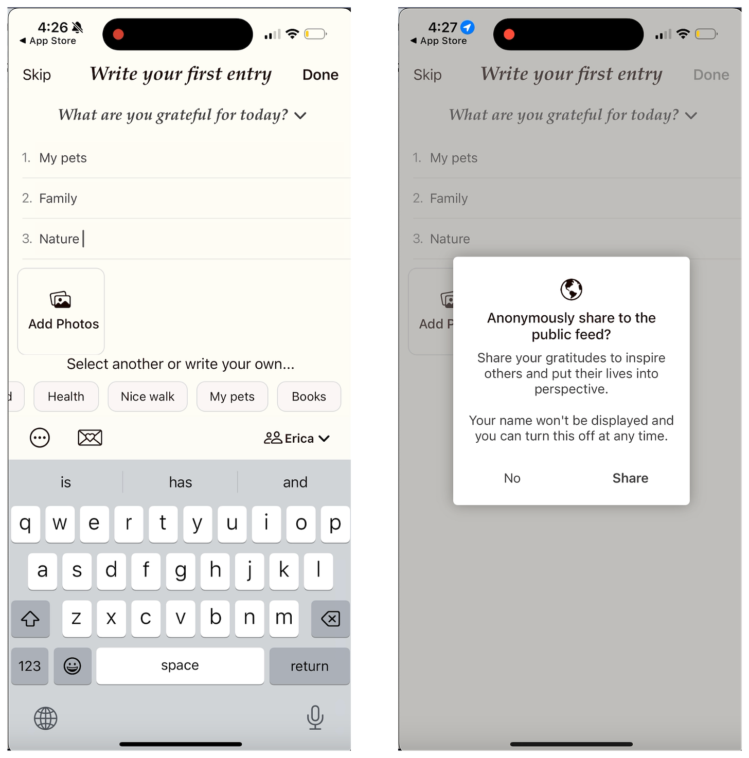
Let’s write an entry!
I’m happy the first journal entry is before the paywall. This seems like the most important part of the experience.
I didn’t realize until later that the drop-down arrow next to, “What are you grateful for today?” gave me more prompt options.
This feels like it could be more important to point out with a tool tip versus the “suggestions”
General prompts like, “What are you grateful for?” are hard because they’re so broad.
Think about when someone asks you, “What’s new with you?”, your mind goes blank.
This feels tangential to the “Paradox of Choice” by Barry Schwartz. There are so many options to choose from you don’t know where to start.
Compared to if you’re asked, “Think about one thing that happened yesterday that you’re grateful for” - it’s much easier because you can go through your day and have a limited set of choices.
I’ve created my gratitude entry by selecting the suggestions, but it doesn’t feel super personal to me because I didn’t write anything myself.
Woah! Now you’re asking me to share this to public?? Share my deepest darkest secrets!?
I need to understand what will be shared and how it will appear
I haven’t seen the public feed yet, so it would be good to preview this first
“Anonymously share in public” is weird phrasing. I get it, but the language feels odd
The public feed can be a very cool feature that adds value, but I need to see it first!
I recently looked at Ladder at thought they did a good job of building excitement and motivation around sharing in public feed:
Woohoo! I started my streak!
This streak page builds on itself, so everything isn’t presented at once, but it still feels a little busy.
I’d prefer to have the mood check-in separate, at least the first time, so you can explain it to me more.
I’m a huge fan of affirmations, but I’d appreciate the affirmations on it’s own page.
By squishing it in the bottom of the screen, you’re diminishing the value and implicitly telling the user they don’t really need to care about it.
If it was big and bold and on it’s on screen, I’d be much more likely to engage.
An idea from the Breeze app:
Make the default share button link to the standard share card vs “Share to your Circle”
People like to share affirmations
People aren’t in your “Circle” yet during onboarding
This is an opportunity to increase organic WOM
On to the paywall!
This is a decent paywall but has room for improvement.
Does this paywall get you excited?
If you’re going to use color for the affirmations, you might as well for the paywall too. That’s much more important. Or at least add some visual differentiation between the sections to show the user what to care about.
Other quick thoughts:
This paywall has too many bullet points for too much reading
You title is “Choose your Plan” but there is only one plan? Do you want people to go select something other than yearly?
Are all of these bullets of equal importance? The first 4 are features while the last is a stat about why they should use it.
Features over benefits. I don’t care that I can attach photos to every entry, I care about building a better relationship with my partner. Figure out what people actually care about achieving
Test idea: show the monthly option to compare and contrast the monthly to the annual on the main paywall.
From Tammy Taw’s presentation at Revenue Cat’s App Growth Annual:
2nd follow-up offer: “Your one-time offer - 50% forever!”
I’d consider waiting a sec before prompting people again.
I like the Headway approach of triggering a message once you get to the home screen again.
You should 100% follow up with a discount offer, but I’m not convinced anymore asking immediately after is the optimal approach.
This probably works differently in every product, so I’d test it and not just implement blindly.
Let me know if you enjoyed this style of breakdown in the comments!
Overall, the onboarding is solid, but has room for improvement:
Focus on getting users more excited before asking questions early on
Or alternate between questions and value
Changing the placement of account creation could make a difference
My first choice would be after the paywall
Run some A/B tests on the paywall
There are likely many optimizations that can be made on this paywall
The blinkest-style trial timeline is always a good starting point
The current content on the paywall could be adapted to this AllTrails style paywall. They use a trial timeline combined with a comparison chart and a stat at the bottom:
📣 Want to help support and spread the word?
Go to my LinkedIn here and like, comment, or share my posts.
OR
Share this newsletter by clicking here.


Hi Jacob! Curious if you plan on doing more of these? Would love to volunteer my app to be put under the microscope 🔬😂
Damn, that was such a good read and analysis. Really enjoyed reading your thoughts!