

Onboarding doesn't end at the paywall
+ the evolution of Imprint from Jan 2024 to March 2025

Hey there, it’s Jacob at Retention.Blog 👋
I got tired of reading high-level strategy articles, so I started writing actionable advice I would want to read.
Every week I share practical learnings you can apply to your business.
This week we’re looking at how Imprint’s new user experience has evolved over time
As you’ll see, the most important change to their onboarding flow comes after the paywall.
When we talk about onboarding flows, we often incorrectly think about everything before the paywall.
If you want to improve trial conversions and retention, you need to continue the new user experience after the paywall.
We’ll start with a quick run-through of what Imprint’s onboarding flow looked like in January 2024.
And then we’ll analyze the changes.

I love how Imprint starts by setting the tone: “Imprint is a completely new way to learn…”
Then they follow up with 3 very clear benefits that are quite concise
And these 3 benefits can be read at a glance very easily
Imprint is one of the best at having extremely “readable” copy in the product.
If you want people to know what your app does, try to make each screen digestible in a few seconds.

Imprint continually does a solid job of iterating back and forth between product explanations and asking users questions to personalize the experience.
As you’re reviewing these, take note if you think they’re providing value to users or simply explaining the product.
Hint: They changed these first few screens in the next iteration
I did like how they got you to think about what you did on your phone and how Imprint addresses that (above).
And then also that it’s hard to dedicate enough time, but Imprint helps there! (below).

They use the format through onboarding of setting up the problem through questions, and then answering how Imprint solves that problem.

I wonder if they found that users don’t pay attention or read these “explainer” screens and just go tap, tap, tap…
Hint: These screens above may not exist anymore

Next, Imprint asks you about what you’re interested in and then to choose your “path”.
Do you think there is an opportunity to personalize the path options better? Hmmm.

Social proof and testimonials - usually good, but maybe less effective than we think? We’ll see.
I like the style of connecting your push notification opt-in to someone’s goals, but in this iteration, it’s a loose connection.

I believe this style of screen is copied from other apps (e.g. Headway) to better personalize your experience.
Figuring out how to create a more personalized experience is solid, but maybe this wasn’t the best way for Imprint to do it.
Sometimes it’s necessary to take inspiration from others to build a solid foundation.
But overtime, your goal should be to make your experience your own. Learn what your users like and dislike and what works and doesn’t work to create a new user experience all your own.

Loading screen - nice visual, but doesn’t say a lot.

And lastly, their long paywall. I know these screens are quite small if you’re reading on your phone, but you get the gist. Trial timeline with a long scrollable paywall that tries to address every possible concern.
I wrote another post on Imprint’s old long paywall here:

Now that we’ve set the stage, let’s dive into the changes!
Is it stupid to save the good stuff for this far down the newsletter?
Maybe. But the real ones are still reading.
Let’s see what we can learn.

The same new user flow, but don’t forget about your ATT prompt!
I’ve gotten the advice to show your prompt on the first 3 screens with no pre-prompt.

More questions focused on paid user acquisition!
These 3 screens, HDYHAU, Gender, and Age are all new from last year.
Why?
These are often critical for optimizing your paid advertising to figure out what’s working for you.
I pulled in some help from Thomas Petit (@thomasbcn) to give you a better answer than I ever could:

How can asking for age in onboarding help you segment your users better?
When monetizing through subscriptions, there is most of the times a strong correlation between age & trial to pay conversion: younger audiences may enroll into a trial easier, but are much more likely to cancel. (My hypothesis being that not only their purchasing power is lower, but they are more savvy about the subscription process with Apple & Google, in particular you would see a lot more "instant auto-canceller" who deactivate the renewal within minutes of subscribing to avoid forgetting about it).
This doesn't only help in analytics but can be used to improve the signal sent to the adnetworks.
When optimizing towards any kind of free trial, the adnetworks are incentivized to serve more of the low-value trials. Free trials are a proxy which may not correlate with your end goal, because the lagging confirmation of the trial is too late to optimize towards. It's just useful because it happens early and often, which helps for ad delivery. To avoid falling into this trap, some advertisers may use as an optimization event "trials for users over 21" for instance (or 23, or 25 or else), to send a better signal to the networks.
This is often more effective than restricting targeting within adnetworks (when even possible, Google for instance doesn't let app advertisers do this).
This is a small example of what I call "signal engineering", sending better data to adnetworks to optimize campaigns on.
I’m also seeing more and more apps use “How did you hear about us?” screens - how come?
Attribution is by nature imperfect, even more so in these post-ATT times. The IDFA-based measurement was never perfect, but the simplicity to rely on it made it the standard for most.
Any last-click based attribution (the most common) is flawed. There is no perfect substitute, and I recommend to embrace complexity by comparing different methods to make more informed decisions.
Those methods may include:
• Network self-reported metrics (usually based on SKAN, fingerprinting, IDFA-consenting cohorts, modeling or most often a combination of the 4)
• SKAN
• App Store Connect traffic sources (with or without CPPs)
• Ideally, using on top an incrementality tool such as Incrmntal
• Or in some rare case MMM (media mix modelling)
Each has their own limitations, but having more information enables better decisions on budget allocation. (For campaign management, it's hard to go beyond self reported metrics, sadly.)
HDYHAU is a complementary method on top of the above. In my opinion, never a real substitute, given user’s perception may differ from the advertising spend, and some channels are harder to match (in particular gaming adnetworks, DSP, Admob, etc.)
Beware that the design & wording of the HDYHAU screen (or screens plural, some may ask further, like which specific keyword for search, which placement for FB/IG, etc) can have a significant impact on the results.
For example:

😂
This comment was on Marcus Burke’s post here on HDYHAU (more great insights)
Thank you, Thomas!!
Go follow Thomas on LinkedIn or X for more gems.
Okay, back into Imprint’s flow:
And a completely new style of questions to personalize your experience!
Interestingly, I liked their old approach that had visual icons to connect with the topics
This text is larger and has scrolling, so possibly that forces uses to engage and be more thoughtful vs tapping? Unsure.
Maybe they wanted all of these question screens to have the same style and save the visual icons for the “Choose your path?
I selected “Career and Business” and “Health and Wellness”
You can see that they follow up on this with personalization to dig into the specifics of these topics.

Imprint now personalizes the “Choose your path” based on my answers
This personalization in this screen and previous screens does a great job of showing value early on to the user to make it feel like the app is designed for them.
Do you remember all those explainer questions and screens? Gone!
This one “Imprint helps you learn…” is now doing the job of those other 5-8 screens.
Experiencing the value is much better than someone telling you about it.
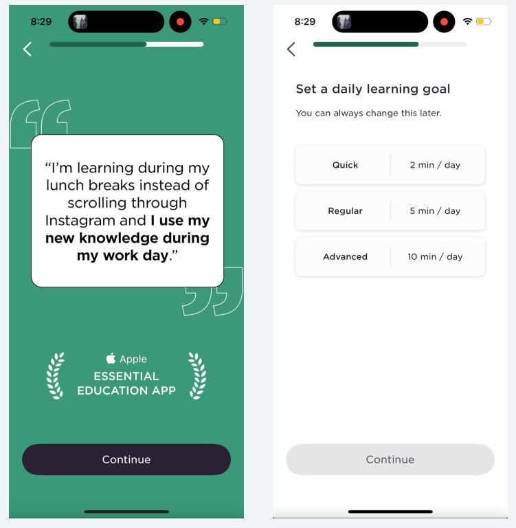
Same testimonial screen that transitions into picking your daily learning goal.
But they did remove the other orange social proof screen!

I love this update to add more motivation once you select a learning goal
It’s a nice touch to quantify how many lessons you’ll get based on this time commitment per day.
I’ve seen a few other apps do similar things.

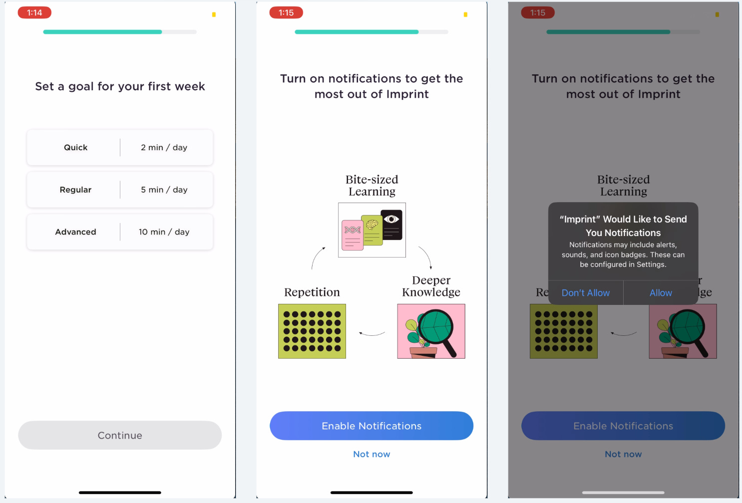
Remember how the notification prompt was loosely connected your goals? No more!
Now they do a great job of directly connecting notifications to your learning goal you just selected.
And then they even talk about “People who commit…” to hook you more.
I also like “Reach your daily goal with reminders” and not using the word “notifications” in the title anymore. “Reminders” are nice and helpful, “notifications” are annoying.
Previously: “Turn on notifications to get the most out of Imprint”
Now: “Reach your daily goal with reminders”
Don’t talk about “getting the most out of your app”, talk about the specific benefits people will get.
Oooh, this invite a friend is completely new!!
I first saw this guest pass format in Calm.
But I love the small innovation of trying to get users to invite their friends before they get to the paywall.
Think about it, if 15% of people who go through this flow invite a friend, you just lowered your user acquisition cost by 15%. Or increase your RoAS by 15%.
In reality, the math isn’t that simple, but you get the point that organic new users are always good.
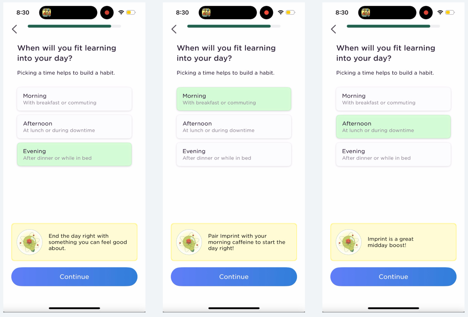
Help users think about when they’d fit your app into their day!
You learn the best time to send push notifications to remind them
You help them connect their usage to the real world
Who is more likely to get something done?
The person who says, “Yeah, I’ll do it sometime”
Or the person who says, “Yeah, if I eat my lunch a bit quicker today, I’ll have time to fit that in right after”
This simple act of thinking about your day can be powerful to build a habit.
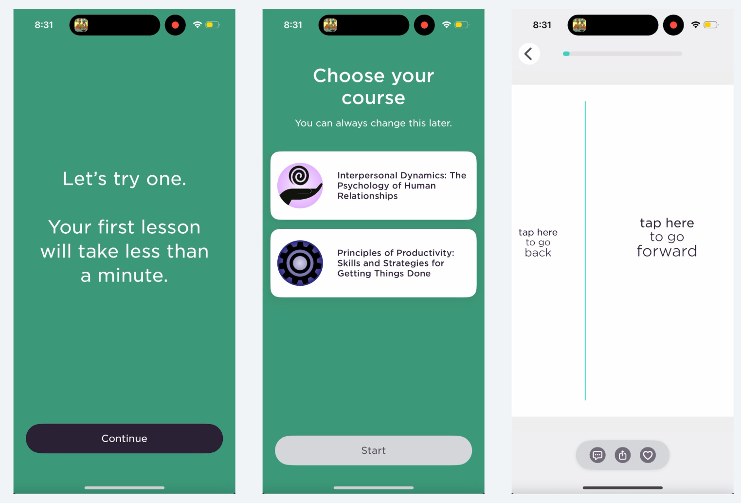
The rest of the onboarding experience is similar until we get to the paywall
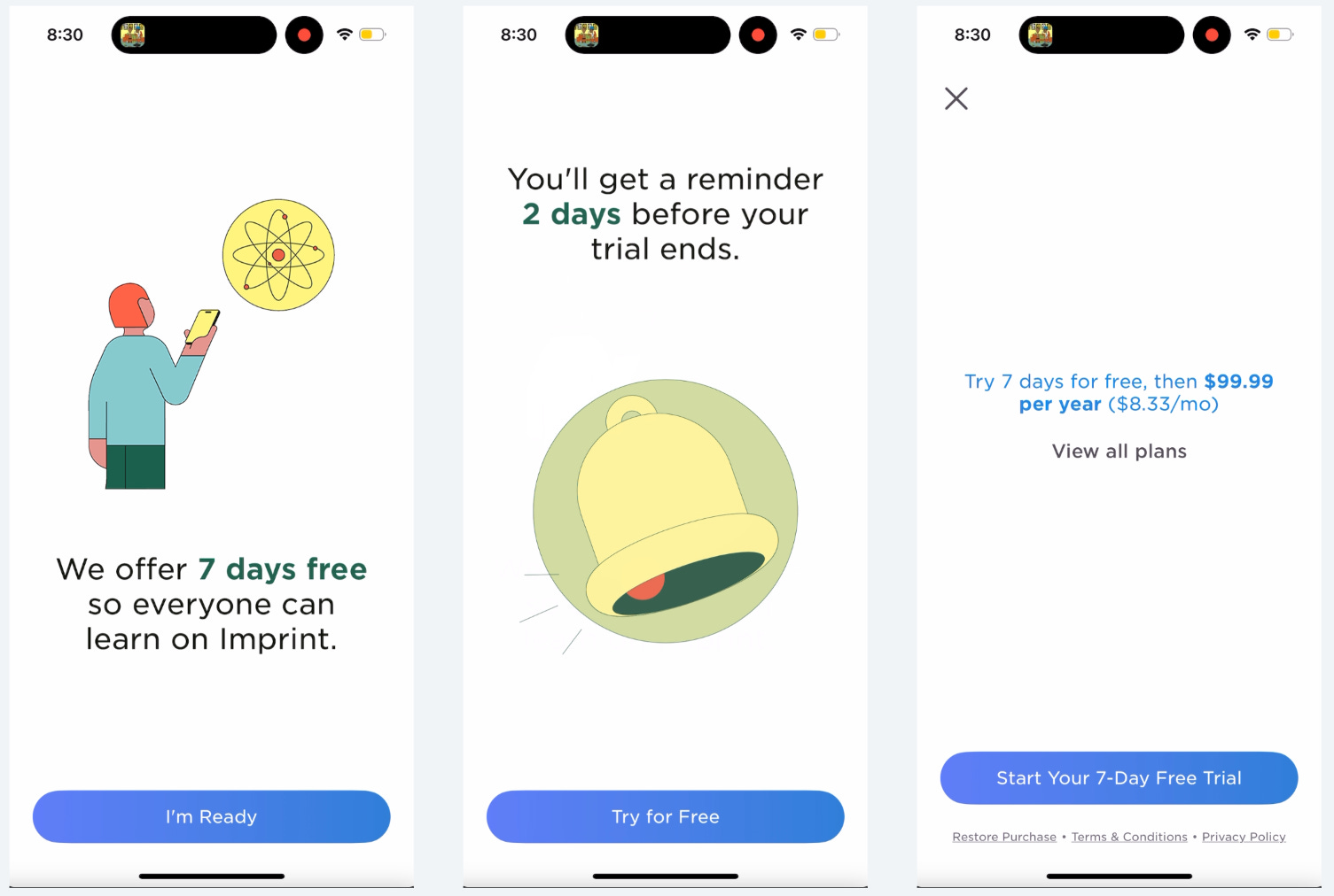
Remember that super long paywall? Replaced!
This multi-screen paywall format has been gaining popularity
Super simple copy, and replaces the trial timeline with the copy that you’ll get a reminder before your trial ends.
This is like the ultimate distillation of the value of the Blinkest trial timeline.
And they push everyone to annual, but offer monthly too on the “View all plans”
They want more upfront revenue from annual, but also want to make it readily available to find the monthly option for people who aren’t ready to pay that much. That’s why the “View all plans” is right below. (the old paywall did something similar)
I promise, I’ve saved the best for last!
Should this have been it’s own post? Maybe, but whatever.
Previously, Imprint dropped users on the home screen after the paywall
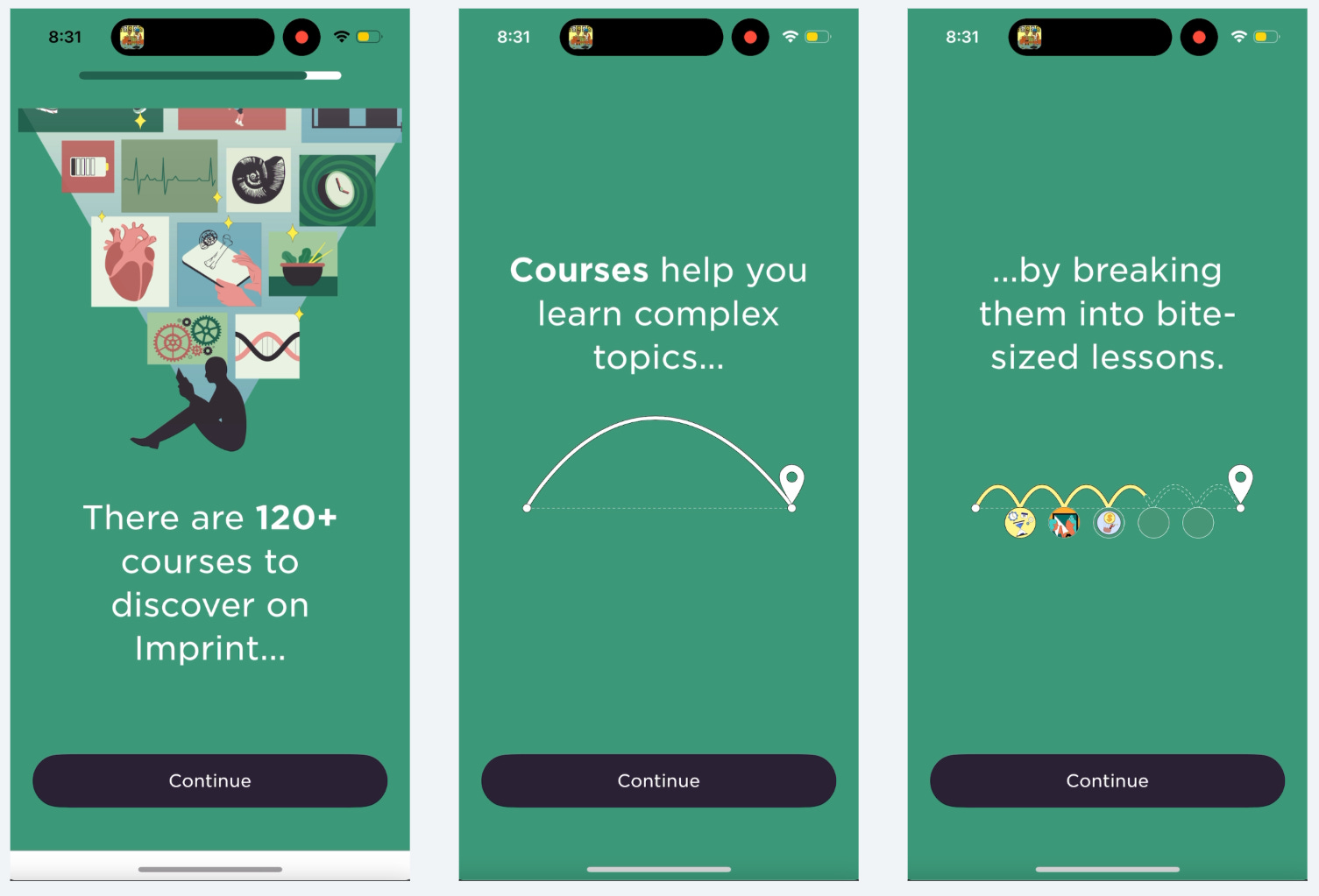
Imprint has built an awesome new user experience that doesn’t just drop users into the home screen without any guidance.
They transition you nicely into your first lesson and educate you on the app in the process.
“120+ courses” makes sure you understand there is a lot of value to reduce trial cancellations.
Some of this is repetitive from onboarding pre-paywall, but it’s important! Don’t be afraid to repeat necessary info.
People want results fast. Can you motivate to users to continue by letting them know how long the next steps will take?
And it’s nice personalization based on what I selected during onboarding to make sure they’re suggesting relevant courses.
And simple built in education on how to use the app.
Should you tell your users how the app works or should you show them in an interactive format?

I’m not going to go through all of these screens because it’s a long lesson, but wanted to call out these XP points.
It’s obvious when you earn XP points via their nice big pop up.

They added streaks!
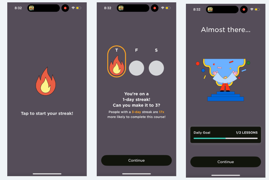
Check out the Daily Goal: 1/2 Lessons
I’d bet they learned that if they can get users to complete 2 lessons in the first day, there is a much higher rate of trial conversions and better retention.
This is what we’d call an “activation moment” :)
Maybe the first lesson is their “Aha” moment and 2 lessons completed is their habit moment? The exact vernacular changes within companies but understanding the actions that lead to conversion and retention are critical.
I talk more about Activation in this post:


Now I understand what courses are so I feel much more comfortable going back to the home page and picking something out on my own
But they do nudge you to just continue with this course since that’s the path of least resistance.
Wow. That was a waaay better experience than simply dropping me on the home page.
Don’t let your users get lost! Give your new users a helping hand.
If you do this well, you have a pretty strong chance of improving your trial conversion and overall retention rates.
I love looking at how these new user experiences change over time because it gives me insight into what these teams have learned.
Looking at a single point in time you’re guessing and you never really know if it’s an A/B test or is just left over.
I hope you learned something too!
Check out the Whimsical board here to see the full Imprint flow and how it changed over time

📣 Want to help support and spread the word?
Go to my LinkedIn here and like, comment, or share my posts.
OR
Share this newsletter by clicking here.

Fantastic article, thanks. I hope redo my onboarding and will take a lot of lessons from this.