

Life of a birb
See how Finch evolved

Hey there, it’s Jacob at Retention.Blog 👋
I got tired of reading high-level strategy articles, so I started writing actionable advice I would want to read.
Every week I share practical learnings you can apply to your business.
Let’s flap our wings and take a trip through the evolution of Finch
If you don’t know, Finch has grown like crazy over the last year.
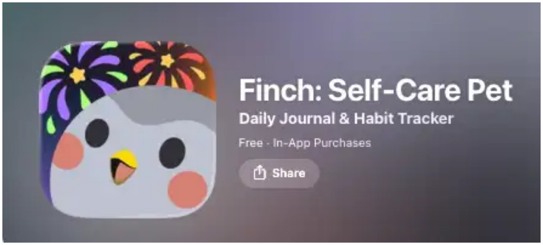
They’re a self-care app, where you take care of a little bird to take care of yourself.
$30M+ last year!!
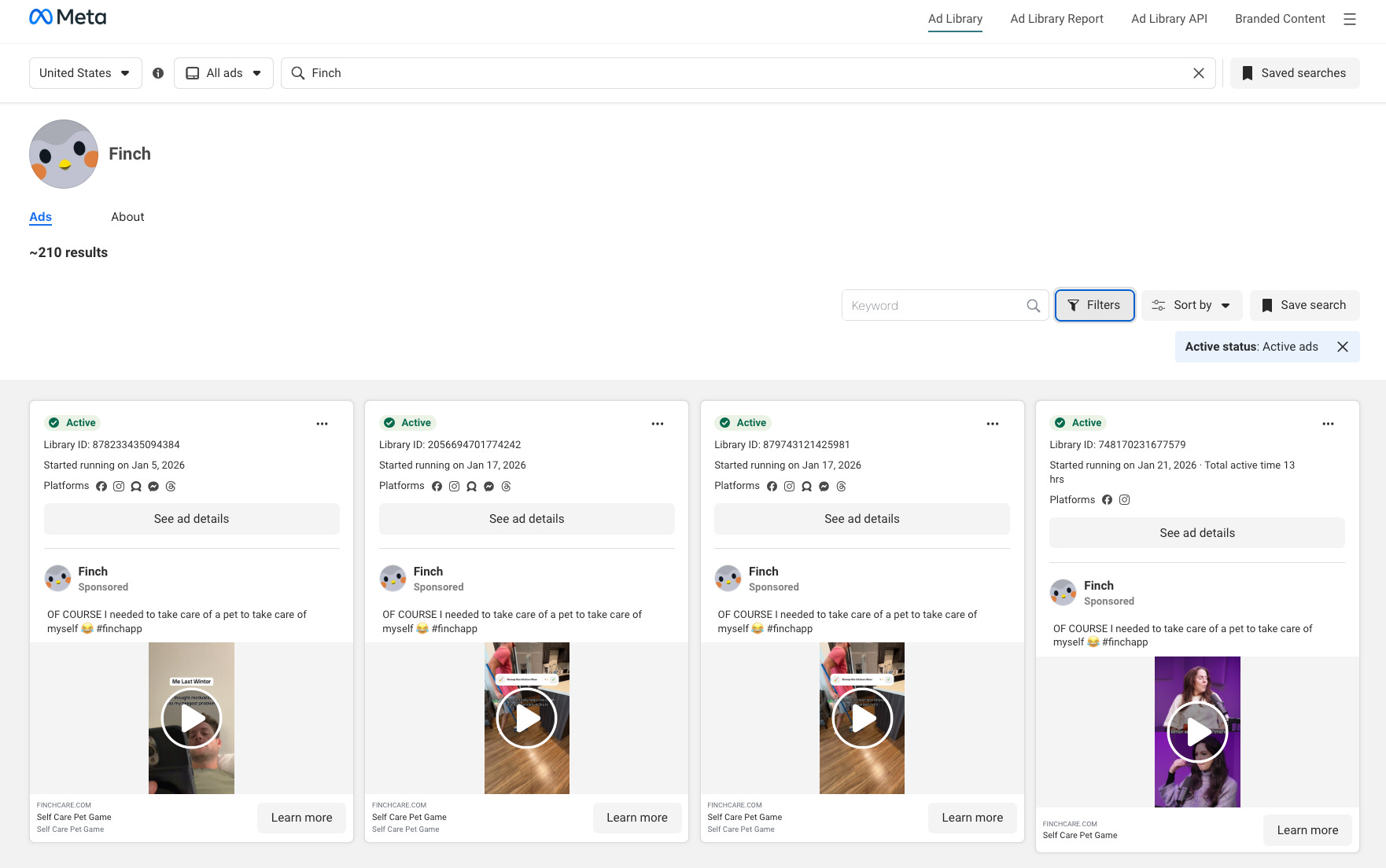
A ton of this is driven by paid UA - 210 active ads on Meta. They also do a lot on TikTok.
But we’re not here for ads, we’re for what happens after the ad!
Perfer a video format? I talk through everything in this newsletter and more here:
Please excuse the wild Youtube thumbnail style. Don’t hate the player, hate the game.
Click here to watch the full video breakdown of Finch ➡️What can we learn?
We’ll start with January 2024
Then see their onboarding in July 2025
And we’ll end in the present day, January 2026
Create an engaging hook very early in your onboarding
You have some of the highest drop off rates on your first screen. Figure out a way to engage them, and do it fast.
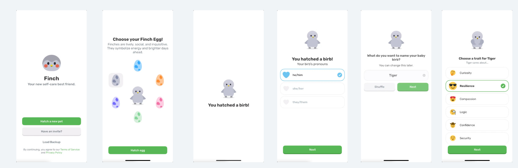
Finch got this right from the start.
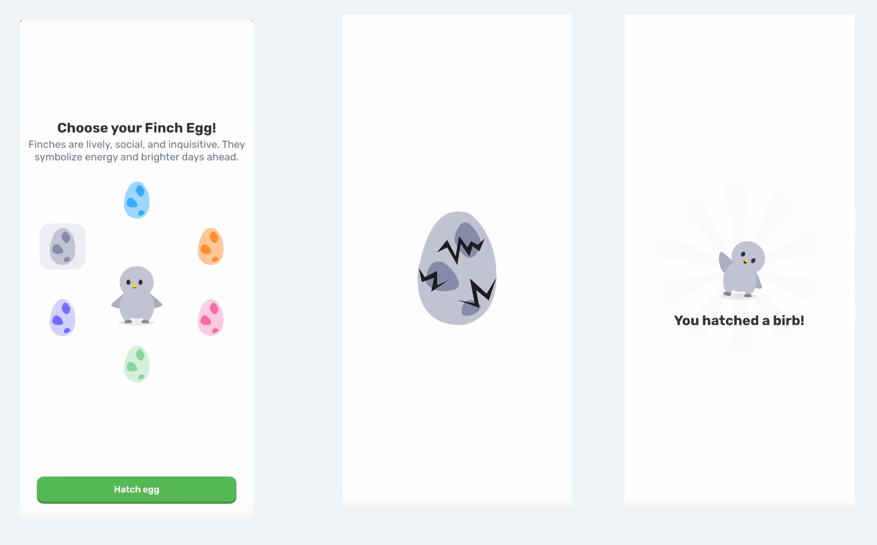
Pick a color
Hatch a birb!
And throw in a fun little hatching animation.
Not asking for any user info, just a fun and easy interaction, that inserts a bit of personalization.
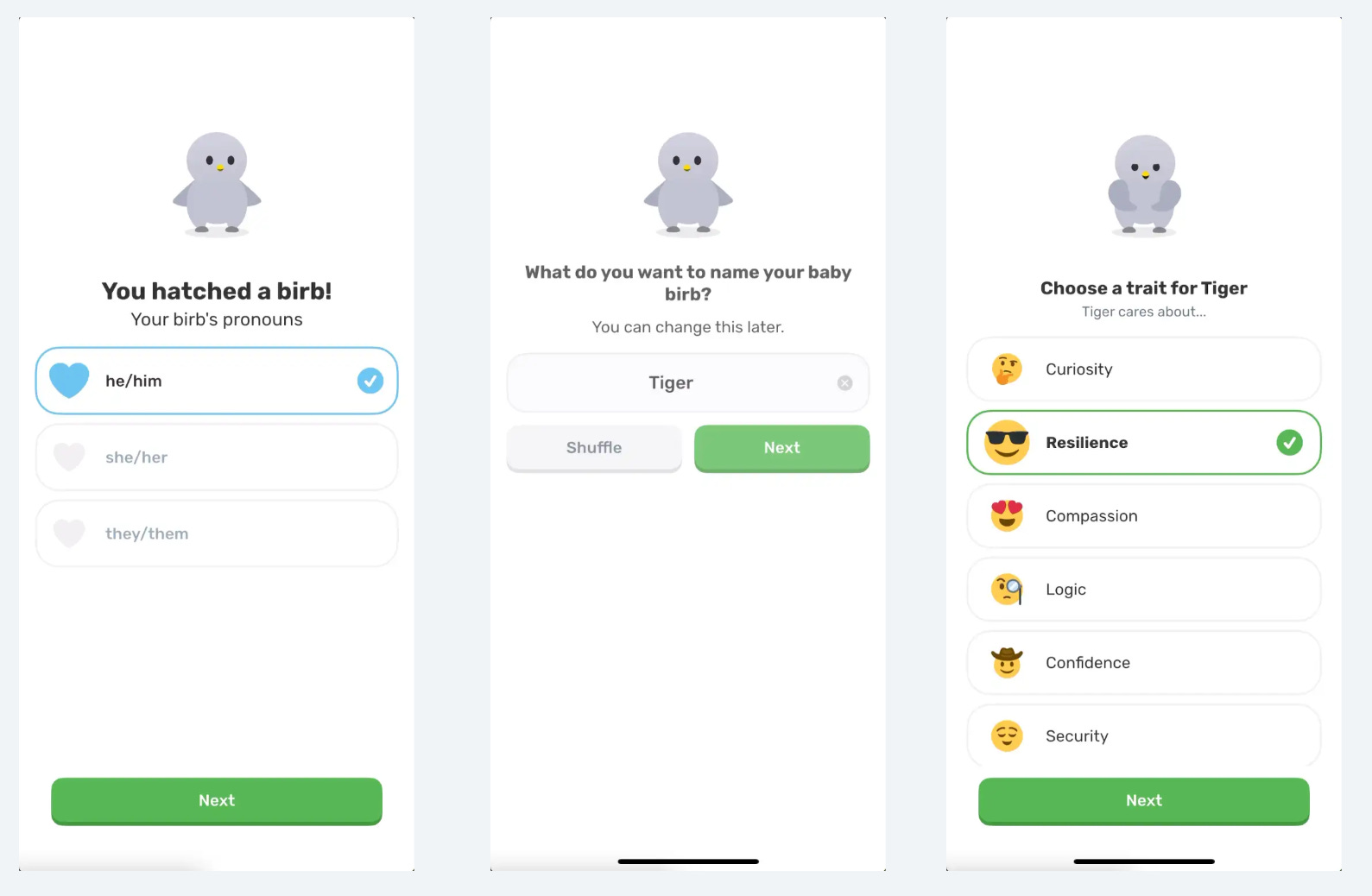
Next, you select a gender for your “birb”, a name, and a trait.
Finch is building investment in the product, but without you sharing any information on yourself!
I get to build my own little self-care pet.
Tip: Peep the “Shuffle” option. If you have a place where people need to enter a custom response, give them preset options to make it easy.
Interaction is good, but don’t let someone get stuck.
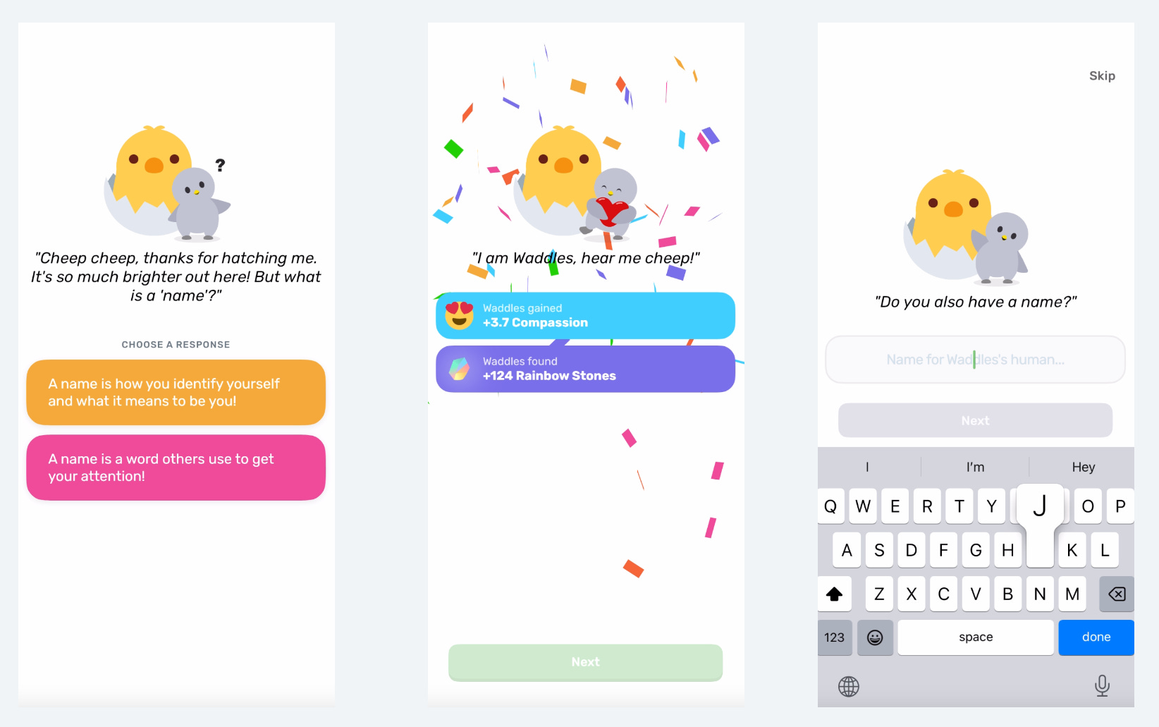
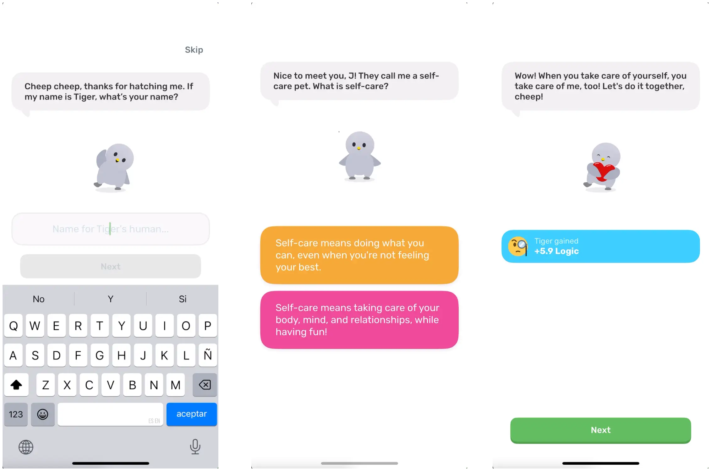
Finch now asks me for my name, but that’s it so far.
They give me choice of what a name means to me and then I get the first real taste of gamification!
By answering a question, I earn points and rainbow stones.
Your onboarding should give people a feeling of what the real product will be like, and this simulates earning things for interaction just like the real UX.
I’m going to skip a few explainer screens and move to the paywall:
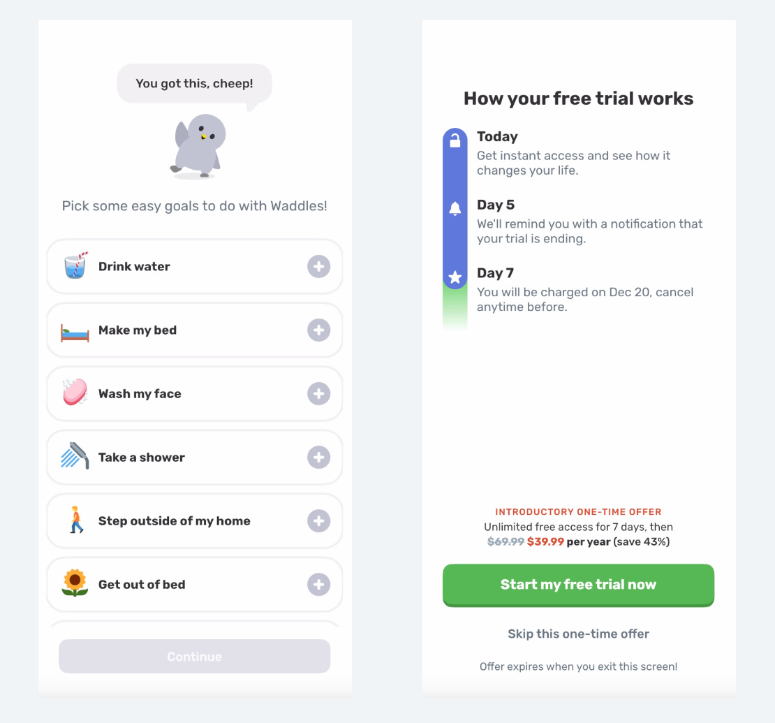
After you complete onboarding, they ask for you to pick a goal.
Next, they show the paywall.
In 2024: standard blinkest trial timeline style, 43% discount, for $39.99 per year.
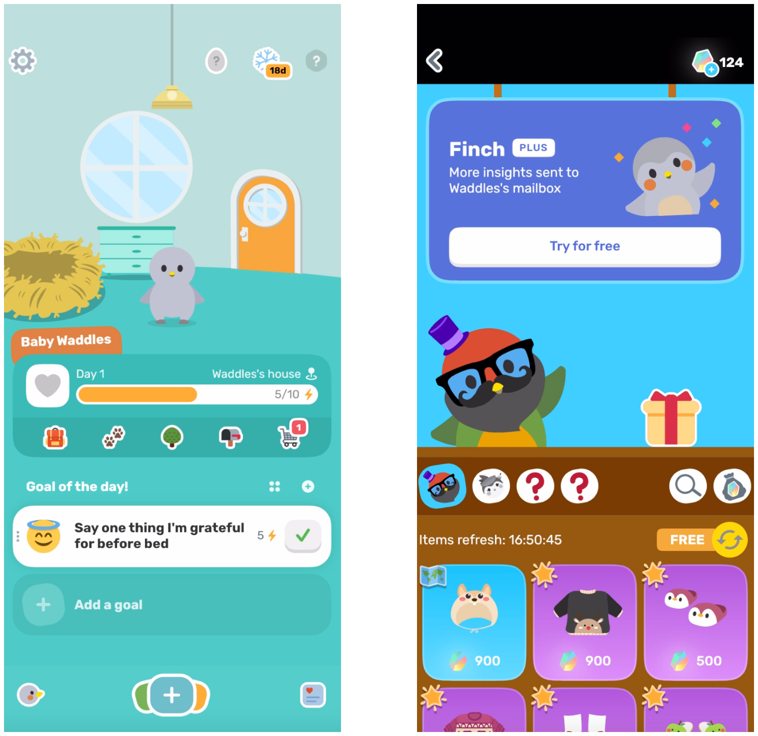
After the paywall, you land on the home screen, and you see your goal you selected.
You tap that goal to earn energy to eventually go on an adventure
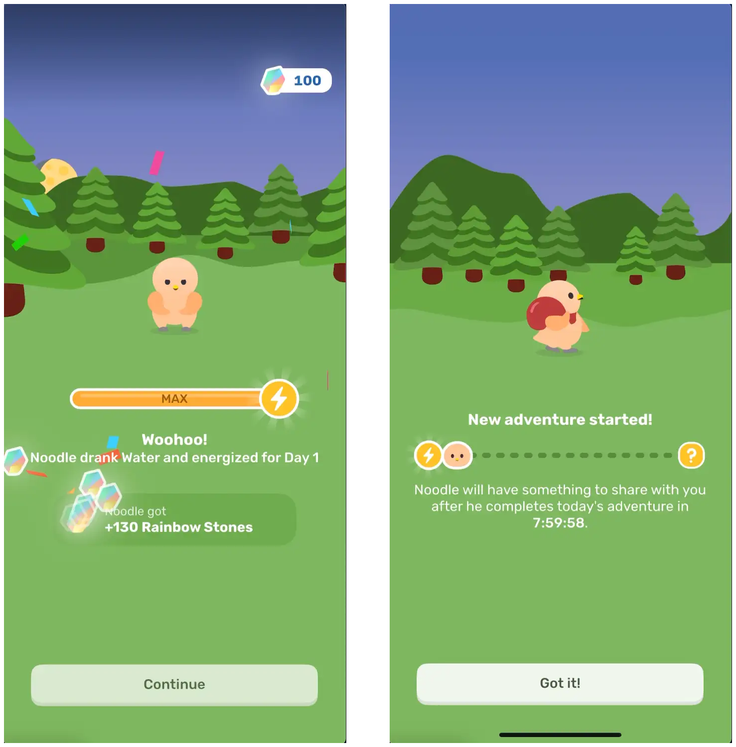
It’s honestly pretty damn cool gamification.
Your bird is gone for 8 hours of real time. You have to come back into the app to see what they got. It’s building an instant habit loop.
Finch has phenomenal gamification and habit building.
Now let’s look at what’s changed over the years!
Nearly the entire early flow is the same!
They did move the “What’s your name?” question to close after inputting your birb’s name. This feels more cohesive.
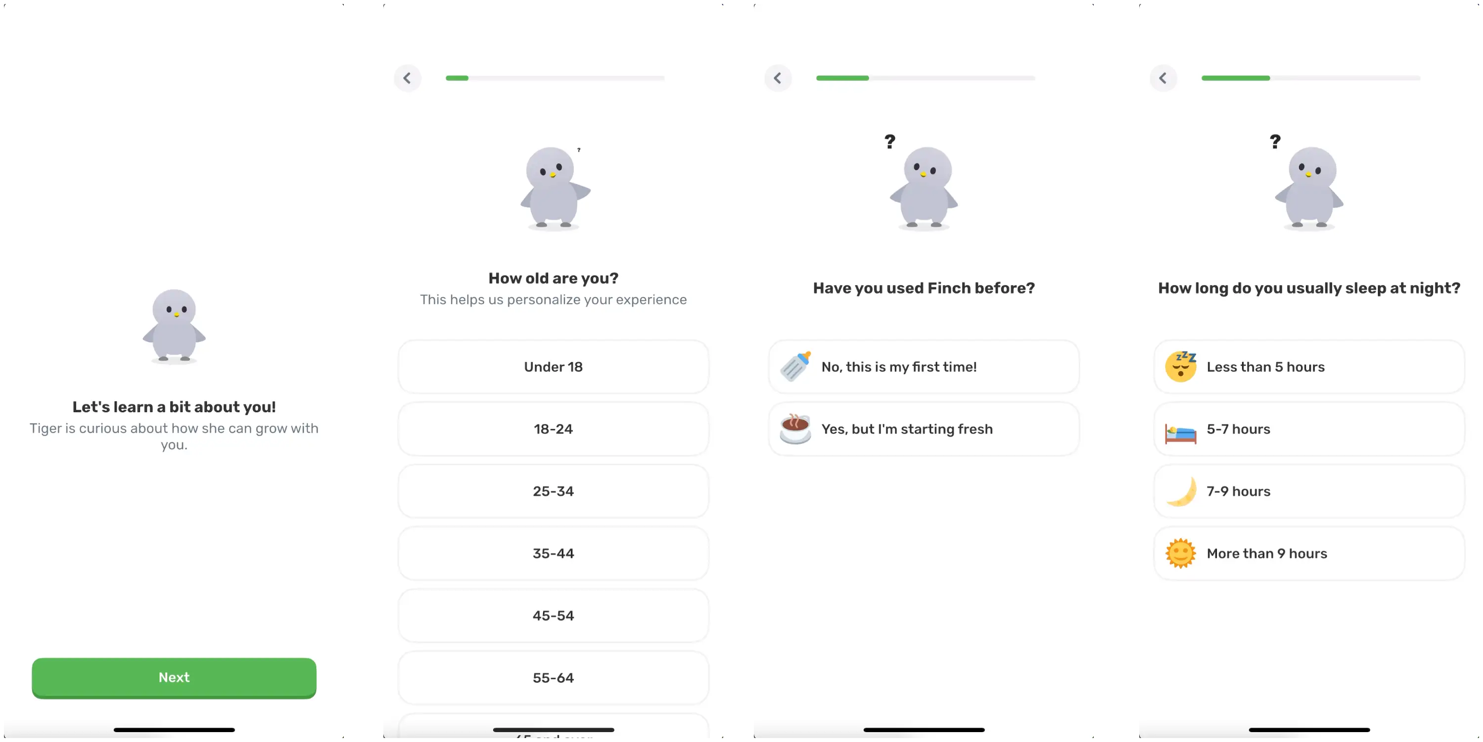
The largest change is they added a whole new series of questions asking information on you!
I don’t believe they actually use this for much personalization, but I’m sure they learned and saw from other brands that when people are able to share information on themselves, they feel the product will be better tailored for them
There is also the time and investment put in through these questions that make people more committed once they see the paywall.
I’m not going to go through all the questions as many of them are pretty standard for health and wellness apps (you can see them all in links below)
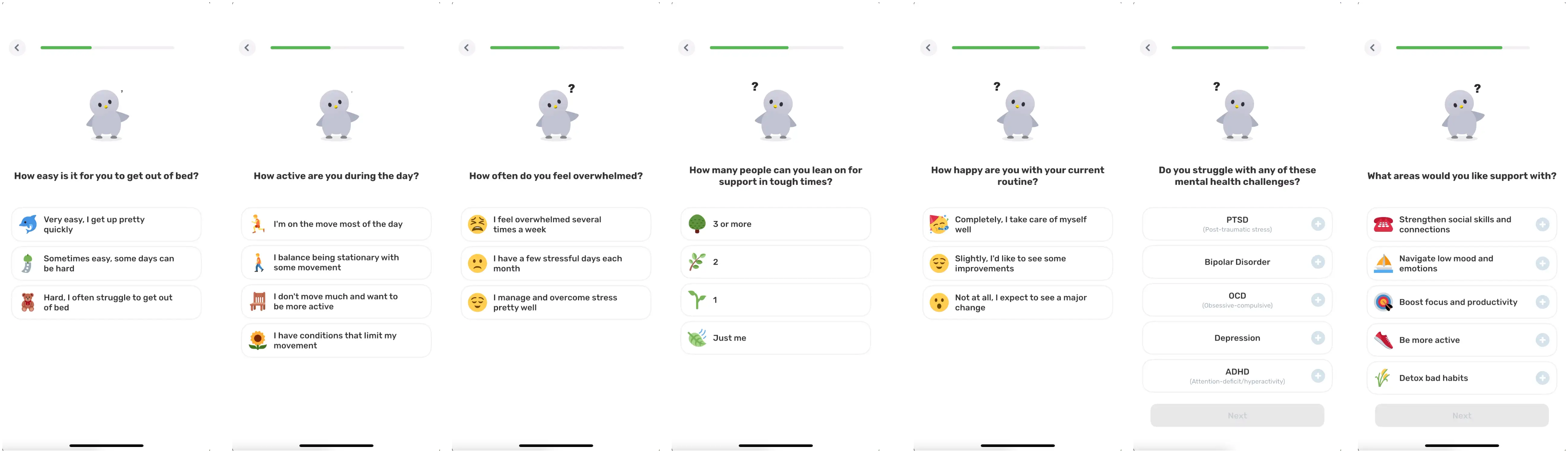
We’ll pause and dig in here - these are new also!
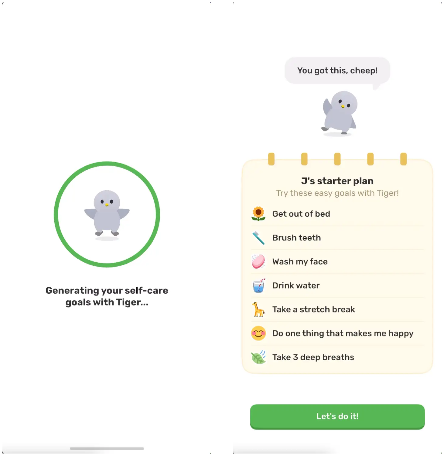
They’ve added a loading screen and created a “Starter plan”
This closes the loop and makes you feel like they took into account everything you shared. In reality, these are pretty much the same for everyone.
And if you look back, these are all the same goal options you originally had to choose from. (we’ll come back to this)
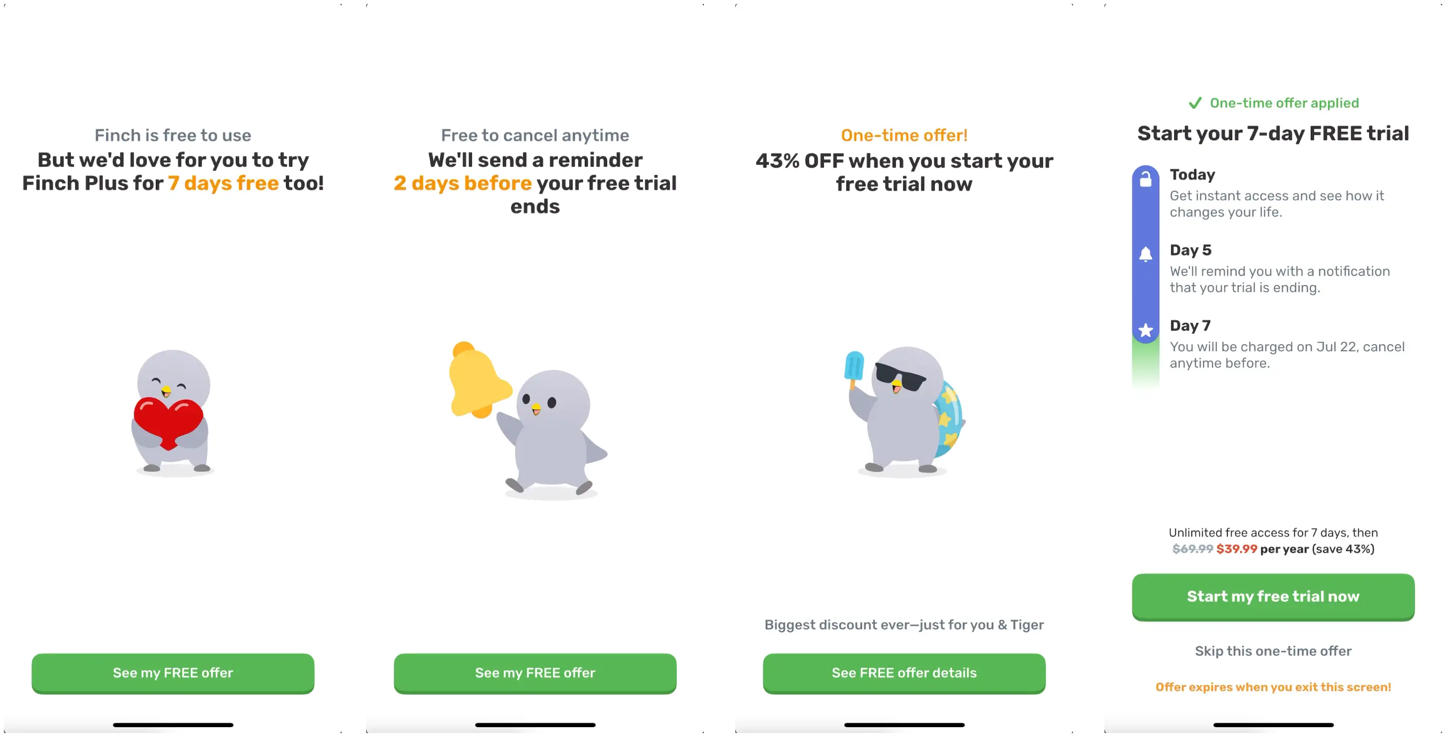
They’ve now shifted to a multi-screen paywall!
I recommend anyone who has a trial timeline style paywall test this out.
Why does this work?
You take the same message you had on the paywall and break it up into bite-sized digestible chunks
You’re able to emphasize “FREE, FREE, FREE”
The biggest challenge is people just leaving when they see a paywall because they don’t see it’s a trial, so you can reinforce this message
And you’re able to mention the trial reminder and discount
THEN, you reinforce everything one more time on the actual payment screen
If it’s important, don’t be afraid to say it twice because your users won’t read it the first time.
After the paywall:
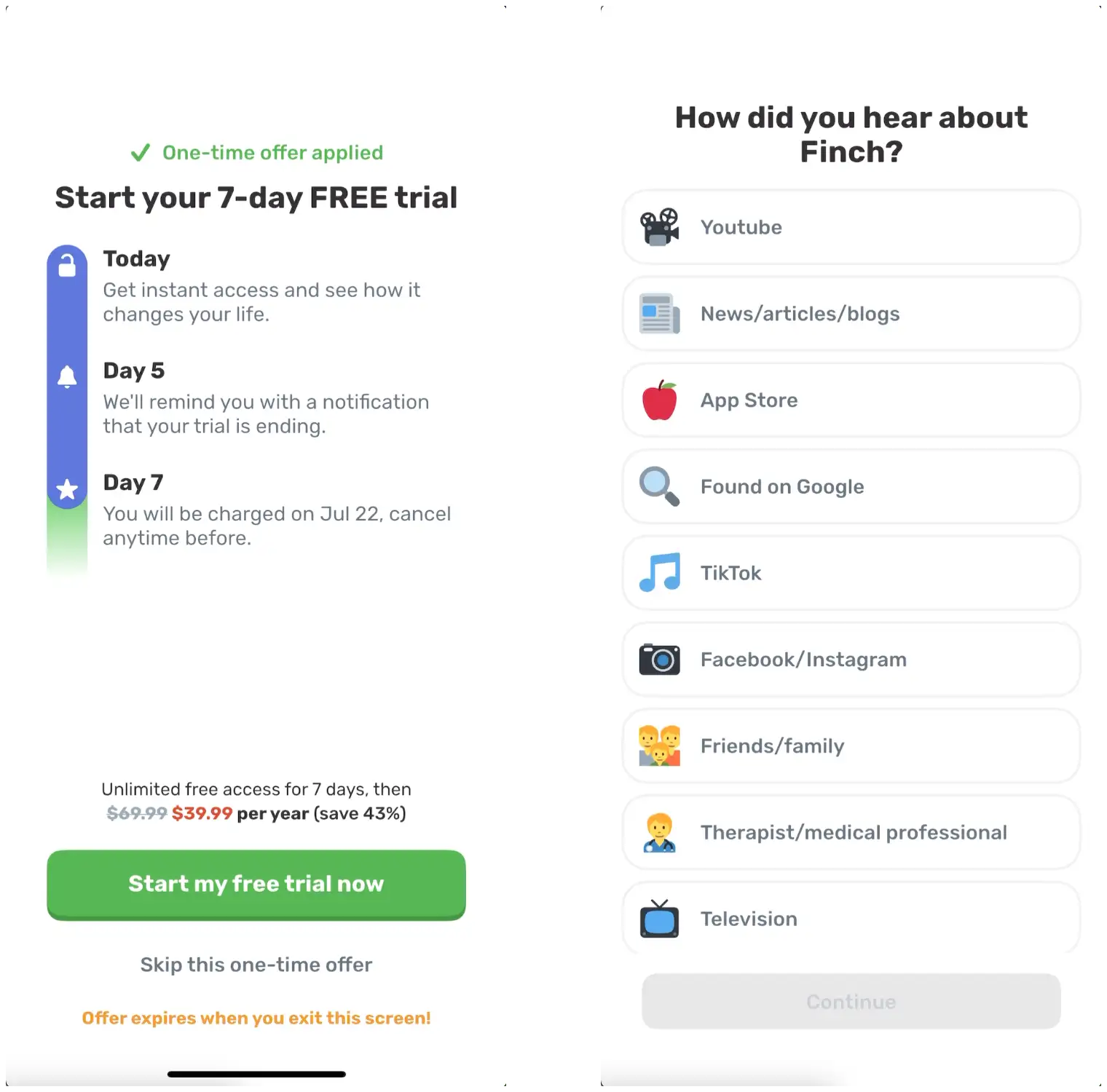
HDYHAU! Read more on the importance of “How did you hear about us?” here:

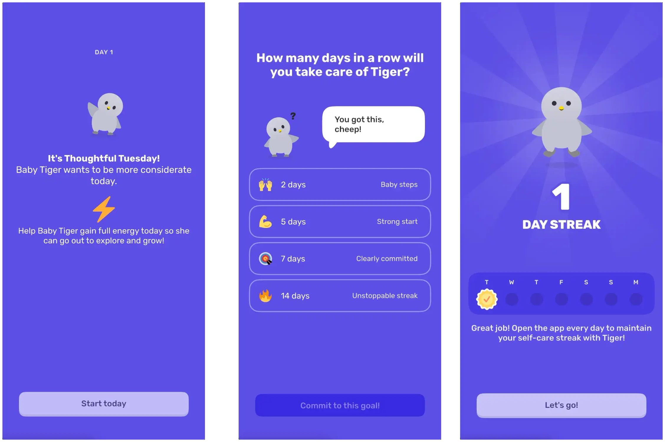
Streaks!
Everyone’s gotta have streaks.
Finch is so gamified, it’s almost surprising they didn’t have them before now.
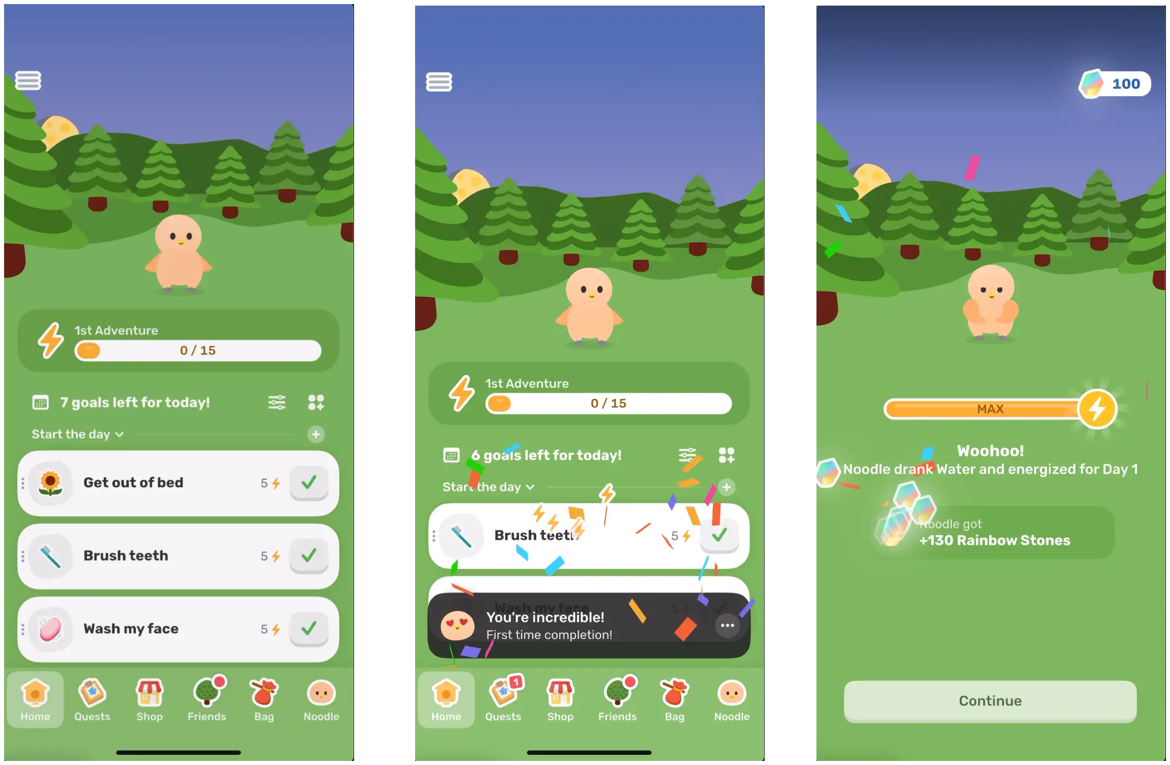
Let’s go back to this goals from above.
You saw how previously, Finch had you select goals, and now they auto-select a bunch of goal in your “plan”
These materialize here and solve a sort of cold start problem.
If a user didn’t select enough goals, they wouldn’t be able to just tap a few times to earn enough energy, and that would force them to have to tap around the app more, potentially not reaching the “Send your Finch on an adventure” moment.
Now, Finch auto-populates a bunch of goals, you tap a few times, and you’re pretty much guaranteed to reach that “Aha” moment of I tap on things to earn energy to send my bird on an adventure.
Remove barriers creatively to get people to experience the value of your app faster. And to get a higher percentage of people to experience that value!
I know I said I was going to go through 2026 as well here, but it’s really not too different.
If you want to see it you have two options:
Learnings summarized:
1. Create an Engaging Hook on Screen 1: First screen has the highest drop-off rates, so engage users with fun interactions (pick color, hatch egg) instead of forms or data collection.
2. The “Not About You” Personalization Trick Users customize their Bird instead of sharing personal info, which lowers the barrier
3. Help your users: When users need to enter custom responses, provide preset options, like Finch’s shuffle
4. Real Product Experience in Onboarding: Finch users earn points in onboarding so they experience gamification mechanics early
5. Multi-Screen Paywall Strategy Break a single paywall into multiple screens that emphasize the important points (free, trial, discount, trial reminder)
6. “If It’s Important, Say It Twice”: Users won’t read critical information the first time, so don’t be afraid to repeat key messages
7. Add “How Did You Hear About Us?”: Self-reported attribution data is a valuable additive in the iOS world
8. Investment Through Questions: Adding questions about users’ lives (even if you don’t use the data much) creates perceived personalization and increases commitment before the paywall through sunk cost.
9. Close the Loop: Show a loading screen and generated plan to make users feel their input was heard
10. Solve the Cold Start Problem: Don’t land users on an empty screen. Finch Auto-populate multiple easy goals so they can immediately engage and earn rewards.
11. Remove Barriers to Activation: Identify your activation moment and creatively remove friction so a higher percentage of users reach it faster.
13. Create Habit Loops: Finch’s bird goes on an 8-hour real-time adventure, forcing users to open the app multiple times on day one and building an instant habit loop.
Thanks for reading Retention.Blog! This post is public and free so share it with your mom, dad, aunt and uncle so they can be even more confused about what you do for work.
