Launch with style
🌹How does a Rose(bud) bloom?
Hey there, it’s Jacob at Retention.Blog 👋
I got tired of reading high-level strategy articles, so I started writing actionable advice I would want to read.
Every week I share practical learnings you can apply to your business.
I came across a new app today.
It’s a brand-new app. But it has an amazing user experience.
And an unreal conversion rate.
12% of new users are paying! And 70% of trial users convert!!!
This works out to a 17-18% trial start rate.
How does this happen with a brand-new app?
They started as a web app first, and recently launched their native mobile version.
So it’s not actually a brand-new app…sue me
Chrys Bader is the founder of Rosebud (go check it out!)
Is starting web only a better way to build a new product?
Development on web is usually faster and cheaper. And you can release updates whenever you want versus having to be approved by the app stores.
But, you probably won’t monetize as well with a web-only product. Apple has eliminated so much friction and built so much trust with their in-app payments, that it’s going to be hard to beat.
For small companies, it’s usually a bigger pain to maintain a product across two platforms. So even if you can test and iterate faster on web, the better monetization is usually worth going mobile app first.
A lot of companies start on iOS only for this reason as well. Easier to monetize. And then once you have a successful product, it’s a much more proven path to launch on Android too for a 20-50% revenue bump.
It feels like there are nearly endless frameworks now that make it easy to launch a multi-platform app. It used to be there were many more UX tradeoffs you would have to make using one of these frameworks, but I’m not sure how far behind they are now.
I’m not a developer, so I can’t really advise here, but there are tons of options.
Wow, writing a newsletter is a lot easier when you just paste images from Twitter! 😂
Don’t worry, I wouldn’t do you like that.
I downloaded and explored Rosebud. I was so curious about what they were doing that converted so well.
One piece I’m still curious about is if they’re seeing stronger initial conversion rates because a lot of those new users were existing free web users. It would be a much more qualified audience that could boost conversion.
Either way, still impressive! I don’t want to diminish their success.
Tactics I loved from Rosebud:
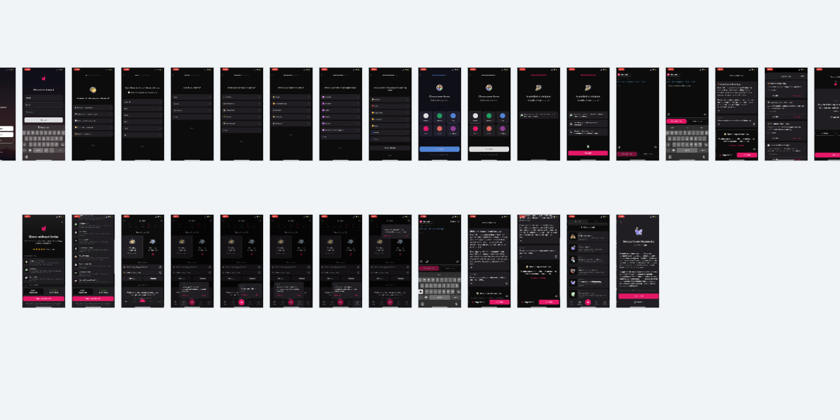
Simple personalization in the beginning combined with an explanation of why they’re asking questions.
Every single early interaction with a user builds your brand voice.
This second screen (upper right) has nice copy
Instead of saying, “Let’s personalize Rosebud" to you” they use, “..tailor fit..” Everyone says “personalize”, so this is a much more unique turn of phrase that stands out.
“How many years young are you?” This is nothing too fancy, but sets a friendly, positive tone.
What do you want your users to feel when using your app? Bring that feeling to life through your copy.
Great, simple, and concise writing takes multiple rounds of edits. Don’t be afraid to keep on iterating until it’s right.
Rosebud also focuses more on benefits you can achieve vs pure functional tasks (with more stellar copy)
“What brings you to Rosebud?”
“Process my emotions” could have easily been, “Track my mood”, but which is more interesting?
“Spark my creativity” could have been, “Be more creative”. Boring! Who doesn’t want a little spark?
“Unlock insights about myself” could be, “Record my day”, but your goal isn’t just writing your day, it’s to learn about yourself.
You can customize the theme of your app during onboarding
This is smaller, but it makes me happy. It makes me feel like the app is mine.
In reality, the level of personalization isn’t crazy, but it’s fun. Don’t underestimate the power of fun.
Also, check out their color names. It’s not “Green” and “Blue”, it’s “Emerald” and “Sky.” The little details add up.
Do you have an important next step in your onboarding?
Try adding a little arrow pointing at the button. I believe their arrow was bouncing a bit.
Another tactic I see sometimes is adding a shimmer effect to the button.
They also reiterate the personalization value prop. Repeat important information to your users.
Next is their coup de grâce
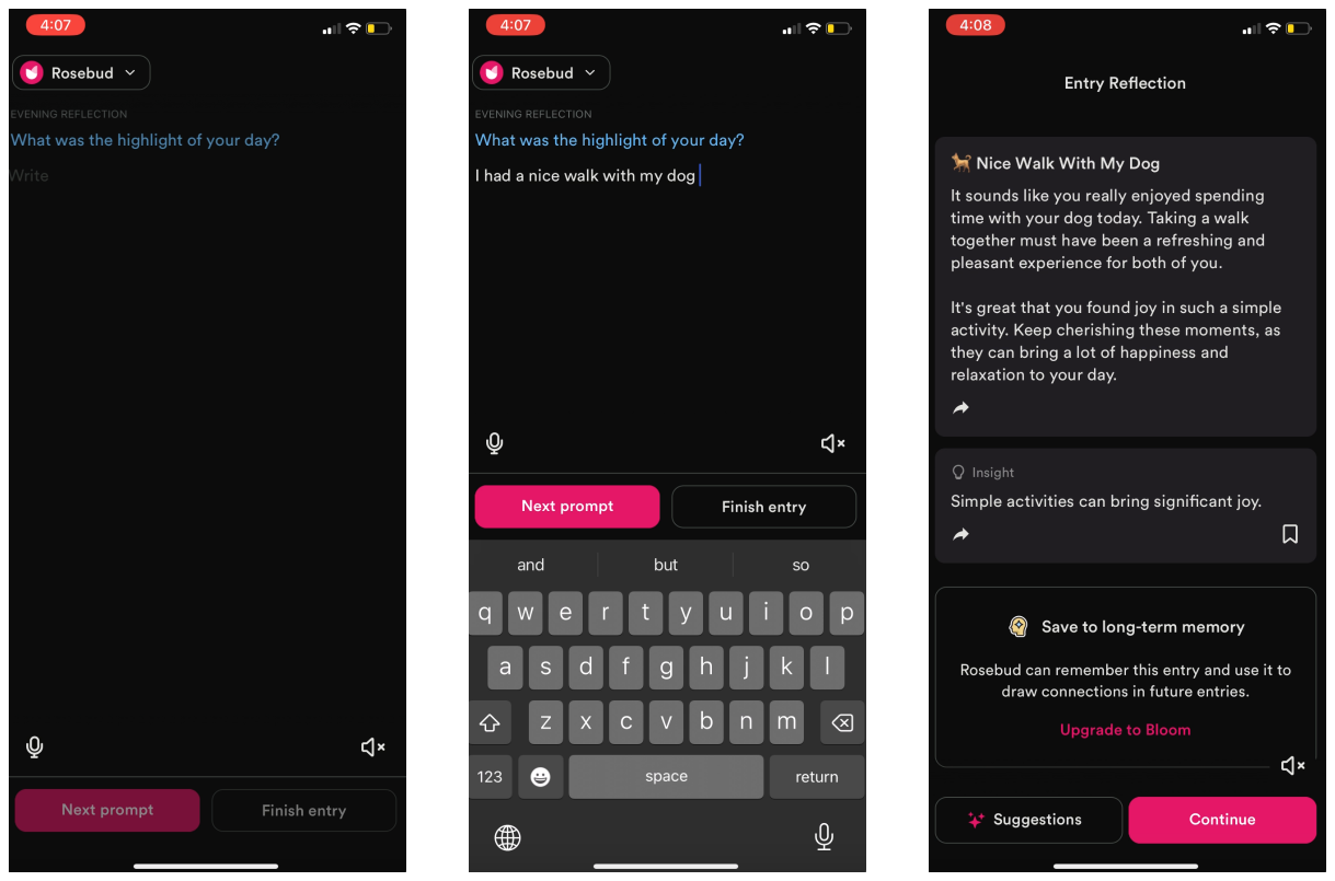
They actually show you the product experience before a paywall!
It’s a very cool AI-powered journal that helps you reflect on what you write. I’m assuming there is real personalization based on your answers during onboarding and they use that to customize your responses.
Get your user to value as fast as possible, but not faster.
Can someone remind me who said that?
They could have shown the journal experience up front to get value even faster, but users wouldn’t have had context for the product yet. They wouldn’t have appreciated what they were seeing.
When someone has to put in a little more work to uncover that value, they are willing to spend more time understanding what they’re seeing.
As fast as possible, but not faster.
You can tell me all about the product you want, but I’ll never be able to really know until I try it.
You can’t do this if you have a shit product, but since they have a cool experience, it “clicks” for people and puts a smile on their face.
Is there anything that could be improved?
The first thing I noticed was account creation upfront. I can’t proceed without signing up.
It’s possible this actually works better for them, and maybe they win back a lot of users through email re-engagement who drop off.
But, they are likely losing a big chunk of users upfront.
This will filter out lower-intent users, but it’s possible they could have higher total revenue with more people coming through the funnel and making it to the paywall, even if it converts at a slightly lower rate.
Even moving account creation a little deeper in the onboarding flow could boost overall completion rates.
They likely value emails a lot coming from web-only.
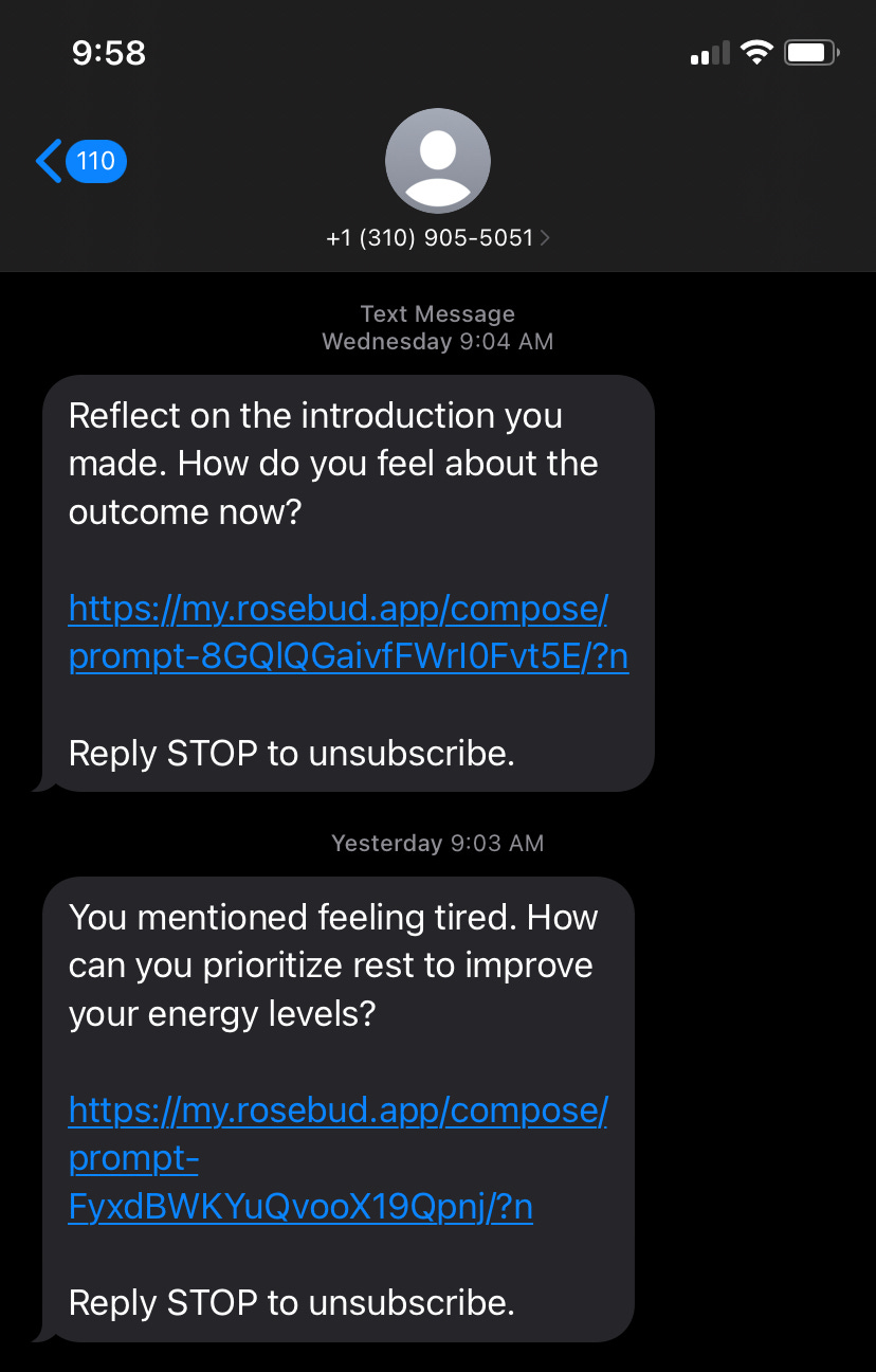
I also noticed on the web they have an SMS experience.
SMS is more expensive than push notifications, but it has the potential for longer messages, much better response rates, and real conversations back and forth. I’d think about how to create more interactive messaging via SMS for mobile users too.
Overall, I’m excited to follow Rosebud’s growth. If this is where they’re at now, I’m sure they’ll go on to do great things.
📣 Want to help support and spread the word?
Go to my LinkedIn here and like, comment, or share my posts.
OR
Share this newsletter by clicking here.


Oooh I got stuff coming up on launching on web first as well!