Expert Paywall Tips
Guest post from Jonathan Parra
Hey there, it’s Jacob at Retention.Blog 👋
I got tired of reading high-level strategy articles, so I started writing actionable advice I would want to read.
Every week I share practical learnings you can apply to your business.
Hey Retention.Blog readers! Jonathan here.
Jacob asked me to write a guest post. I was excited to contribute to some of the amazing content here already.
The following are insights I’ve learned after designing 2,000+ paywalls and joining 6-9 growth calls a week with our customers.
Running Tests
Large apps run experiments every 7-14 days.
The first experiments they run are price/trial tests.
It's best to find what prices and trial lengths you want to use and then move into design, messaging, and placement/frequency testing.
While the price tests are collecting trial-to-paid and retention data, we'll move on to some design tests, and by the time we've found a couple winners, we're ready to combine them with the data-mature price test winners.
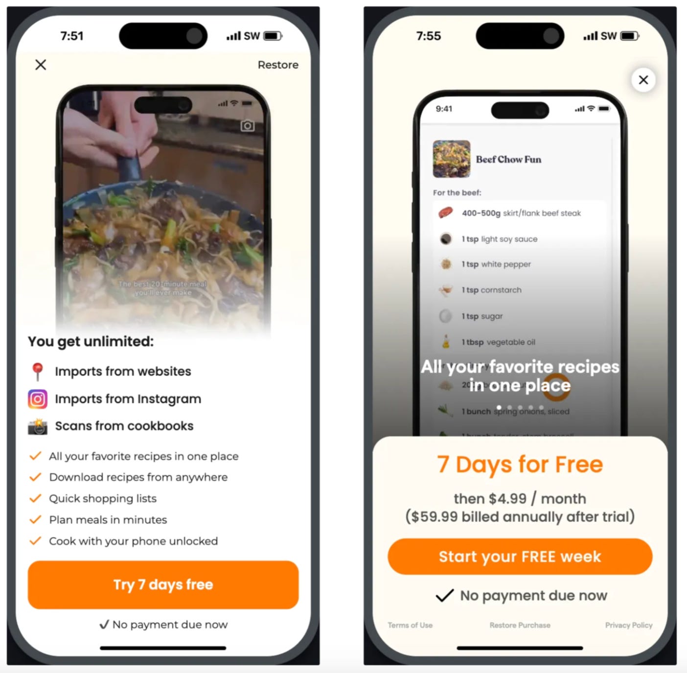
For example, adding a "No payment required now" Text View above your purchase button increases conversions every single time.
We have no idea why, but it works.
We may also try adding a free trial timeline, customer reviews, and social proof, with a lot of nudging that you're about to subscribe for $0.00.
We put these design changes against a control group and let the Campaign run for a week or two.
Even with large apps, it's not unheard of to increase revenue by 30%-40% after 2 months of testing.
Here are some insights based on recent calls:
There is no significant difference between 3-day and 7-day trials.
A well-priced yearly plan will usually convert higher than monthly and weekly plans.
In general, yearly subscribers are worth more than weekly or monthly.
It’s also important to still have all plans accessible in the paywall to capture more of the demand curve though. We typically hide this behind a “View All Plans” button.
It’s very much worth experimenting with exit intent popups when a user tries to close the paywall. You can offer a one-time discounted price to try and capture the sale after showing 4, 5, or more paywalls and the user still doesn’t subscribe.
Use your shorter plans as a price anchor to make the yearly look like the obvious best value. Good price packaging design paired with the right price sets can unlock an extra 10-15% in revenue per user.
💡 Jacob’s Note: A 50% price discount for annual plans is very effective. Even if yearly subscribers are worth more, keep the monthly plan available to direct customers to the yearly.
Check out the data from Tammy Taw’s presentation on different pricing tactics here (I know, I know, I shared this last week too).
Conversely, a sticky product with a weekly plan will drive higher revenue over time.
Apps that succeed with weekly pricing are immediately useful or operate in a gray area. For example, role-playing character AI apps, find if your significant other is on dating apps, or viral apps like TBH or Rizz come to mind.
Jacob’s weekly subscriptions post shows that gaming apps typically have the highest number of active weekly subscriptions.
I don’t have hard numbers, but from my interaction with customers, the trend leans towards generative AI apps. We don’t have many gaming customers so I don’t see that aspect of it.
Multi-page paywalls where the timeline is broken down into different pages are performing well right now.
Check out the Yuno template to see this in action: https://superwall.com/templates?templateId=34375
Jacob’s Note: Duolingo has been using this style for a while now. I’m pretty sure they were the first. Check out their design pattern in a past newsletter here:
Remember: The only way to see what you can get away with charging is to price test.
Price presentation
Showing equivalent pricing, discount percentages, and using good visual design to make it crystal clear what the best value is can have a massive impact on moving users to your best LTV product, especially if you only include a trial on one product.
See the Exit Popup, Green Noise, and Mojo (tap view all plans) templates for good design examples.
Video paywalls
Videos can give a feeling of quality when done right and we almost always see improvement when you use your best-performing ad creatives or screenshots of the app in use.
See Vixer and Scape template for examples.
Trial timeline
The timeline almost always improves conversions and is great for mitigating a user’s resistance to starting an auto-renew trial.
Especially, if you've already explained the value of your product in onboarding.
See Fig and Roi templates for examples.
Exit intent designs
You can show a different offer (a discount or an entirely different product) when users tap X to close the paywall.
This has worked very well for a few customers recently, adding as much as 15-20% in total revenue.
See Exit Popup template for an example of this.
Multi-page paywall designs
More customers are using a few specific screens to either explain the trial or the core benefit of the product before asking users to convert.
This generally works in the health and education categories. I’m less confident it’s the best format for everyone, but it's worth testing.
See Scape and Multi Page templates for examples.
You’re never done testing
Even if you think you’ve found a winner… you can still probably improve some elements to get better performance.
I hope you learned something new!
Thanks for reading,
Jonathan
🙏 Thanks so much, Jonathan, for sharing all your amazing insights with Retention.Blog readers!
📣 Want to help support and spread the word?
Go to my LinkedIn here and like, comment, or share my posts.
OR
Share this newsletter by clicking here.


Hi,
Yesterday my app was rejected for having an exit popup. I have a paywall, then if the user clicks X I show a 30% off limited time offer.
Apple rejected it saying :" The app attempts to manipulate customers into making unwanted in-app purchases. Specifically, after users close the subscription screen, another offer appears."
Any idea why? I mean, I see everywhere the exit popup, and we have been using it for a while, but suddenly the last updated was rejected.
Fantastic read as always, thank you Jacob and especially Jonathan for this post.