Dynamic and Contextual Paywalls
How Strava, Calm, Duolingo, and AllTrails change their paywalls
Hey there, it’s Jacob at Retention.Blog 👋
I got tired of reading high-level strategy articles, so I started writing actionable advice I would want to read.
Every week I share practical learnings you can apply to your business.
The most important paywall in your app is the first one users see
But if you have a freemium product, there are many more entry points to a paywall
Do you use the same paywall everywhere? Do you use the same CTA?
If it didn’t work the first time a user saw it, maybe try a different message.
Or even better, take into account how a user is triggering a paywall.
Or the user type.
A free user could have started a trial and canceled.
They could have subscribed for a month and then unsubscribed.
They could have subscribed for a year and then canceled. Or they could have used your app two years ago and just redownloaded it.
Are all of these people the same?
Let’s look at how Strava, Calm, Duolingo, and AllTrails change their paywalls
We’ll start with Strava
Strava doesn’t actually change their paywall much.
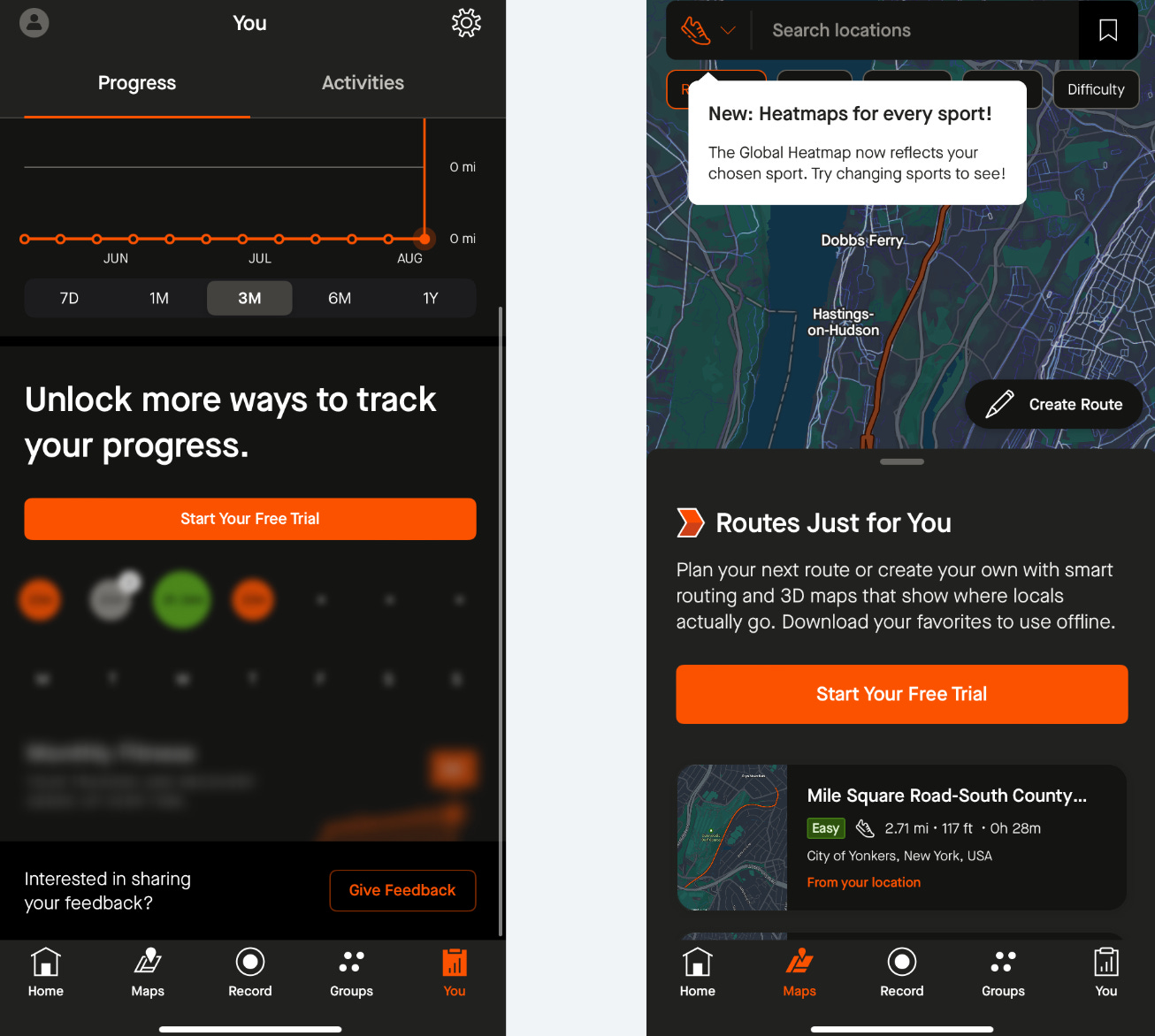
But they do have many different contextual CTA blocks based on where you’re trying to access a premium feature
Even though their paywalls don’t change, Strava does a great job of integrating their CTAs into the UI so it doesn’t interrupt the free experience.
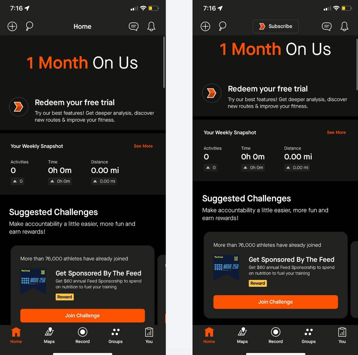
Yeah, it is a big button in your face, but they’ve designed the whole section to incorporate that button.
They do the same thing on the home page.
Yes, the main content is pushed down the page, but it’s not overlayed on top of anything.
Are you wondering why I shared two very similar screenshots?
Look at the top menu bar of the image on the right. This is after I started scrolling down on the home page.
The “Home” copy changes to “Subscribe.”
I love this because floating banners that get in your way and follow you down the page suck.
Strava makes sure a subscription CTA is always visible without being annoying.
Why does Strava block some premium content while letting you view other premium content?
A bunch of the map features are locked and if you tap on nearly any button in the map, it’ll trigger the paywall. (middle image)
On the progress section, they gray out the feature and block you from being able to access it. (left image)
Does the feature have compelling visuals? Then you may want your users to be able to see the feature to get excited.
Does the feature take more explanation? Maybe try graying it out and covering it with a CTA button.
This map is much more engaging and interactive, so it makes sense to let users see it. If you haven’t used the app much, the Progress feature isn’t going to look like much.
(There are also free map features, so I’ll admit there are probably multiple reasons…)
AllTrails uses similar contextual CTA blocks,
But they follow through better by also making their paywalls dynamic based on what you tap
AllTrails has a standard paywall they change based on what CTA button you tap in the app
They’ve tested their free vs pro comparison graphic, know this works, and then they change the graphics and title to reference what a user is interested in
You don’t need to design completely new paywalls.
You can edit the hero image and the paywall title and still make it more relevant to the user’s interests.
AllTrails also has another version for when they run sales
They focus on savings in the copy over the feature benefit.
What is more motivational - saving money or the feature? It makes sense to emphasize the savings.
Cash rules everything around me…💵
Calm changes its paywall based on user interaction and user type
You can change the paywalls based on the content a user is trying to access.
Or you can change the paywall based on the user subscription state
Calm uses a mix of both.
When you tap on locked content, Calm pulls through the image of that content in the header of the paywall.
They’ll also slightly modify the title copy.
Calm has so many pieces of content, that it’s pretty impossible to pull through the exact content title. Instead, they vary based on the category or other variables. For example, if it’s sleep-related content, they reference that in the title.
For content-based apps, pulling through the image of the content into the paywall isn’t usually a huge technical lift.
(That is if you’re building the paywall natively. If you’re using a no-code/low-code tool, then it could be much harder).
I’ve also started a trial of Calm in the past, and they offer a 2nd trial opportunity
Calm has so many users who have tried the app in the past, a huge amount of their new users are actually old churned users they’re trying to bring back. If they’re not able to offer a trial they’re missing a big opportunity
They reference my user state as a user who had a trial in the past.
I’d bet a lot of apps have an opportunity to offer free users a 2nd free trial.
These free users will probably never purchase straight-up, so there usually isn’t much to lose.
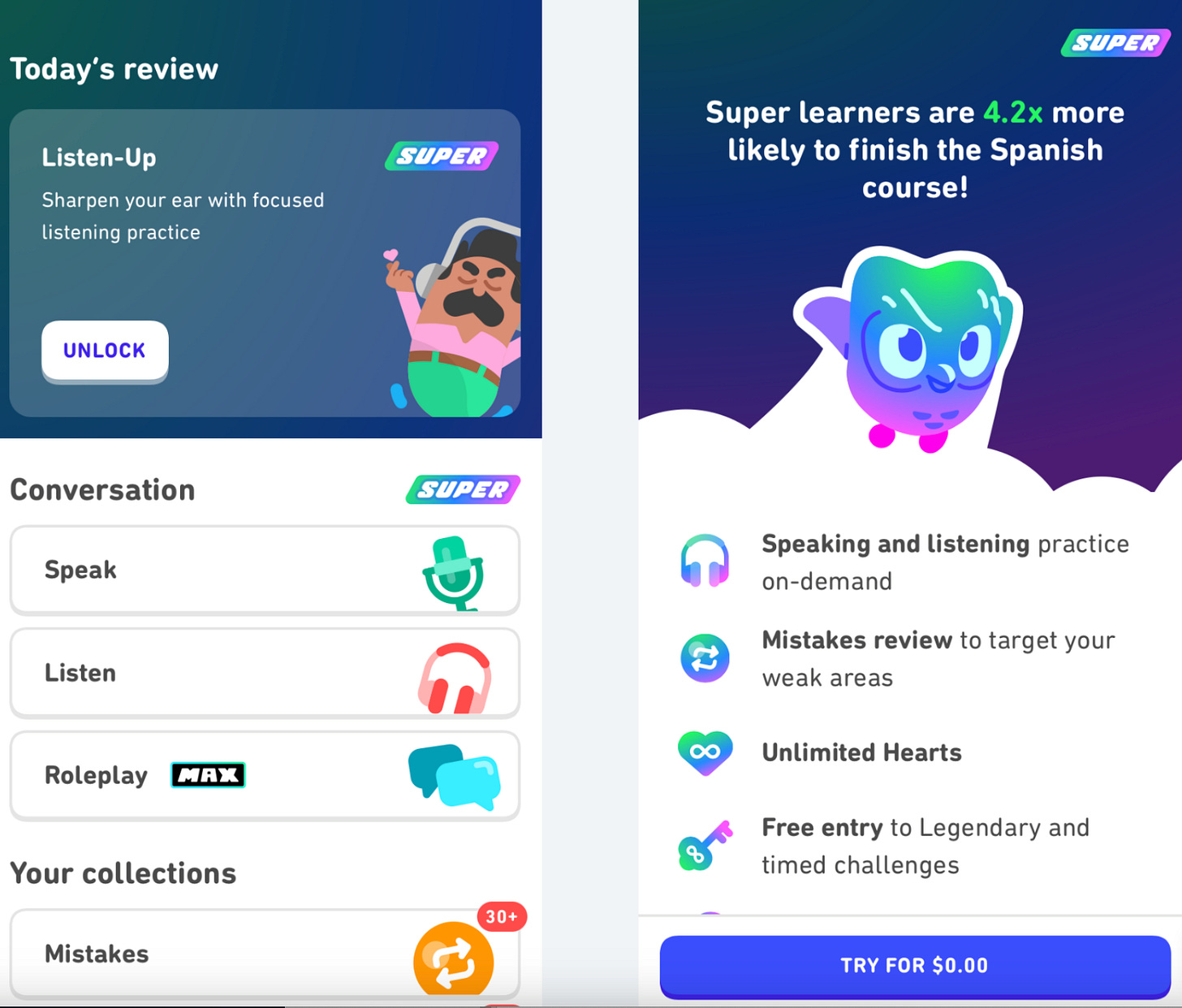
Duolingo uses a similar paywall throughout the app, but they change copy and design elements
If you trigger the paywall because you tapped on the “unlimited hearts” CTA, then they’ll place that value prop as the top line in the bulleted list.
If you tap on the “Listening practice” CTA, then they move that value prop to the top
Pretty simple.
Moving around the order of value props is a great tactic you can easily implement.
We know people don’t read everything in detail, so this ensures that people see what they’re looking for.
They also call out the language you’re learning in the copy of the title of the first screen of the paywall.
This is another simple change, but these small dynamic elements make it feel more contextual for the user.
If you enter the paywall flow by tapping on family plan CTA, then on the final screen, they reference how much savings you’ll get from a family plan “Save up to 76% with Family”
A lot of apps have family plan options and don’t do this. Never miss an opportunity to show people how much they could save!
Do you think you could create more contextual and relevant paywalls for your users?
All of these apps’ actual dynamic elements are pretty simple.
What’s stopping you from trying this type of improvement?
Help create a more relevant experience for your users. Acknowledge what they’ve done in the app to make it make sense.
The dynamic creative elements based on a user’s path are the most common.
Honestly, what I find the most interesting is different paywalls or offers based on a user’s past subscription state or usage activity.
I would love to see more examples of app changing offers based on subscription state. (Share ‘em if you got ‘em!)
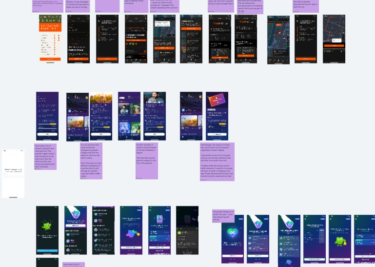
See all my research here on my Whimsical board:
📣 Want to help support and spread the word?
Go to my LinkedIn here and like, comment, or share my posts.
OR
Share this newsletter by clicking here.


