🪝Does your onboarding have a hook?
Learn 7 tactics you can use
Hey there, it’s Jacob at Retention.Blog 👋
I got tired of reading high-level strategy articles, so I started writing actionable advice I would want to read.
Every Tuesday I share practical learnings you can apply to your business.
Great writers have one goal: Get you to read the next sentence
Writers hook their readers, you need to hook your users.
Your onboarding flow is like a great essay.
You draw them in with the headline.
And hook them in the first couple of sentences
This is your goal for onboarding too: Get your users to the next screen
This makes it a little easier, right?
Instead of putting pressure on yourself to create a beautiful massive flow, focus on making one screen compelling enough for users to want to progress.
And then make another, and then another. And then a few more.
What are the different tactics we can use to help?
Quantifying the value they get (”Reduce work hour distraction to <20%”)
Showing the value you provide (Visual of upcoming features)
Ask multiple-choice questions to build investment (”What are your goals?”)
Personalize the experience with inputs (”We recommend this for people like you”)
Build Problem → Answer format so you are the answer to the problem you just created
Creating suspense with a cliffhanger
Social proof and testimonials to build trust
“Remember, if someone downloaded your app, they’re looking for a solution! It’s your job not to f*** it up.”
-Jacob Rushfinn
Have you used or heard of Opal? “#1 Screen Time App”
Opal is a great product and has a solid onboarding flow where they use all of these tactics
Quantifying value
Reduce your Screen Time by 30% to 2h 48m each day
Reduce work hour distraction to <20%
Become 30% more focused than the average of your peers
Develop habits to save 30d this year
Showing the value they provide
Video explainer on the first welcome screen showing you friendly UI
I think this video is a screen recording with some text overlay, but their UI is very well designed, so they don’t need extra production value.
Multiple-choice questions to build investment
Simple multiple-choice questions build an engagement pattern that draws people deeper into the product
We can’t ask endless questions though, we need some payoff so our users feel good about their time investment
Personalize the experience
Opal asks “What is your daily average Screen Time”
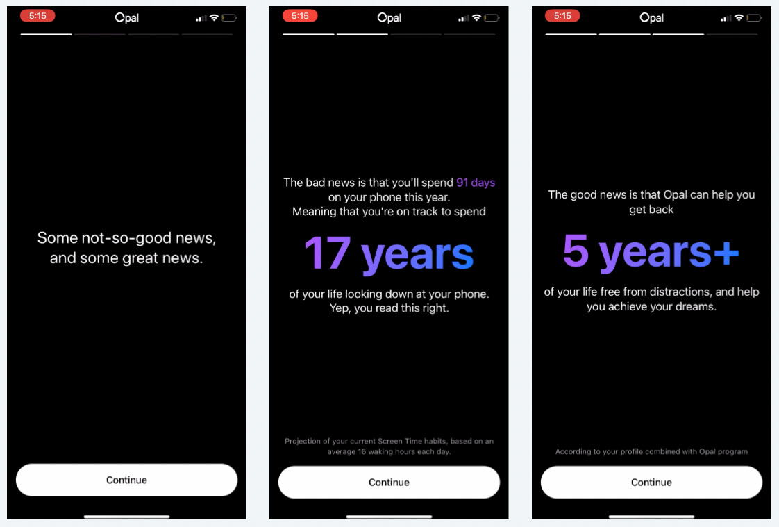
Then they let me know I’ll spend 91 days on my phone this year (yikes)
Use this information from your questions to create an engaging, personalized experience
Problem → Answer Format
Opal screams the problem in your face: “You're on track to spend 17 years of your life looking down at your phone.”
Opal then throws on their Superman cape and swoops down to the rescue: “Opal can help you get back 5 years+”
“17 years!?!” These three screens are the most powerful in the app. They could remove nearly everything else and probabably still have a decent conversion rate.
Creating suspense with a cliffhanger
Opal asks you questions and then has an annoyingly long “loading” screen to build anticipation
Next, you see, “Some not-so-good news, and some great news.”
There has got to be like .0001% drop off from these screens
Then don’t forget to toss some social proof in there
Think about social proof like deposits in your user trust bank.
You can sell something to someone without them trusting you, but it’s sooo much easier if they do.
Opal uses:
Press mentions
App store reviews
Number of users
Awards: App of the Day
#1 screen time focus app (whatever that means)
And even with all these awesomeness, they could likely make some improvements.
The video they play on the Welcome screen is good, but how much better would that be if it was more interactive? They could build in an explanation of the app instead of the video.
After the paywall, they have a generic tutorial carousel that I’d bet most people skip. Why can’t these explanations be more integrated into the onboarding flow?
(I’m guessing this onboarding grew organically and wasn’t created in one go. It lacks some cohesiveness.)
Either show me these features in a more interactive format or just wait to explain them once we get to the main screen. I’m going to forget.
You’re dropped into the home screen without a ton of direction. I unlock a gem, but why do I care about a gem on my first session? I have no context.
I’d bet Opal has a higher-than-average active paying audience, but a lower-than-average active free audience.
They have a free experience, but unless I pay, their product experience after onboarding isn’t as intuitive. If I paid for the app, I’d have the motivation to figure it out.
In the productivity category, they rank #83 for free app downloads, but they rank #44 in the top-grossing charts. This is a signal they monetize better than their peers.
At the end of the day, it’s easy for me to second-guess their onboarding. And I truly am just guessing without having tested the different flows and knowing the team. I don’t want to discredit anything the Opal team has worked on since it’s an awesome and innovative product.
You know what they say: “If you ain’t got no haters, you ain’t poppin”
Check out the Whimsical board here to see the full onboarding
📣 Want to help support and spread the word?
Go to my LinkedIn here and like, comment, or share my post.
OR
Share this newsletter by clicking here.


One of the best and most thought-provoking insights in your series. Well-done, Jacob!