

Community Wins: Paywalls and Rating Prompt
Wins from OMENA and Expenses Manager

Hey there, it’s Jacob at Retention.Blog 👋
I got tired of reading high-level strategy articles, so I started writing actionable advice I would want to read.
Every week I share practical learnings you can apply to your business.
Learn from others in the mobile community

Hahyeon Park, CPO and Co-founder at OMENA recently shared an interesting paywall win.
Many apps have been using the Blinkest style trial timeline paywall for quite a while.
Why? Because it’s hard to beat!
This is part of the reason I was so interested to see Hahyeon share this win.
And not just a small win, they doubled their trial start rate!!
Here you can see the baseline paywall they were trying to beat:

I know not all of us speak French, but I think you get the gist.
I took French in high school, so I can kind of read what it says, but don’t try to talk to me!
And here is the winning variant!

This is quite cool. And also beautifully designed.
They give users the choice of whether they’re ready to start the trial immediately or if they need more information.
How?
By making a long paywall that users can scroll through if they’re interested. Since the CTA button modal overlaps some of the content, it’s obvious there is more to see.
What else is in the long paywall? Quite a lot.

It follows the theme of providing more information if needed. Users can scroll vertically, but if they want to see more information, they can swipe through a number of carousels.
And never underestimate the power of happy smiling faces of real people. Our brains are wired to recognize and pay attention to faces.
Let’s keep scrolling down…

More happy faces and real people.
More testimonials on different parts of the app with a horizontally scrollable carousel.
And simple, understandable education on the other features.
That’s not all, there is more!

They share pictures of the founders - this makes sense. Especially, since they’re women. If it was built by men, it may not be the best idea to share pictures of founders for a menopause app.
I also think showcasing founders is a strategy for apps earlier in their growth. You can intersperse it here and there for email comms to boost conversion, but eventually, the brand gets bigger than the founders. (and rightfully so)
Then they move into ratings and credibility through logos. Honestly, I would have moved the ratings a little higher in the long paywall since I want most people to see those.
Lastly, they have quite a long FAQ section. (I didn’t include most of it)
So what were the results??

Based on this data it seems like a pretty big win!
Things I would check to validate this A/B test:
It looks like we have a sample size mismatch? If both flows were receiving the same traffic, the “Blinkest” 7.7% CVR should be more like ~40 trial starts.
7.7% CVR with 23 conversions means ~300 people entered that experiment variant
14.7% CVR with 88 conversions means ~600 people entered that experiment variant
So it looks more like a 66% vs 33% traffic split
What are the issues?
This is low volume for an A/B test.
Technically, it is a stat sig increase if my traffic assumptions are correct.
And since the conversion improvement is so large, it’ll probably hold up.
But there is some level of natural variance with these low sample sizes, so I’m skeptical it’s actually a 2x improvement. (meaning if you ran this test for longer, the lift would likely go down)
Also, not running 50/50% test stresses me out.
Aside from the data questions, what else would I take away?
It’s helpful to have hypotheses on why a test won.
My big hypothesis is that users didn’t understand the app and didn’t know what they were getting.
This longer paywall provides sooo much more information than the previous version.
I would strongly consider adding a lot of this information in onboarding flows before users get to the paywall. Only X% of users will scroll through it all on the paywall, so adding in onboarding gives a higher chance of people seeing helpful information.
I confess, I didn’t check the whole onboarding flow. So if this info already exists before the paywall, I apologize, Hahyeon.
Win #2: Ratings Prompt Improvement

Our 2nd win is from Amit Mohan, Founder of Expenses Manager.
Amit does an amazing job of sharing his wins on LinkedIn, so give him a follow.
He recently shared:
“Over the last 28 days, Expenses Manager achieved an average rating of 4.8 ⭐️ on the Play Store. 🎉 “
He had a 4.3 average previously.
I was curious if he improved ratings, but sacrificed review volume.
He did not!
I asked because rating/review volume is equally as important as the actual rating. I’m not sure of the exact weighting in Apple’s ranking algo, but I’ve seen huge jumps in app rankings by an increase in rating volume. (From something like 10 or 15 in the charts all the way to #1 for a few days)
Let’s check out what Amit did.
Here is the old review flow:
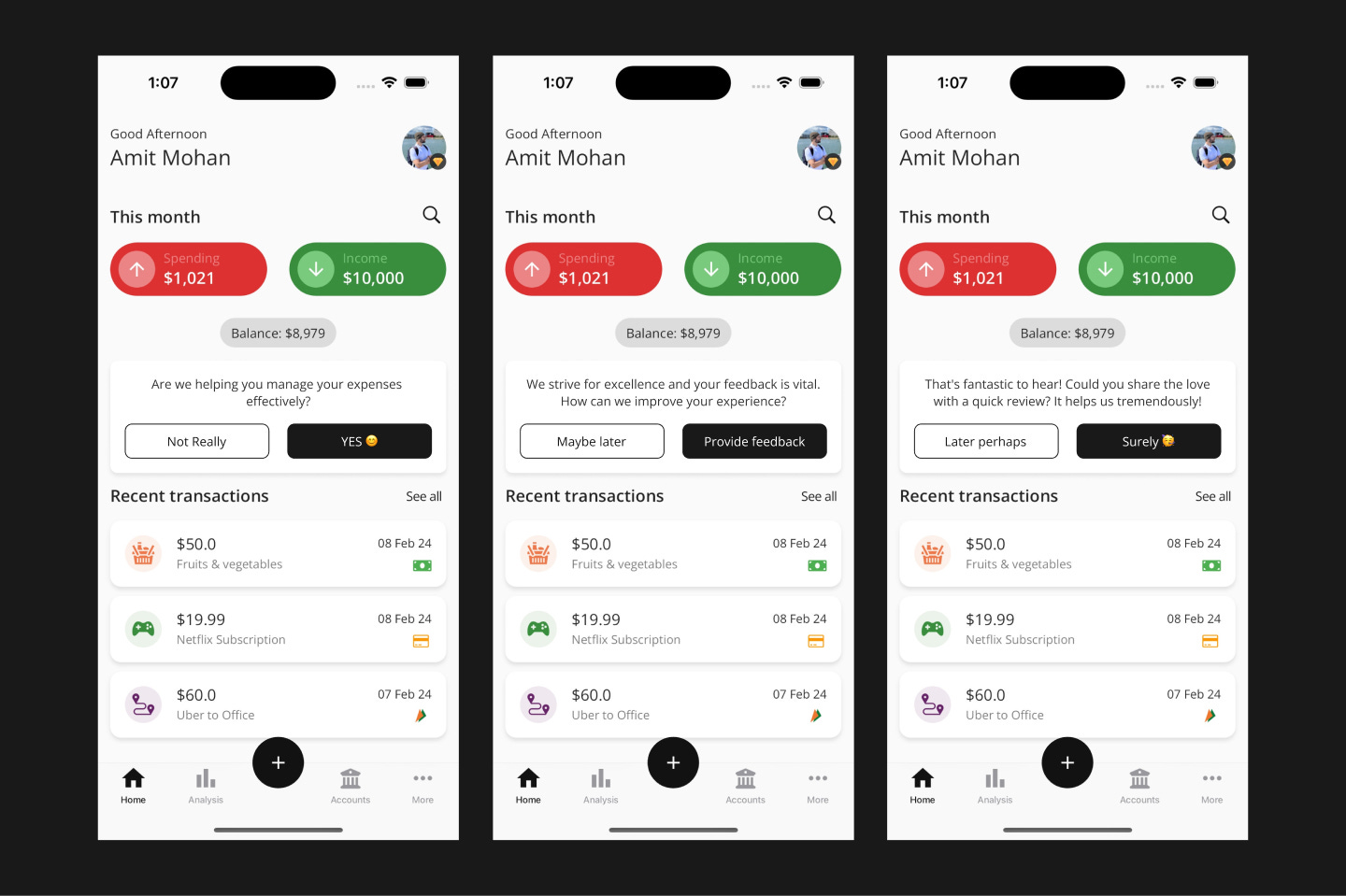
From Amit:
“I used to show it when the user had entered at least 10 transactions or set up their monthly budget in the app.
I also used to show the native rating prompt directly to the user post-trial start / Premium purchase.”
We can see that he is still filtering to only users with positive feedback by asking if Expenses Manager is helping.
And here is his new flow:
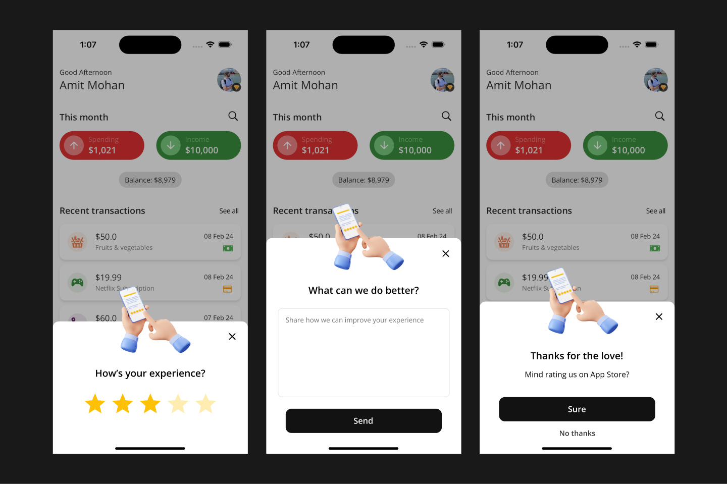
The first thing I notice is the design! It’s much nicer :)
He also does a partial takeover of the screen and darkens the background. This helps people focus and pay attention to the ask.
In the old design, it’s not obvious at first glance there is even a rating prompt.
From Amit on the new flow:
“I show this popup to the user just after they add their 3rd transaction in the app. I'll play around with this number in the future, but right now this is the number I've set.
I was getting a lot of 4-star ratings and reviews with the old flow, which this new flow solves, hence improving the overall rating.”
So he is actually asking users for a review sooner than previously, so it makes sense he’s increasing the volume of reviews. But he also increased the average rating!
By giving a star rating prompt in-app, he can filter users who would give a positive review. I’m assuming he only prompts those users for a rating in the store.
Very cool.
I bet that with this filtering system, he could move this even further up in the app experience to after the 1st transaction. I’d be curious to see if he can improve rankings further by increasing review volume.
I hope you enjoyed!
A big thanks to Amit and Hahyeon for being open to sharing these results.
I have a few other community win posts in the works, so I hope you liked this style of post.
I’m often sharing wins and ideas from larger apps, but it’s fun to see the real work being done by different developers.
Do you have a win you’d like me to feature in Retention.Blog??
Let me know! I’d love to share it and give you credit for your awesome work.
Reply to this email with a 1-2 sentence description and we can chat!
📣 Want to help support and spread the word?
Go to my LinkedIn here and like, comment, or share my posts.
OR
Share this newsletter by clicking here.

Nice read. I honestly wonder how the rating is working because it's prohibited by both stores. Here is a quote from the Android Guidelines:
"Your app should not ask the user any questions before or while presenting the rating button or card, including questions about their opinion (such as "Do you like the app?") or predictive questions (such as "Would you rate this app 5 stars")."