


Hey there, it’s Jacob at Retention.Blog 👋
I got tired of reading high-level strategy articles, so I started writing actionable advice I would want to read.
Nearly every week I share practical learnings you can apply to your business.
How should you design your app2web flows?
We’ve come so far since the original Epic v. Apple ruling.
I wrote a post more than a year ago when this all first happened: “New rules: WTF does it all mean?”
We have a lot of adoption across the industry and lots of learnings on how to do this well.
As a reminder, this is only allowed in the US right now. Maybe that’ll change in the future?
Let’s take a look at the big boys:
Flo
Duolingo
Strava
And some other apps using app2web flows:
FIG
Zumba
Waking Up
Tolan

Retention.Blog is sponsored by Botsi
You work hard to bring in tens of thousands of new users.
But 90% of them never convert or pay.
Your product isn’t the problem. Your offer is.
One user needs a trial. One needs a discount. One is ready to pay now.
Botsi turns more users into paying customers using personalized offers.
Move to personalized offers for each user to increase LTV by 30%+
Learn more →
Duolingo
Most recent Duolingo onboarding here →
I don’t think most apps can use this style, unless you have a very strong freemium upsell flow.
Before the paywall, Duolingo, asks you if you want a premium experience or not:
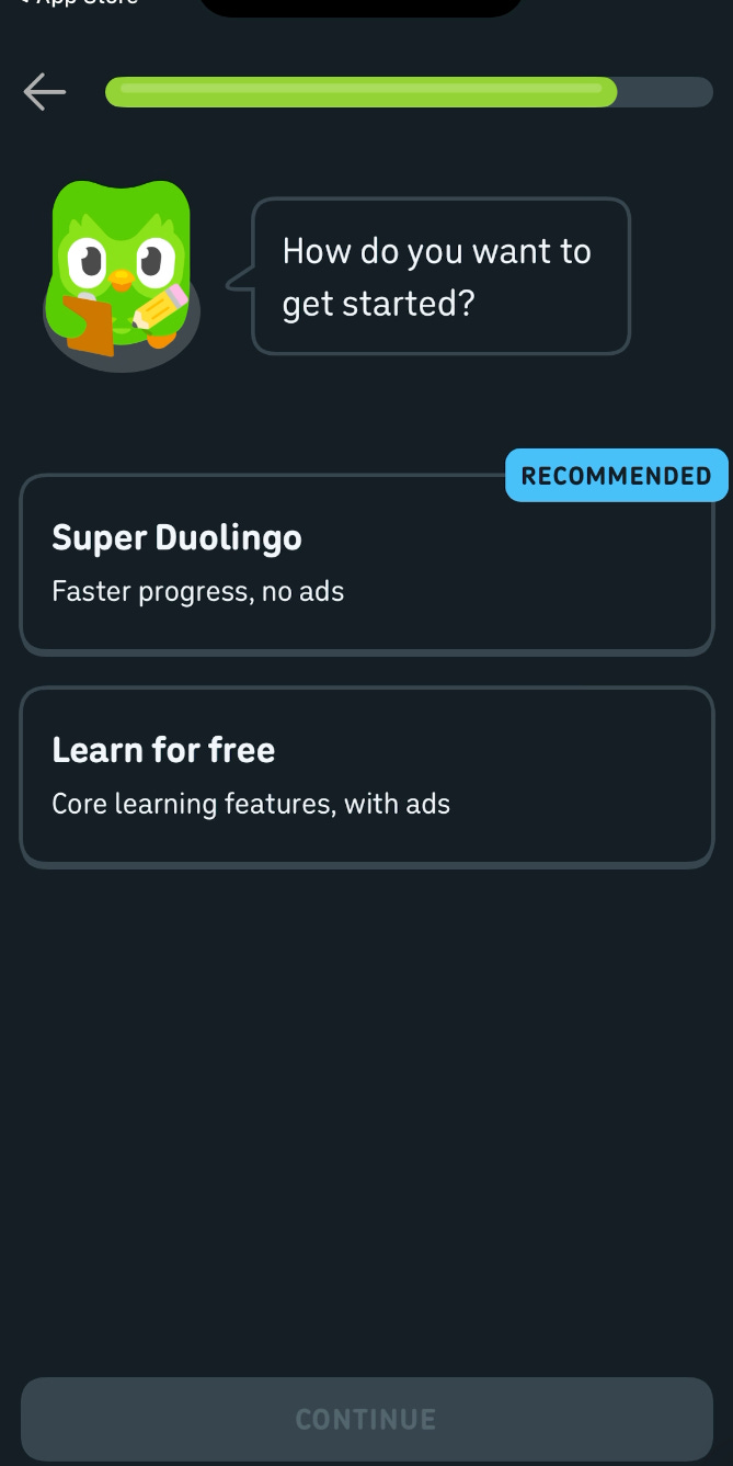
I believe Duolingo only used to upsell users after they started a lesson, so this is a departure from having users experience the product first. I would guess that still the majority of new users press “Learn for free”
Then Duo uses their free vs paid comparison chart, and then goes to the “Trial reminder selection” page
(side note: the “Trial reminder selection” is a great tactic I see working again and again)
Oh no!
I actually didn’t get an app2web experience :(
A few possible reasons:
I’m part of a test group
My device is tagged as part of an older account
I’ve changed my app store and access Duolingo from another country in the past?
I am in the US now
Some user metadata makes them think I’m unlikely to convert on web
Here is what their app2web experience looks like from what I’ve seen other times:
It still starts with the trial reminder prompt and then you press “Start my free week”, so they direct you to the web page before you even reach the paywall
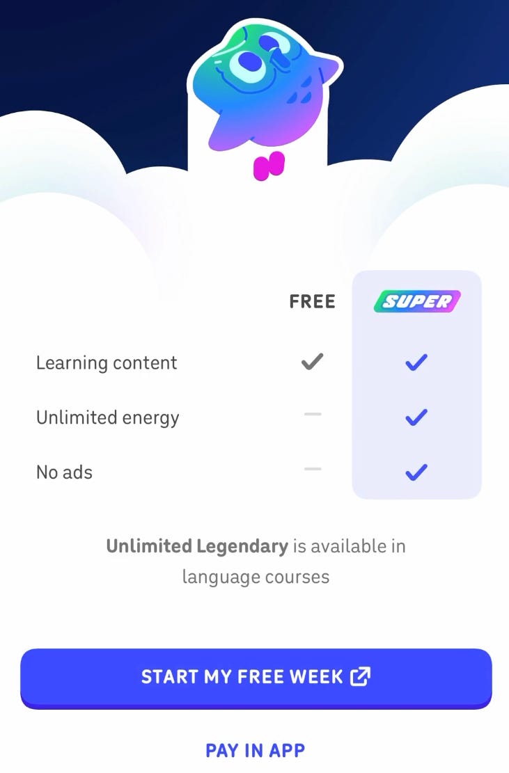
This is a web view that looks exactly like the in-app experience
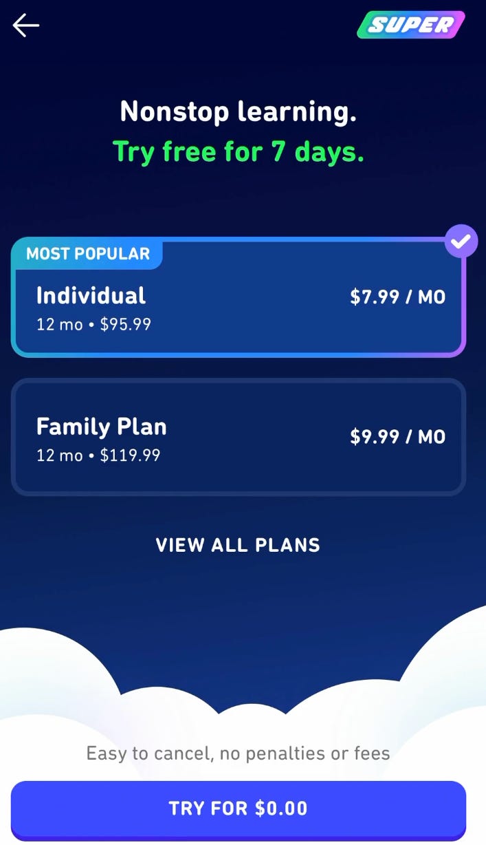
And then they trigger an Apple pay prompt that looks as close as possible to an IAP purchase prompt.
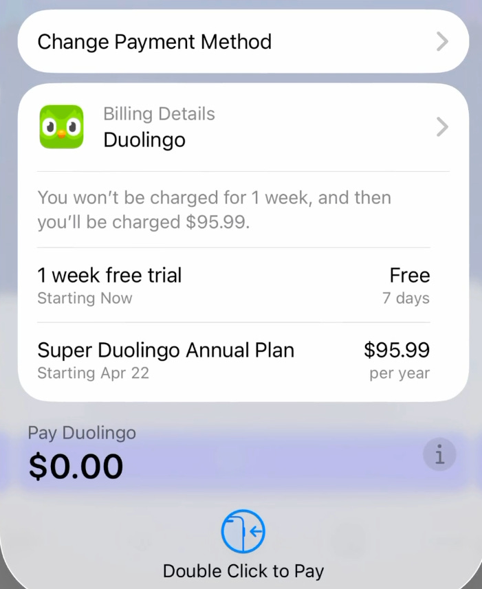
One other note I’ve heard is a good best practice:
If someone doesn’t convert on the web purchase, and then goes back into your app, show the IAP instead
Flo
Full Flo app2web experience here
The Flo onboarding experience is quite long, so theres tons before it that you don’t see. And honestly, I’m due for an update since they’ve added a good bit.
But back to app2web…
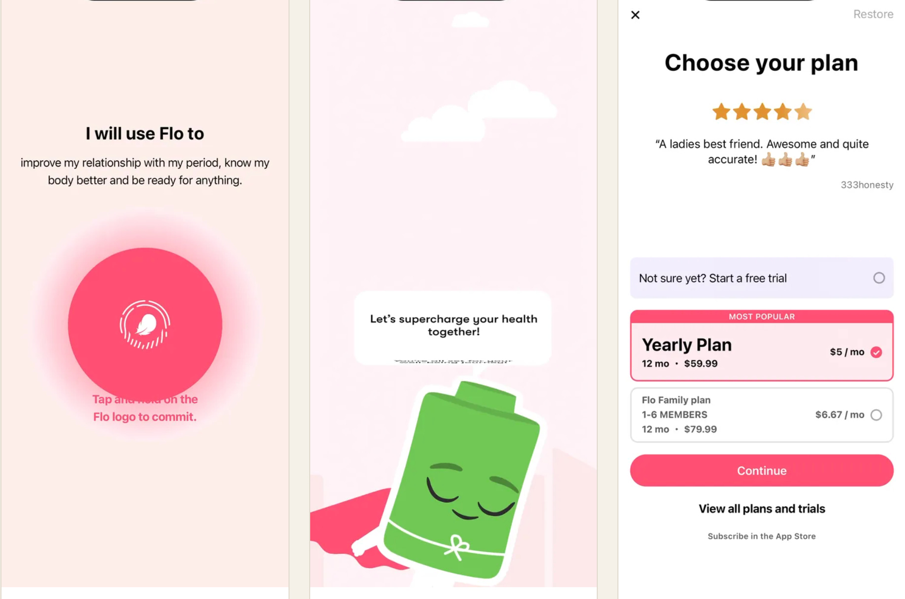
Flo uses the hold to commit prompt
Then has a fun animation around their “body battery” mascot
And finally shows the paywall
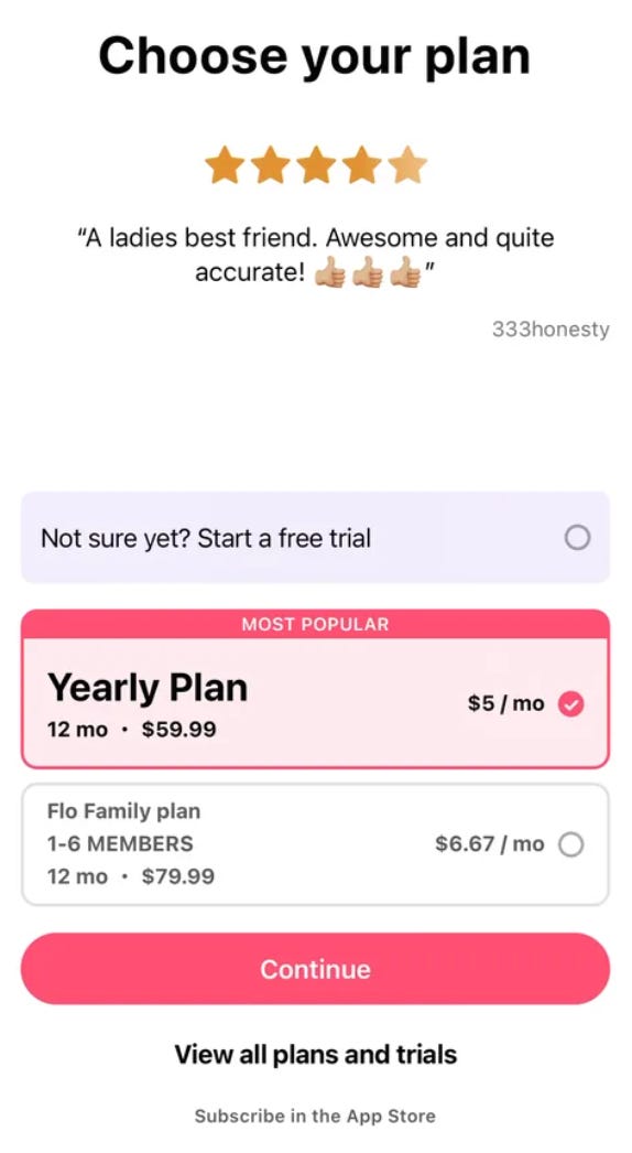
We can see here they simply use the “Continue” CTA as the main button
And the 2nd CTA is “View all plans”
Then, in super small text, they have “Subscribe in the App Store”
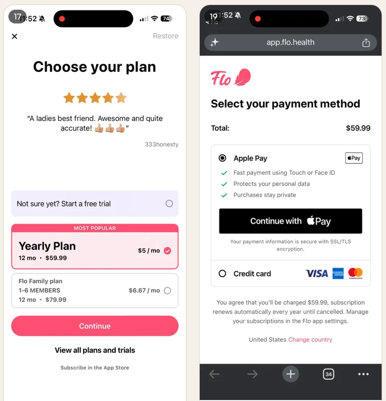
The main CTA directs to their custom Apple Pay purchase page.
Pro tip: If you’re trying to do app2web and don’t have Apple Pay, don’t even bother.
The conversion rate difference between Apple Pay and credit card is crazy.
Strava
Up-to-date Strava onboarding with app2web
Strava has some interesting elements in their app2web experience.
First, they semi-recently bought Runna so they’re now trying to sell subs to both!
Their onboarding flow is focused on getting to value fast, so they have a few questions, but get to the actual app fast.
And they don’t use app2web on their first paywall!
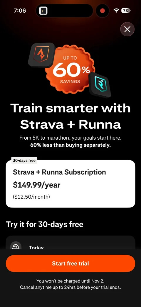
During onboarding, it’s all directing to IAPs.
But then secondary upsells are sending to their web purchase flow.
Why?
I’m not 100% sure. Sorry.
My best guess: It almost feels like the Runna + Strava double purchase was too complicated and they just decided to keep it as IAP only for now.
And then they have the secondary prompts only directing to Strava, and these use app2web flows.
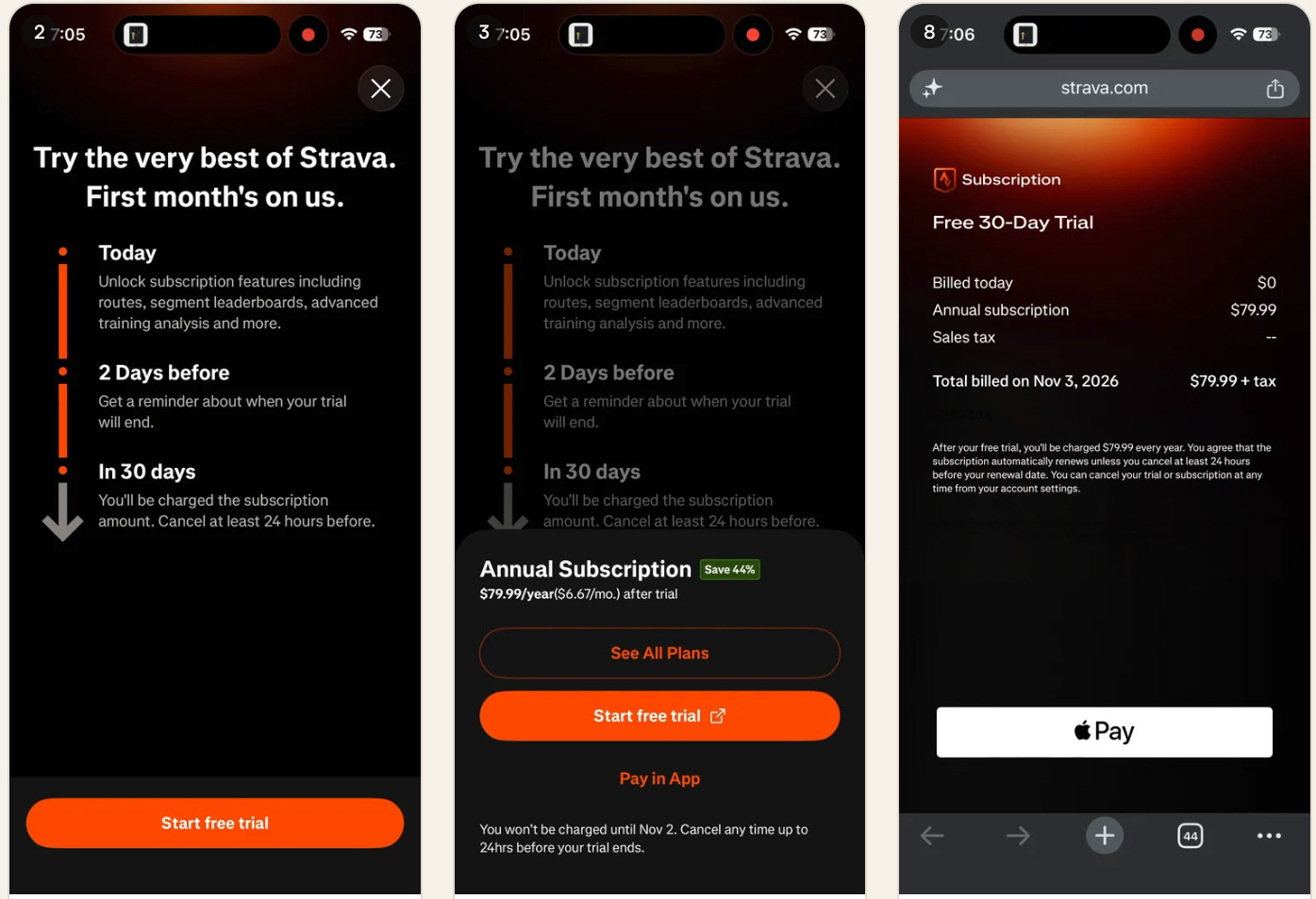
Similar to Flo, they have built their own custom Apple Pay payment page they link to.
They all have a single product on that page, so there is no getting distracted, no exploring other plans, just buying.
FIG
Fig is quite a cool app, and an acronym for “Food Is Good”
It helps you understand the ingredients in food to help you match your dietary or health needs.
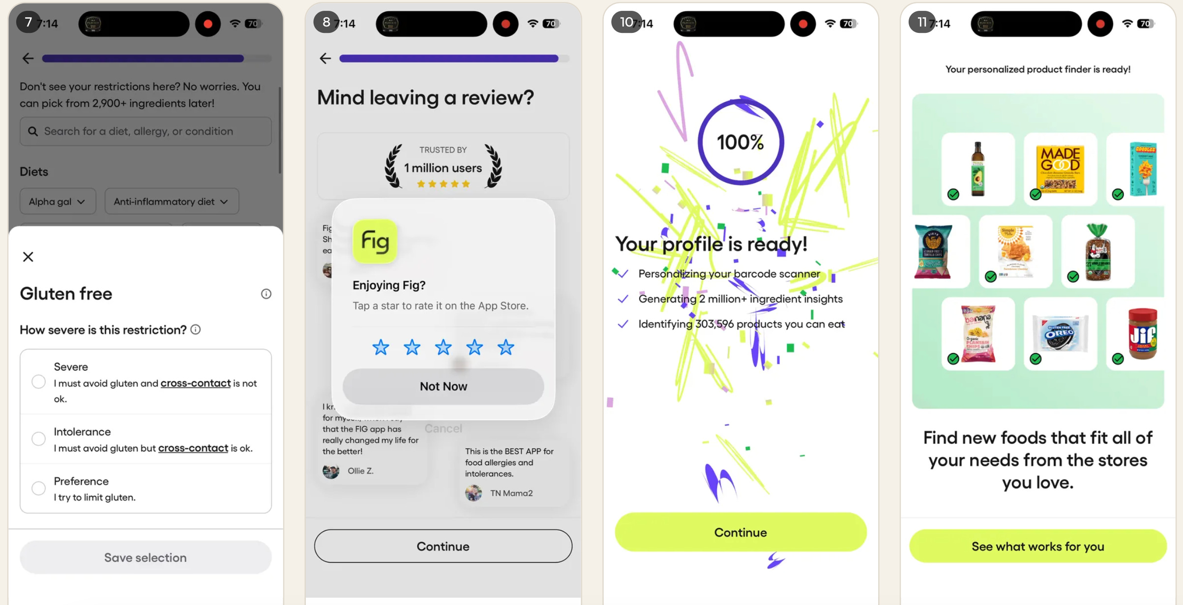
You complete their onboarding flow
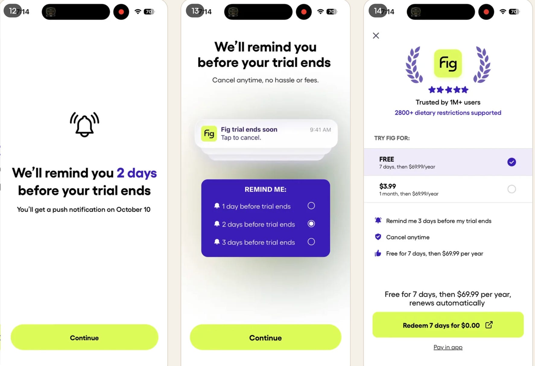
And then they send you into the paywall flow.
Look similar?
All these apps converge on the same tactics.
FIG uses a “Design your trial” paywall
Both options link out to Stripe purchase page.
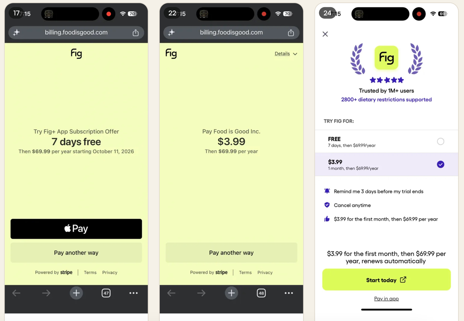
I think this is Stripe’s specific app2web implementation with Apple pay for more streamlined flows.
Well, obviously it’s Stripe, but I believe they have a specific app2web product? I saw this somewhere else, but honestly, I don’t feel like looking it up right now… 🤷
I’ve seen the advice to change to IAP if someone doesn’t purchase the first time on web and goes back to the app, but haven’t actually seen any of these apps do it. Hmm.
Okay, who’s next?
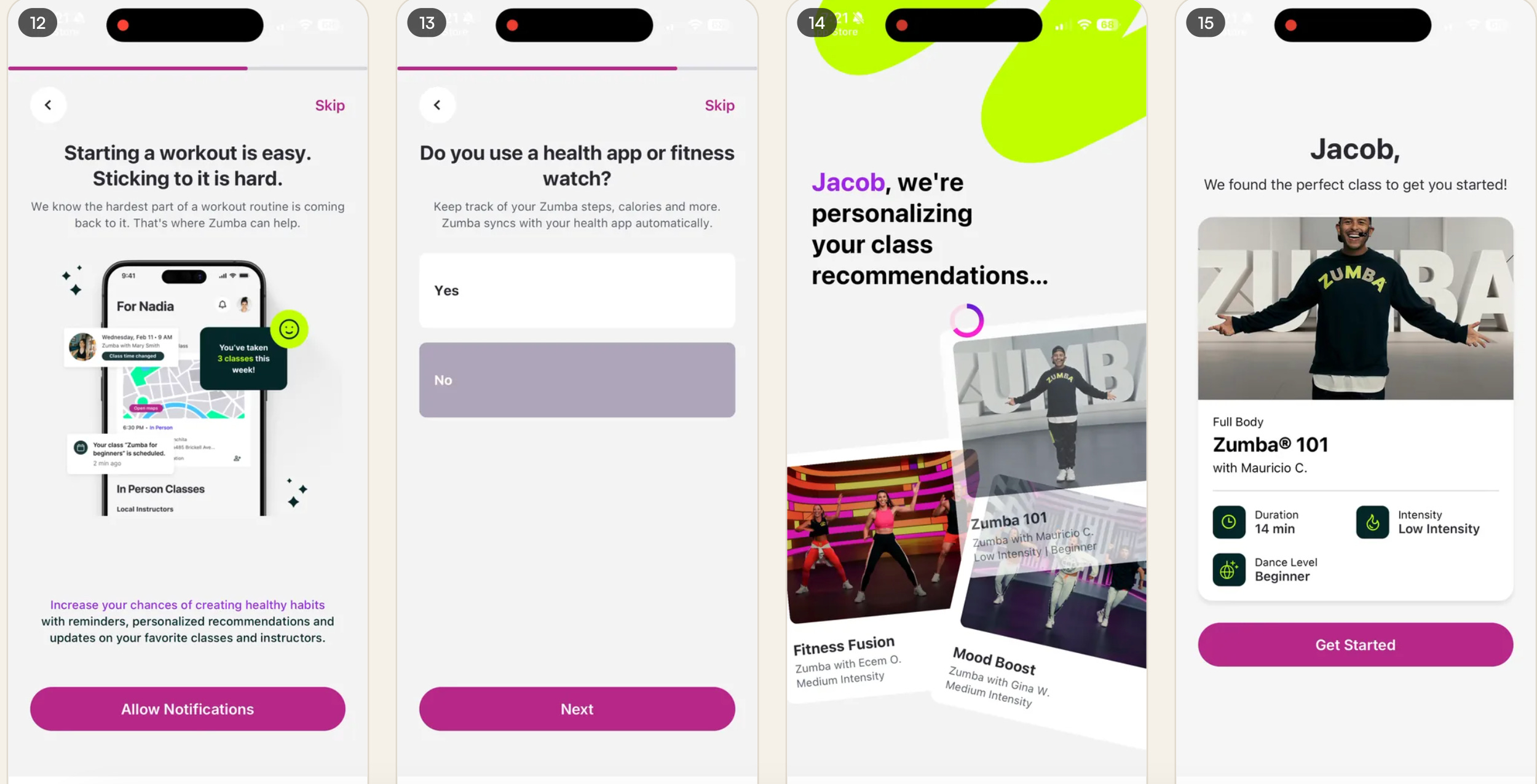
Zumba
Their onboarding flow is a bit corporate, but overall, pretty solid.
This is just a snippet below
And here is their paywall!
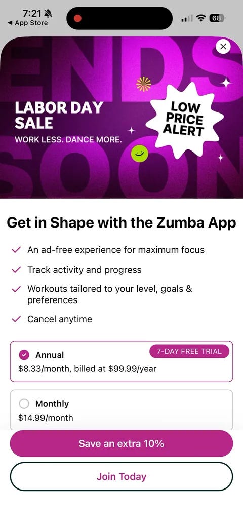
Look at that, Zumba gives you a discount for purchasing on web!
I haven’t seen any other apps do a discount.
Maybe they know if they design the UI right, everyone will go to the web purchase option anyway?
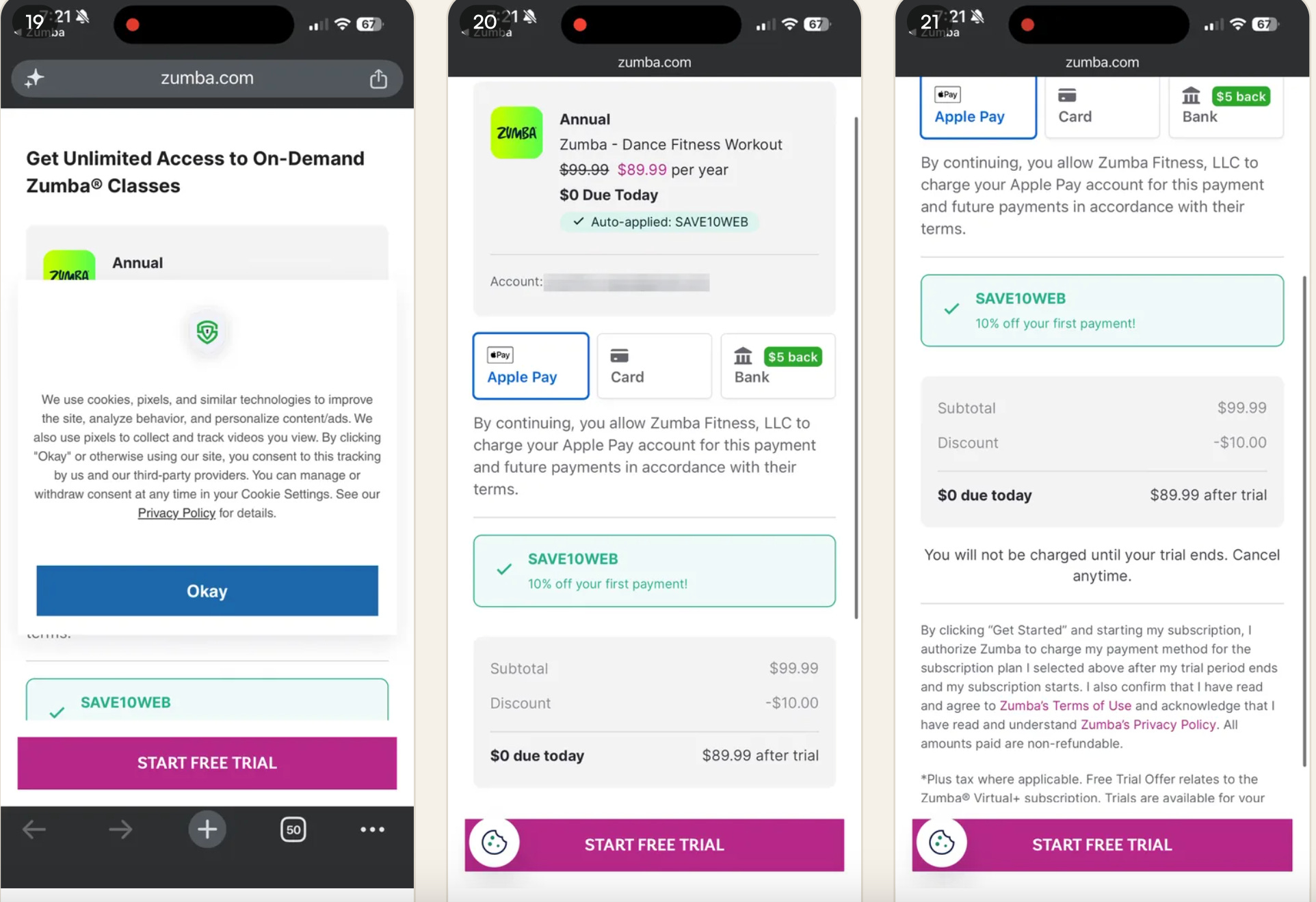
I get a 10% discount on monthly or annual.
Also, make sure your cookie banner doesn’t trigger on your web checkout page. Barf. Such a bad experience.
They use a more convoluted checkout page.
I think the other apps auto-detect if you have Apple pay and only show that option if you do.
Hmm, I should go back and test if these apps show app2web options if I don’t have Apple Pay enabled!
You can check for this without any permissions on the device (I believe), so it makes sense to customize your experience based on this since it boosts conversion so much.
They’re a “big company”, so it make sense they don’t quite have as a streamlined flow.
But I do like the discount!
Waking Up
Waking up is an app created by Sam Harris focused on mindfulness and meditation.
They have a pretty simple onboarding flow. I would guess this is because people come to the app from his other content, so they have a decent level of awareness, intent, and goodwill built in from that.
They don’t have to work as hard to convince and sell you.
Here is their paywall:
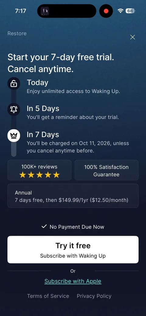
A little clunky, but not bad.
Only an annual plan.
And it links to a Stripe page:
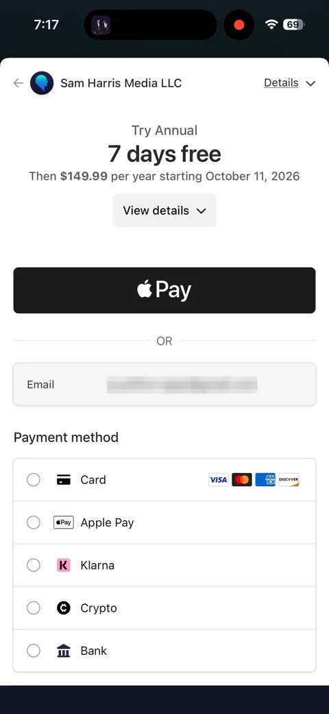
This page is actually an in-app web view!
This is a bit of a gray area. I’ve heard you shouldn’t try to get away with this and always link out to an external web page.
I’m sure Sam wouldn’t be too happy if Apple flagged his app. Sorry, I hope I don’t get them in trouble.
Also, compare the Stripe purchase page from FIG and here.
The FIG one is so simple and streamlined. That HAS to convert better than this.
I think this one here is the standard Stripe checkout page.
Tolan
I wrote a whole post on Tolan a bit ago, and they are absolutely crushing it.
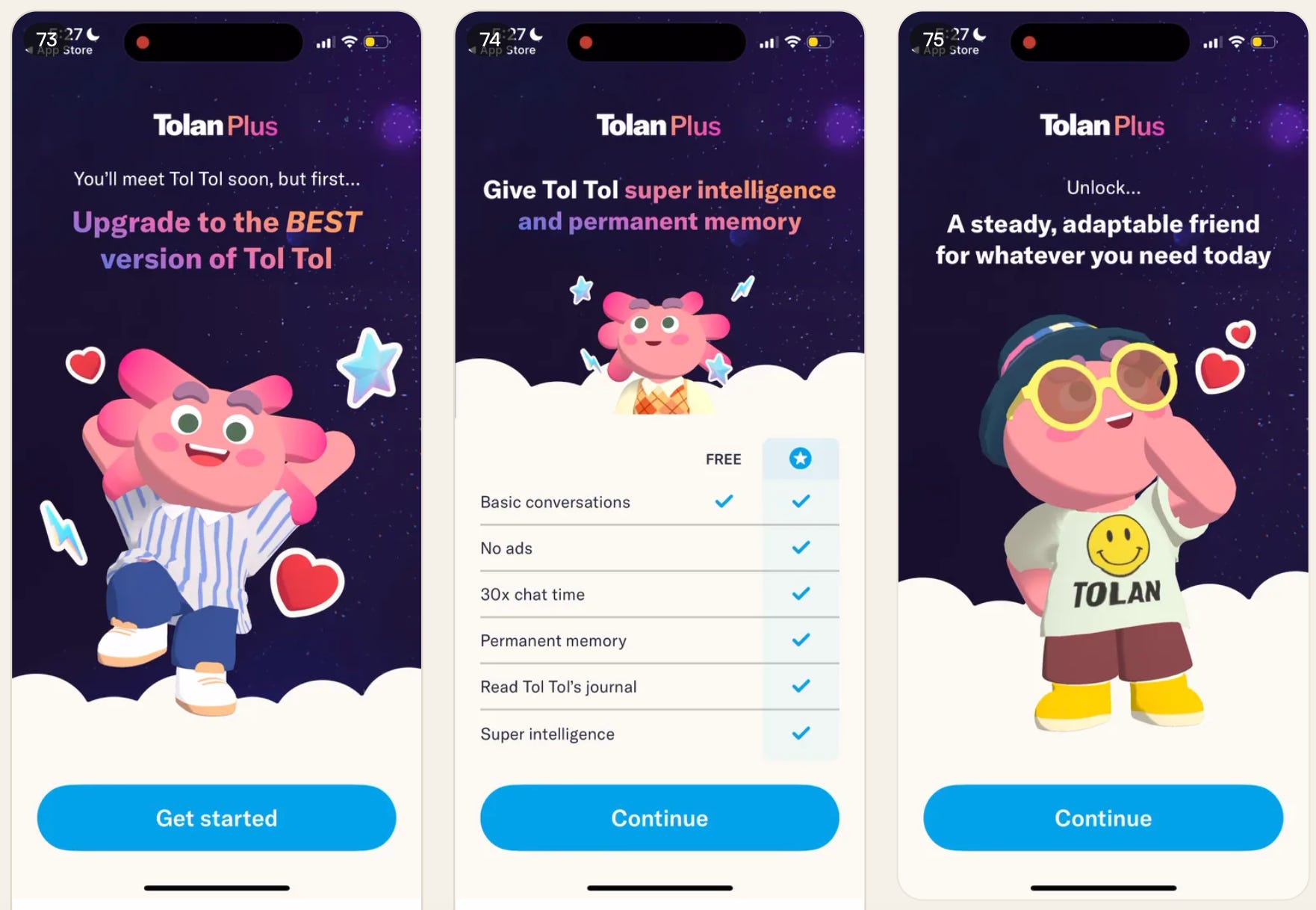
Tolan has an awesome set of pre-paywall screens:
Personalization
Free vs paid comparison chart
Selling benefits again
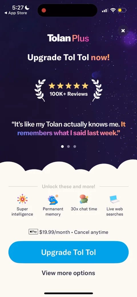
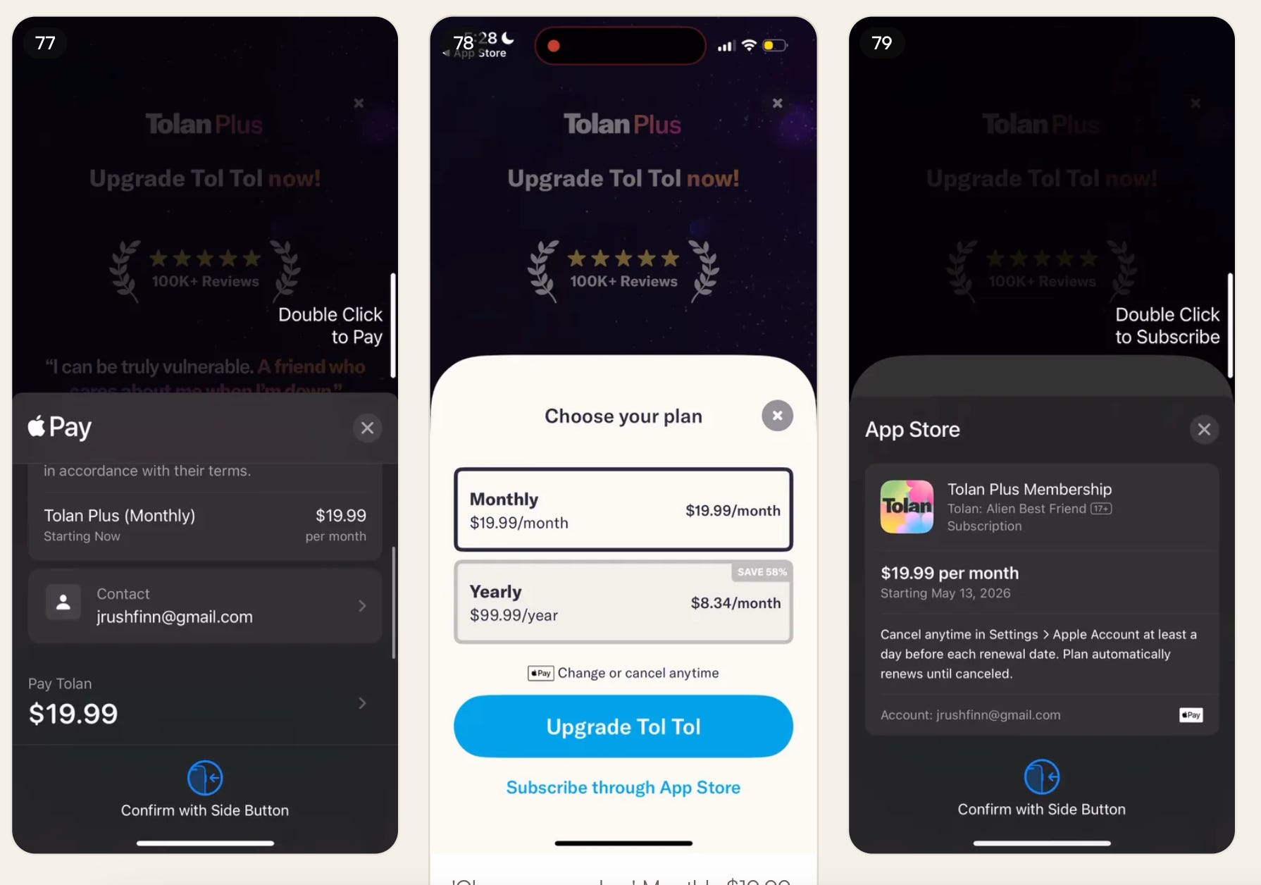
And then directing to the monthly purchase as default!
And they default to Apple Pay here.
Core takeaways
Apple Pay is non-negotiable.
One product per checkout page. Flo, Strava and Duolingo link to a page with a single plan and nothing else to explore.
Make web feel like IAP. Duolingo’s web view mirrors the in-app UI and triggers an Apple Pay sheet that looks almost identical to a native purchase.
Custom or streamlined checkout beats standard Stripe. FIG’s Stripe app2web page is clean. Waking Up’s standard Stripe checkout is clunky, and Zumba’s is convoluted. The difference has to show up in conversion.
Kill the cookie banner on checkout. Zumba’s ruins the moment.
Fall back to IAP. If a user bails on web and returns to the app, show the native paywall.
Link out, don’t embed. Waking Up runs Stripe inside an in-app web view, which is a gray area that risks Apple flagging the app.
The pre-paywall flow keeps repeating: trial reminder selection, free vs. paid comparison chart, hold to commit, personalization, benefit restatement.
📣 Want to help support and spread the word?
Go to my LinkedIn here and like, comment, or share my posts.
OR
